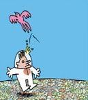
Oops!
Well, it's Easter time for all the Christian folk out there, and since I'm visiting with relatives this weekend I thought it'd be nice for my site to 'visit' with a real comics icon, someone perfectly appropriate for the season.
I refer, of course, to Jack T. Chick.

It's no exaggeration to call Chick one of the most-read cartoonists in North America; honestly, it's something of an understatement. The man has become no less than a minor cultural icon, his famous lil' landscape format giveaway comic tracts standing as a uniquely successful permutation of the art form. He's been around for decades, long enough for many comics readers (and countless others) to become familiar with his particular brand of preaching, emphasizing the hundreds of perils that might spell damnation for even the most well-intentioned soul, and the lone footpath away from the Lake of Fire: unequivocal acceptance of Jesus Christ as
your personal savior.
He's still at it today, releasing numerous fresh items every year. I've
already gone over Chick's recent return to full-sized pamphlet-format comic books, a new issue of
The Crusaders, which dips into the conspiratorial side of his favored subject matter, as well as his collaborative aspect. Few men can support an empire of funnies alone, after all, and Chick has long had an understanding partner in artist Fred Carter.

Well, the two of them may not share a similar
visual outlook, but they're most simpatico in terms of message. As such, Carter's current project makes some sense - he's
remaking a handful of particularly famous Chick tracts in his own visual style, so as to appeal directly to black audiences. From what I've seen, the process sometimes involves simple augmentation to preexisting art, though other tracts see a full-scale makeover.
Among the latter is
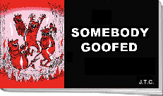
Oops!, one of the newest tracts to see release from the Chick nerve center. And even its cover art, seen above, hearkens back to its source material:

As far as these things go,
Somebody Goofed is an excellent choice for a redo. It's one of the quintessential Chick tracts, lean and mean, stomping and snorting across 20 full-page images (and one page with two panels) to deliver its simple message. No convoluted metaphors or diabolically baroque machinations here; it's Chick
distilled, yet far enough along in his career that he's become somewhat self-referential, if not self-aware.
Carter's approach is understandably similar (I mean, it's a
remake), but his style is so fundamentally different from Chick's that a comparison is still worthwhile. C'mon! Let's hunt for the Easter eggs! I think that's a pagan fertility thing!

Here's page one of Chick's original, already reminiscent of those later episodes of
Dragnet wherein Joe and Frank would encounter our changing society and put the changes in jail. But Jack T. Chick has grander things on his mind - check out how there's two solid splotches of black on the page, both of them shirts, both of which serve to immediately grab at your eye. One belongs to poor Bobby ("
Gasp!" ), while the other belongs to a local sensitive badass who's totally into Satan, motherfuckers.
Death, drugs and demons are immediately linked in this way, and the story's
shock surprise ending is foreshadowed before the plot can even begin. It doesn't look like much of a crowd on that page, or even a very good
suggestion of one; Chick's composition seeks only to deliver the awfulness of the situation, even going so far as to provide a handy bridge of white space between his globs of doomy black, although that clunky bottom left word balloon spoils the flow.

Carter's version, in contrast, flushes the symbolism entirely to present a sense of realistic community. This is a
real crowd, the visual emphasis placed on their teeming bodies while Bobby ("
Gasp!") is pushed into the background. Consequently, the word balloons -- and they're
exactly the same in content, as it'll go for most of the story -- compliment the visuals by forming a circular pattern, mimicking the rustling of the people as the eye is drawn around the page, and creating a sensation of the crown
surrounding the ambulance, even though Carter only draws people on one side.
What's most impressive to me is that Carter isn't just creating a similar scene to Chick's; he's recreating many of the
elements of Chick's composition, even placing several characters in the same
postures, while transforming the mood of the page through simple changes. Having a more realistic visual style (one now incorporating photographic backgrounds, if you look closely) doesn't hurt in creating a tactile sense of community, of course. And it was nice to not have the paramedic announcing the kid's fate to the whole neighborhood. Asshole.
Anyway, the plot of the tract kicks off soon after. The (
gasp choke) fate of Bobby prompts an onlooking young boy to ponder his own mortality; a nearby religious sort decides this is the perfect time for a little intervention, but unfortunately the kid is hanging out with these guys:


I'm partial to the classic Chick 'hipster' design up top, although Carter's command of body language is formidable as always. I've mentioned it before, but Carter always sort of reminds me of Frank Quitely, a younger artist working in a more overtly stylized manner, but possessed of a similarly puffed-up approach to faces and bodies, with a fundamentally humorous outlook.
Or maybe it's this page's juxtaposition of detailed character art with a nebulous background glow that's doing the trick, like one of those bits in
All Star Superman where characters converse in a shimmering void or conveniently pass in front of a blank wall; that's not really a criticism, given that both artists are obviously putting a premium on body language and facial expressions (and, in Quitely's case, a sense of incredible speed against yawning landscapes), but my preference is for the volume-adding scratches that Chick provides.


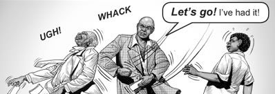
Body language is generally worth checking. On this page, Chick and Carter again provide essentially the same character positions (although the latter version can't help but change some of the former's stilted text). But look at how Carter's depiction of the religious guy changes the tone; he's reasonable, pleading, reaching out, while the other adult character turns away meanly. In contrast, Chick's guy is basically yelling at the pair, making the hipster seem a little more reasonable.
Fascinatingly, the religious guy in Chick's version appears to be
a self-portrait. Which raises the question: is the same character in the new version supposed to be the even-more-reclusive Carter? It's tempting to speculate as to the dueling psychologies at work; does Carter sees himself as a fundamentally reasonable man in his witnessing? Is Chick a man of force, inside? Does he think himself pushy? Does he
need to be?
That's maybe a wrong turn, though. The philosophy of the Chick tract suggests a different possibility.


Ah, the trials of the faithful! But Chick isn't one for self-pity; his works, inspired by Chinese propaganda comics, you'll recall, are containers for
psychological warfare, and everything in them is typically poised for maximum effect. This story is an efficient one. Notice that Chick/Carter(?) is dropping his tracts as he's shoved; the man being rejected is the guy who handed you
this comic you're reading now. Maybe he seems a little nuts; the characters say as much.
Meanwhile, the other adult appears to be perfectly sane. He notes that many modern theologians (like Jesuits,
UGH) accept that the Bible is a patchwork accumulation of sometimes contradictory perspectives. He castigates the Chick perspective as extremism and fearmongering, a product of midievil thinking and anathema to a society of reason. Hell, the guy isn't even an agnostic or anything - he openly advocates a respectful generalization of Christian values ("
Just follow the ten commandments and believe in the golden rule and you'll be O.K.!"), and impliedly advocates only surgical intolerance toward those who spread messages of fear and inflexibility.
But, he's
wrong. He's
always wrong. Worse, he's no less than a literal agent of Satan (er,
spoilers). And the assholes are not only right, they're the ones who won't roast in perdition for all of eternity. It's just like
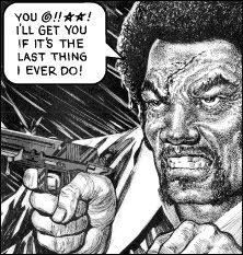
the famous tract with the foul gunman who accepts Christ, and is saved, and the unfailingly good-working (if sneery) sheriff who does absolutely nothing wrong beyond not accepting Jesus, and goes
right to fucking Hell, where he belongs, for unspeakable suffering unto eternity! In that way, it makes perfect sense for Chick to portray himself as sort of a hectoring asshole; that's all part of the reversal his works feed on. The least made most, the most made least, and so on. It's proudly extreme, and
always extreme, and so rhetorically persistent that it just might bore into your head after 40 or 50 times, which is part of the plan. The beauty of
this story is that it blends criticisms of 'the Chick outlook'
into the outlook itself! God, who said this guy was rigid?
On the other hand, Chick does make
his shove look way more painful than Carter(?)'s. Look at those impact spikes. He even lost his glasses. Those inert sound effect don't help Carter's case.

But then, if Carter isn't a more restrained preacher, he certainly lacks Chick's fire for mayhem. This is the page where the boy (NOT SAVED) and the adult die while driving to a lecture on evolution or something. Just look at Chick's flair. The upper right of the panel is filled with the black of death while most of the sky is dominated with the terrific impact of the train. A whole cloudbank of smoke is vomited into the bottom left corner while the rendering of the car slashes with inky violence. If you peer in, you can see the hipster flailing inside the car, although from the looks of the collision I bet he won't get far with the engine crushing his legs.

Carter's? Same composition -- the wheels are even flying off in the same direction -- but man, it's practically a
Yuichi Yokoyama panel. Cleanliness and geometry rule the day; it's clear, but incredibly detached. The impact is signified by a glowing blast, as if the car is being pressed by the train's headlights. The adult character is thrown free of the car; Chick makes you imagine the meat jelly of his hipster's body, but he makes
sure you imagine it. Carter can only convey.


I think that's the key, given the type of battle Chick tracts always aim to fight. The top image here is one of my all-time favorite Jack T. Chick drawings, as the boy and the adult enter the bad place. The conflicting textures of the rock are appropriately jarring; for Chick, it's subtle. The hipster... I love his expression. He seems faintly mournful, or maybe just
sorry; he can't quite understand how people keep falling for his wrong-type-of-Christian tricks, when the answer's so simple. It's always simple in Chick tracts, but so many still fall into the pit.
Carter's version is
way funnier, and I kinda dig the mix of photographic flames and (modeled?) rock textures, but the Chick version embodies the Chick ethos to the fullest extent. You're
so stupid, because there's only
one thing you need to do.
Jack T. Chick may have been the guy getting shoved, but he's also temporarily present in our last glimpse of adult humanity, that of soft irritation.
Sympathy for the devil.


Happy Easter! You're probably going to Hell!


