SPX 2009 - Comics and Connecting Fabric
***
(A fanfare sounded as Chris Mautner exited the men's room. Song filled the air while we walked, booming as we passed the long line for admission to the Small Press eXpo. A woman's high voice raised and maintained the connotation of praise, divine, though I did not need words to know. It was a ministry event in the adjoining room to the con floor, which itself was in a different room than the year before, not that the rows of tables don't impress the mad market character of an American indie show onto any damn space in the Marriott region. I nonetheless accepted the music as a convocation, a prayer to some god of funnies and monies. I'm here in my suit, wearing my bag, and I'm ready to buy.)
***
Cold Heat #7/8 (of 10) (Ben Jones & Frank Santoro), Cold Heat Special #7 (Michael DeForge), MOME Vol. 16 (various)
Why yes, this is the cover of the new Cold Heat. Or, half of a wraparound. Title's on the back.
For a project that started out infamous for getting rejected for Direct Market distribution, Jones' & Santoro's creation has proven remarkably expansive; there were no less than four Cold Heat items debuting at the show, and the sky looks to remain the limit. Indeed, at Saturday's new action panel, Santoro expressed interest in working with a more 'mainstream' artist and pitching a reoriented incarnation of the story to Image, and it says something that I can't come up with any other comic at the entire show that could possibly support such a plan. But Cold Heat abides.
For now, the big release is issue #7/8 of the 'main' series, another slick, 48-page press-run-of-100 pamphlet priced at $20.00, 'cause that's what it takes. Oblivious to her incredible powers and unable to remember what the hell happened last issue(s), girl hero Castle fools around with a BBC correspondent/music critic and stows away to Brazil, where the demonic Derck-Johnson pharmaceutical corporation launches the next phase of its scheme. Meanwhile, hapless rocker Joel Cannon is at the mercy of a bloated supervillain in Space Channel 5 boots who injects drugs into his penis and rolls through probably the best one-page party scene of 2009.
The whole issue's a bit like that - short sequences and funny lines gradually building toward an upcoming climax, which is plain enough for a fantasy-action series like this, except that Santoro has already stated that generic-structural conventions are not to be trusted (from the above link: "My comic is a big Maguffin, though. It's a big joke. There's really no fighting in my comic, so much. It's all this eerie set-up and I'm trying to trick you that there's going to be some big lightsaber fight at some point, but there really never is."). The true focus, as always, is on the Cold and the Heat, the reds (or so) and blues (thereabouts) that touch everything.
Granted, there actually was some fighting last issue -- or, specifically, in the '6' half of #5/6 -- with an added layer of combat provided by Santoro's juxtaposition of slashing lines and diamond patterns against his forever-in-flux character art, the powerfully inhuman (plus-human, divine) invading the chaotic world of humanity.
This issue sees chaos take control, with an often barely-dressed (if at all) Castle sneaking and fleeing and crying and running through shifting lines and (especially) textures, with Santoro's coloring becoming flat when characters are scared and richly bodied with intimacy, all the better to showcase some eventual invader depicted facially in slashes of crayon over a blank circle outline. In this way, it makes sense that Santoro heads up the project's many corollary comics; the unironic "joke" that is the Cold Heat plot ultimately draws power from being so on the nose about youth comics anxieties, but that power is only conducted through Santoro's art of sensation.
'Sensation' is a good term to guide you with the Cold Heat minicomics too. They'd gotten a bit ahead of themselves lately, with some assigned artists moving quicker than others, so SPX saw some catching up via Cold Heat Special #6 and #7, the former of which didn't even make it to the show until Sunday, so I couldn't get one.
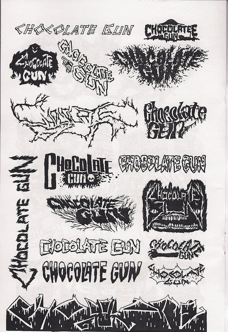
The latter is a small, 12-page solo booklet by illustrator and cartoonist DeForge, recently of the glossy comic Lose, though he's worked in magazines, newspaper broadsheets and plain white minis. He also sometimes fills whole pages with rows of fancy logos (a la Kevin Huizenga's Untitled), which is what we've got here: logos for all sorts of stuff from the world of Cold Heat, forming perhaps the very conclusion of the series' emphasis on detail.
Meanwhile, over at one of the alt comics big dogs:
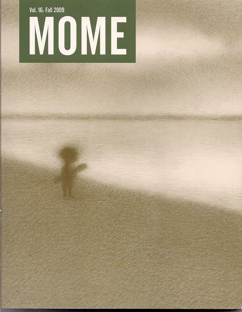
I'm really, really, really behind on MOME, the Fantagraphics house anthology, but this SPX debut edition verily brims with Renée French, Archer Prewitt, T. Edward Bak, Dash Shaw and new Fuzz & Pluck from Ted Stearn. And it includes two exclusive Cold Heat stories; maybe the assault on the mainstream proper has already begun?
Jones & Santoro handle an initial two-pager, seeing a high school goth lead a local jock to his satanic doom, but it's the second, John Vermilyea-drawn piece, catching a few quiet moments between series aliens Kandril & Mufas, that sticks with you from transposing several crucial Santoro ideas -- diamonds! labels! -- to a far rounder, illustrative approach. Maybe it's the future I'm sensing.
***
(As usual, Frank Santoro had his longboxes set up at the PictureBox table. I owned a lot of those comics. Paradax, from Brendan McCarthy. Pacific Presents, featuring the Rocketeer. Tim Vigil's Grips #1. SPX was birthed from the occasion of popular self-publishers, back in that DIY pamphlet boomlet hot past the Image Revolution. Grips was also a boom child, but of the b&w explosion, circa 1986. Call it a godfather; it belongs. A beneficiary of especial heat, but rough and gross and shoestring as all the darling minis. It's crap, but so's a lot of every generation. Frank then took issue with my review of Inglourious Basterds, which I defended in the inadvertent 'free comedy' style that's come to define my live rhetoric and select sexual encounters. Then a guy standing next to me joined in; he'd later be one of two people to ask a question at the critic's roundtable. I never got his name.)
***
Mazzucchelli Mini-Set (curated by Frank Santoro)
[purchased separately]
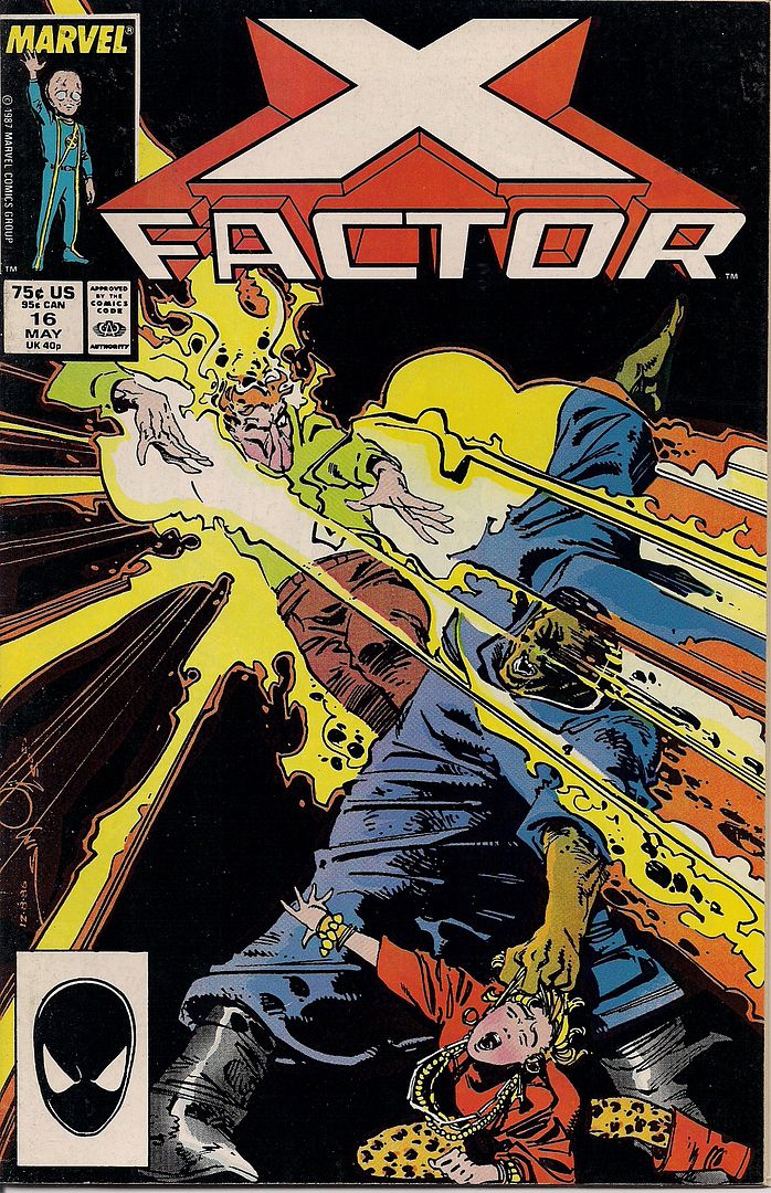
Oh no, Marvel superheroes at SPX?! With David Mazzucchelli, anything is possible. As Frank Miller remarked of him in his Afterword to the collected edition of Daredevil: Born Again, "He's talked of writing his own comics. Keep your eye out for them. I will." That was in 1987, the same year X-Factor #16 was released, possibly to piggyback on DC's then-running Batman: Year One, almost half a decade off of that promised solo showcase, Rubber Blanket.
It's a pretty typical fill-in issue, all things considered, with Mazzucchelli inked by Josef Rubinstein and colored by Petra Scotese (note the cover art by Walt Simonson, regular penciller at the time). Series writer Louise Simonson provides a ripe slice of X-Men metaphor as force field mutant and leopard print enthusiast Skids can't get over her abuse-laden home life because her powers won't let her pick up her dead mother's beloved pearls. Luckily she overcomes this trauma in time to strangle Morlocks co-founder Masque in the midst of a burden-of-guilt scheme to melt the face of firestarter Rusty, who once burned a lady's face off when he kissed her in the Mighty Marvel Manner re: Merry Mutants.
A curiosity, some nice compositions. On the other hand:
Weirdly, this 1988 issue of Marvel Fanfare (#40) had been a topic of conversation on the car ride down to the show; Tucker Stone described Mazzucchelli's 14-page cover story as proto-Rubber Blanket work, though it was written by Ann Nocenti, who's recently picked up some good notices for her story in Daredevil #500 with artist David Aja, working in homage to Mazzucchelli himself.
Truthfully, the writing isn't that much more graceful than Simonson's, though it takes pains to aim prudently above genre mechanics; it's a superhero-as-metaphor piece with the X-Men's Angel landing in the yard of a lonely old woman who takes him to be a from-the-Bible angel and learns to Live Life to the Fullest in the process. But man, set down on that glossy Fanfare paper with capable colors by David Hornung - it looks nice.
A car... that just won't leave the garage! But the heavy gloom of these panels are quickly replaced:
This sort of Renaissance pose is just that, mind you - the story's title is Chiaroscuro, but while Mazzucchelli & Hornung seem to set the bright Angel against the dark of the woman's dreary life, Nocenti's writing knowingly undercuts the Christian theme.
Angel is just a superhero, after all, and his plunge to Earth wasn't from a swarming battle with the forces of Hell itself but via Al Milgrom's & John Buscema's 1987 one-shot-of-a-series Mephisto vs. the X-Men. No sooner is Warren Worthington III on the woman's bed -- and yeah, there is an unstated sexual aspect to all this spiritual fervor -- than Our Heroine encounters a white dove, the ol' spirit standby, which she then shoos out the window, transubstantiating it into... well, a bird escaping its cage. To say nothing of an apple knocked loose by Angel's fall, another biblical icon left untouched; she returns the fruit of knowlege to the mistaken cherubim, and thus remains none the wiser.
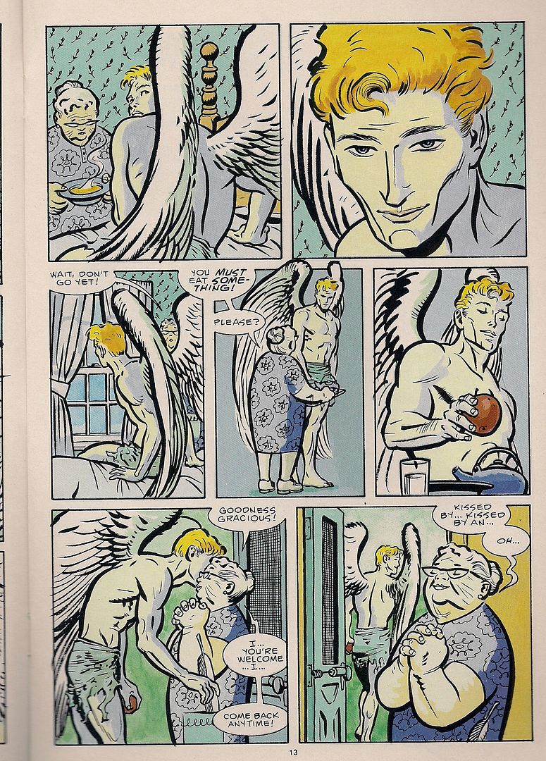
Yeah - anytime! The big joke here is that the woman's grasp of religion is just flat-out wrong, though the artists happily play to her cluelessness. It's really her that changes her own situation, not some fake people in the sky. I mean, it's Marvel: there's real people in the sky. In this way, Nocenti's script is both door-in-the-face obvious and sophisticated in its interaction with Mazzuchelli, whose style was clearly itching for more complex stuff than the mutant comics of the late '80s could typically provide. So he became unto a myth himself, at least in the longboxes.
***
(Someone asked me if I knew what happened to Dick Hyacinth. "You know he was Mark Waid, right?" I asked. Then I admitted I was lying, which doesn't feel so bad when you're not before a grand jury. I don't know what happened. In the end, it's none of the internet's business, but the nature of the place gets you thinking. It's easy to go away, especially when you don't practice my Reed Richards-level care over maintaining a distinct secret identity. Nobody has to know anything about you, and you can just stop responding at any time. Part of your liberty. This is the mote of impermanence in the online discourse. That everything could always go away, so it follows that the internet does not encourage depth, as if marked by Original Sin. Yet the space is so big, so that liberty might likewise stretch.)
***
2BY2 (Jonathan Chandler)
This is a packet of three related comics of varying size by the UK-born, Tokyo-based Chandler, published by Famicon Express but carried at the show by PictureBox; he does indeed seem sympatico with the American publisher's interests, citing Yuichi Yokoyama as revered. The work on display, however, strikes me as halfway between C.F. and Anders Nilsen circa Dogs and Water, with a dab of Richard Corben present in his delineation of muscular men and women.
The story is elliptical, divided in time between the three books and not quite straightforward within them either, with every 'panel' floating in a zone of isolating white. A man, a woman and an artificial man roam a desolate planet, although the three never meet - it's the man we stay with, as he's contrasted with his similar fake and his sexual opposite, two pairs of two. Quite minimalist, in terms of construction (some pages contain nothing but short lines of speech) and development; tenuous connections between people hang suspended. I'll look to see how the artist develops.
***
(It was getting late. I sat down for Tucker's panel on humor comics. The critics' roundtable was next. I eyed the water glasses to see if they were big enough to hide in. I liked the panel. Matt Furie got off a good line about comedy based in cruelty toward animals, that humans are animals too and cruelty to them is funny, so really animal cruelty is only the fair thing. Everyone applauded. My second favorite part was when Tucker used the phrase "party at the gangrape factory" and Emily Flake quipped "Is that a casual Friday?")
***
Buenaventura Press Comics Revival 3-Pak (various)
[purchased separately]
These were all sitting around the Buenaventura table on their own, but the Direct Market will see them as part of a daring scheme to circumvent the difficulties faced by small press pamphlets: a specially priced three-in-one comics bag, just like the ones you used to get at the supermarket. The legal indicia of one of them refers to the batch as "scary art comics," but these are frankly among the most accessible humor/fantastical books the publisher has released.
You might not recognize some of the artists, though. All I'd seen of I Want You creator Lisa Hanawalt prior to this was a strip in Arthur:
Most of the comic goes further than that. Hanawalt was also on Tucker's panel, and she told a story about a kindly old farmer type who acted as a grandfather to her when she was little. Then, years later, he started reading her work and became totally shocked with how gross and perverse it could be. And there are stories about ripping the keys from your keyboard and discovering cockroaches jerking off underneath, and tips on picking fun names for personal blemishes (anal fissure: "Jack the Ripper").
But there's also some surreal takes on 'cute' standbys, like a Top Causes of Freeway Accidents feature that somehow involves horses every time, or eerily exact illustrations of animals wearing little hats based around foodstuffs or human anatomical features. At times it reminded me of Lauren Weinstein's Vineyland comics, if a little heavier on the sexuality and deformity. Well worth a look, along with her Stay Away From Other People minicomic, which won an Ignatz Saturday night.
Not all the titles are debuts, though:
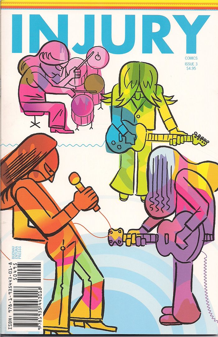
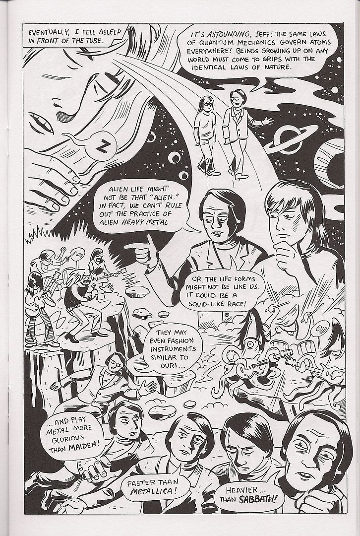
This is #3 in Ted May's Injury series, a blend of comedic superhero-flavored stories and sardonic teenage angst from the '80s that wouldn't have seemed at all out of place in the first wave of post-underground alt comics 25 years ago. I liked May's Moe the Bartender story with Sammy Harkham in last week's Treehouse of Horror #15, and the stories in here likewise highlight his knack for collaboration; only a single one-page strip is purely May's, and he particularly thrives in putting together another fine autobiographical strip with co-writer/subject Jeff Wilson, just the thing for those who like spice and fights and unashamed heavy-metal-as-rebellion in their autobio.
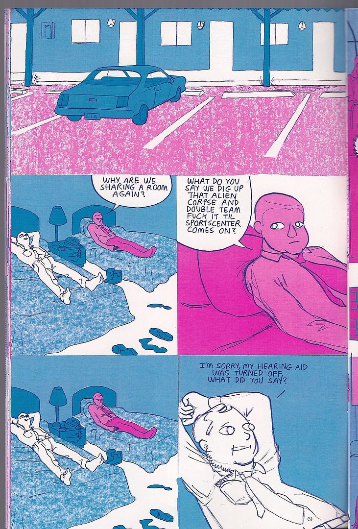
Meanwhile, The Aviatrix #1 is the first work I've seen by creator Eric Haven, although his small press work dates back to the '90s, and his three-issue Tales To Demolish series with Sparkplug seems well-regarded.
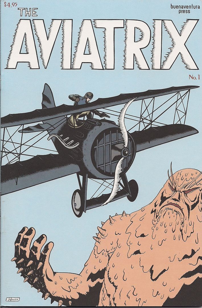
From what I can gather, this book seems to be a continuation of Tales' style, mixing absurd, dark comedy (often starring similarly dumpy male characters) with passages of wry comic book hero fantasy, rendered in smooth lines. The best of the short stories in here is also the best blend of these styles, seeing Our Man romancing a miniature woman in a spicy sci-fi magazine costume, only to ask to use her toilet and accidentally knock her own with the fumes. This segues with endearing ease into an action-packed car chase in which we're reminded in nearly every panel that the frustrated her is wearing a tie, and therefore can accomplish anything.
I think that, the promise of a Kirby-esque muck monster called Melgor and the following image will provide sufficient guidance on whether to proceed. I would.
***
(The critics' roundtable went pretty well, in that I didn't die like a dog or try to get a laugh by rolling off my chair and then making a break for the exit. The size of the panel, seven people, all but assured we'd be chasing a few topics at most. Listen to it here. I'd like to see a new kind of panel next year, maybe Gary Groth and a more active, self-aware blogger than myself hashing out the past and present. As it stood, Groth functioned essentially as co-mod after the first five minutes by his displacement from the rest of the panel, all of whom I suspect were within eight years of one another's ages. As Johanna Draper Carlson later remarked, we were also all white, all male, all heterosexual. But I wondered about cultural differences all the same. Internet culture, since writing on the internet was so much of the content.)
***
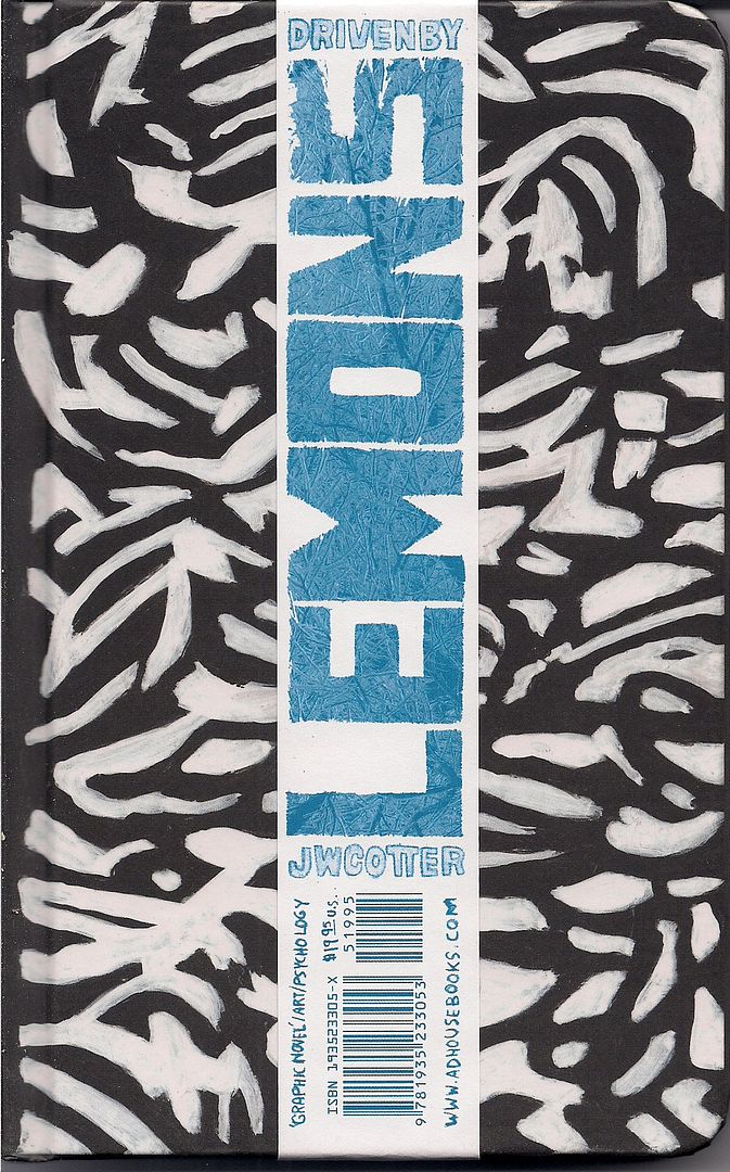
Driven by Lemons (Joshua W. Cotter)
I never got to use one of my prepared jokes on the critics' panel, in case Bill Kartalopoulos asked where Tucker and I got the idea to do an 18-part series on the DC/Humanoids publishing alliance and every last book to come out of it. I'd reply: "undiagnosed mental illness," and then everyone would laugh and I'd finally be married. Later on someone told me they'd met an exhibitor that actually did suffer from mental illness, so maybe the joke wouldn't have gone over so well. Then I showed them this new AdHouse release, and they said "speaking of mental illness..."
Cotter, as you know, is the well-regarded artist behind the lauded Skyscrapers of the Midwest. Those inclined toward pop music analogies may be tempted to call this 'the difficult second album,' although it was also the closest thing I saw to a buzz book of the show. It's kind of astonishing, suggesting comparisons to Anders Nilsen's The End and Gary Panter's Jimbo: Adventures in Paradise, the former an excellent comic and the latter one of my all-time favorites. Others might suggest different Nilsen books, Monologues for the Coming Plague and Monologues for Calculating the Density of Black Holes, his personal philosophical musings in improvised comics form, lettering errors crossed out and left on the page and everything.
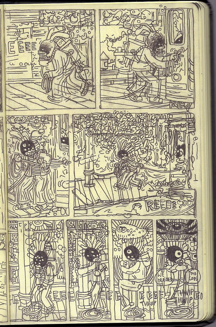
You won't get any of that here, though. Cotter did complete this book without going back and changing anything, letting a story suggest itself as he went along, but he mostly emphasizes that aspect of the work through format. The book itself is a reproduction of the Moleskine notebook the art was composed it, 104 pages with decorated inside covers. If you look close at the title band in the cover image, you'll see he's placed scare quotes around 'graphic novel.' The legal incicia cheerfully insists you're reading a 7th printing of the work, from 1979, while the copyright belongs to '73, with God as the author.
All of these things serve to emphasize the personal, hand-made nature of the work, maybe because Cotter's drawing remains startlingly polished and complete, despite the sketchbook origins of the stuff, even when the drawings are loosened up by choice. That's fine, since Cotter does have a firm grasp on a wide variety of styles, and it's the precision with which those styles are presented -- and the artist's careful toying with pace and structure -- that gives the book its weird power. Like Adventures in Paradise, it seems restless, totally willing to rush the enormity of the form, but Cotter also inserts a table of contents breaking the book up into movements. There's even two pages of an all-text "key" up front, to tease you with the possibility of getting it all to make sense.
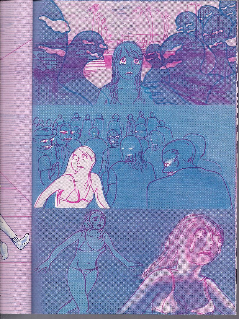
You're unlikely to pull that off, but Driven by Lemons is not so hard a book to understand. Broadly, it's about a lil' rabbit guy who suffers a metaphoric trauma (depicted as a truck plunging into a city in a bit titled Skyscrapers of the Midwest II), who then explores occasionally windy spiritual-psychological avenues, until he finds a way to live, which does take bits out of himself, literally redacting parts of his dialogue. But mighty Dionysis exists outside his story -- literally, in that he's spotted smashing out of the book prior to the title page -- and quotes The Touch while soaring out of reach.
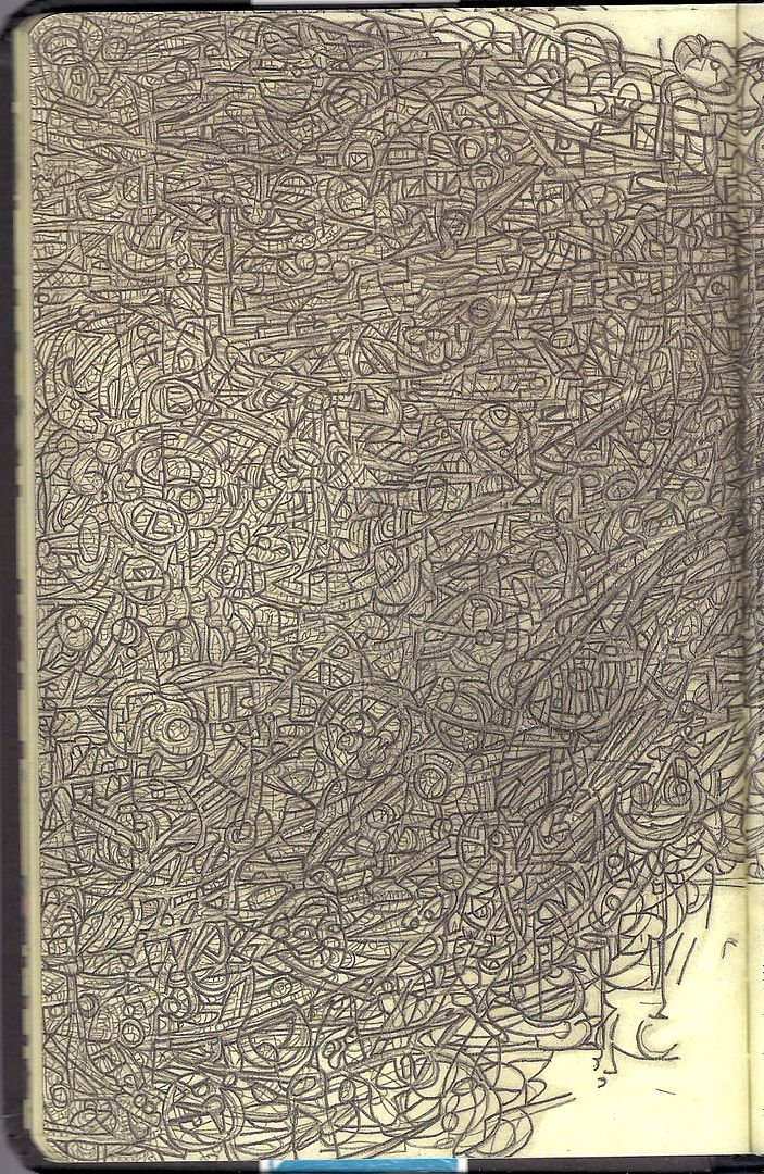
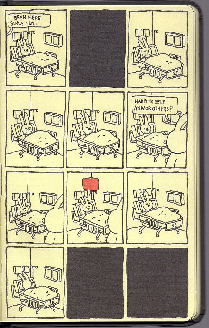
That's a very, very, very, very simple way of putting it, as you can no doubt tell from the last few images. Much of the book's effect is in watch Cotter control the page, orchestrating a bit in a hospital bed as a dance between all-black bouts of unconsciousness, studying the movements of rabbits chasing and wrestling, or observing symbolic mutations, iconic but animated. And like The End, recurrence is mighty.
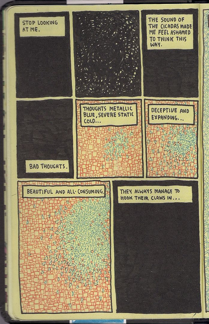
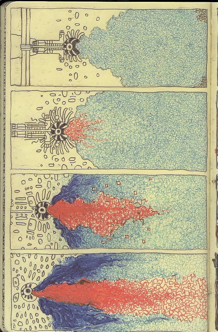
Take this page. Look at it. We're told what it means: blue triangles, bad, beautiful thoughts invading the red squares. As with nearly everything in the book, this continues for several pages, like bits of music. Then:
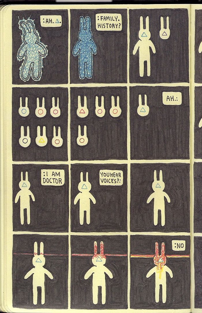
This is later, but the blue triangle returns. The reader might understand this as similarly representative of mental distress, as the dialogue indicates. It's also played out with gradations of color shapes and heads. The red beam, meanwhile, has its own identity, already established, and the yellow leak in the final panel is foreshadowing, eventually becoming a facilitator of growth, when the patient is ready for it.
It's not a puzzle book or anything; you can't cobble together an answer key and solve it. But Cotter's composure as an artist encourages this layering of visual metaphor, which does seem to rule the book's world and at least carries it across the thicker dialogue-based worrying and conversation, a little of which goes frankly a long way. If Cold Heat turbo-charges the stuff of genre as ever-shifting, emphatic, this book sees existence as series of diverse orders, with some order ruling above them all.
It's made simple in this dichotomy: the pulsing techno-organic mass of higher responses pulled away from the car driving on solid ground. One cannot really obtain the other. There's your lemons. I look forward to more writing on this stunning/rambling, fecund work.
***
(In the beginning, the forums encouraged more discussion, more community, everyone on the level. Many of the early blogs were diaristic, fusing analysis with day-to-day personality. Today we are harder. Comics sites look professional, bloggers group their efforts. Review sites review, chit-chat is for Twitter, or a 'personal' site on the side. Is this the resistance to impermanence, our inoculation against the dispersal of idle conversation into a void of supple, unwanted recall? If the comics internet used to be a village, where everyone sort of knew each other even if they didn't want to, and now it's a city with buildings and neighborhoods to stay in, are we prone to the same enclave mentality you read about politically, where everybody knows who their friends are, and they know what facts are, and soon enough we know which Apostle hid Barack Obama's birth certificate from Rann after he rode down on the Zeta Beam. Aesthetically. Or is that just specialization? Just magazines all over again? Wide? Forever and ever ever?)
***
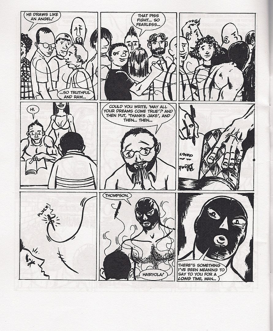
Men Called Him... Hairyola (Tom Batten & Patrick Godfrey)
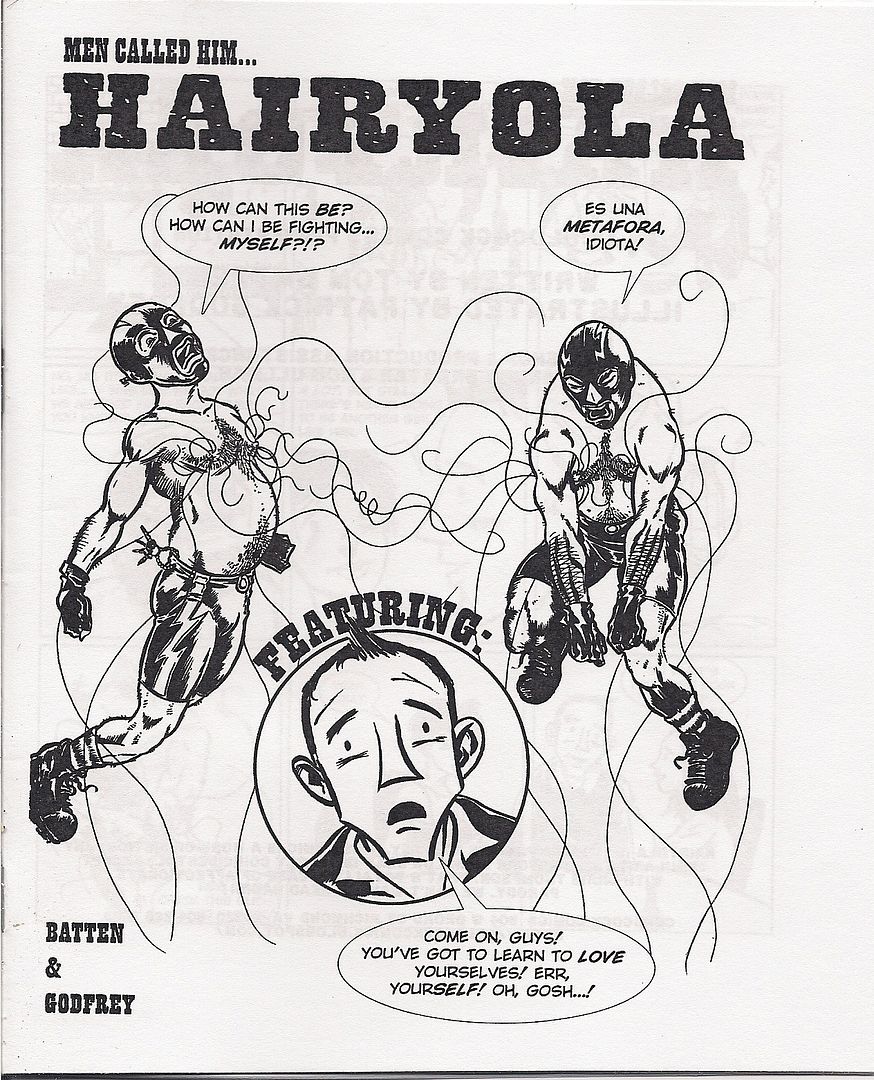
David Welsh personally directed me to this old-school stapled white paper minicomic, dubbing it "evil." The creators -- of the retailer Velocity Comics in Richmond, VA -- call it "an affectionate parody." It's the tragicomic saga of Hairyola, childhood BFF to Blankets author Craig Thompson, but while Craig gets all the girls Hairyola is stuck with a luchadore mask and nipple hairs that are sentient like the Venom symbiote. Desperate for validation, Our Hero crafts a heartbreaking graphic novel opus, How Smooth My Pony, How Broken My Heart, but it's recieved cooly by the Comic-Con audience; everything climaxes in a deadly showdown between old friends on the con floor.
It's the kind of thing I hope to find at every small press con: a short, cheap funnybook put together on what seems like a total lark (or as much of a lark as drawing a 16-page comic can realistically be). They are of the primordial gunk, and part of the soul of the show... thanks, David!
***
(Time was short. The damn thing closed in two hours and I hadn't even made a full circle around the show floor. I liked meeting people. Sean Witzke, Sandy Bilus, Marc Singer. I finally met Peter, my editor at comiXology, in person. To anyone who came up to me during the show to tell me they liked this site, that means so fucking much to me, thank you. Slowly, I made my way around, though the crowd, bigger than last year. Obviously so.)
***
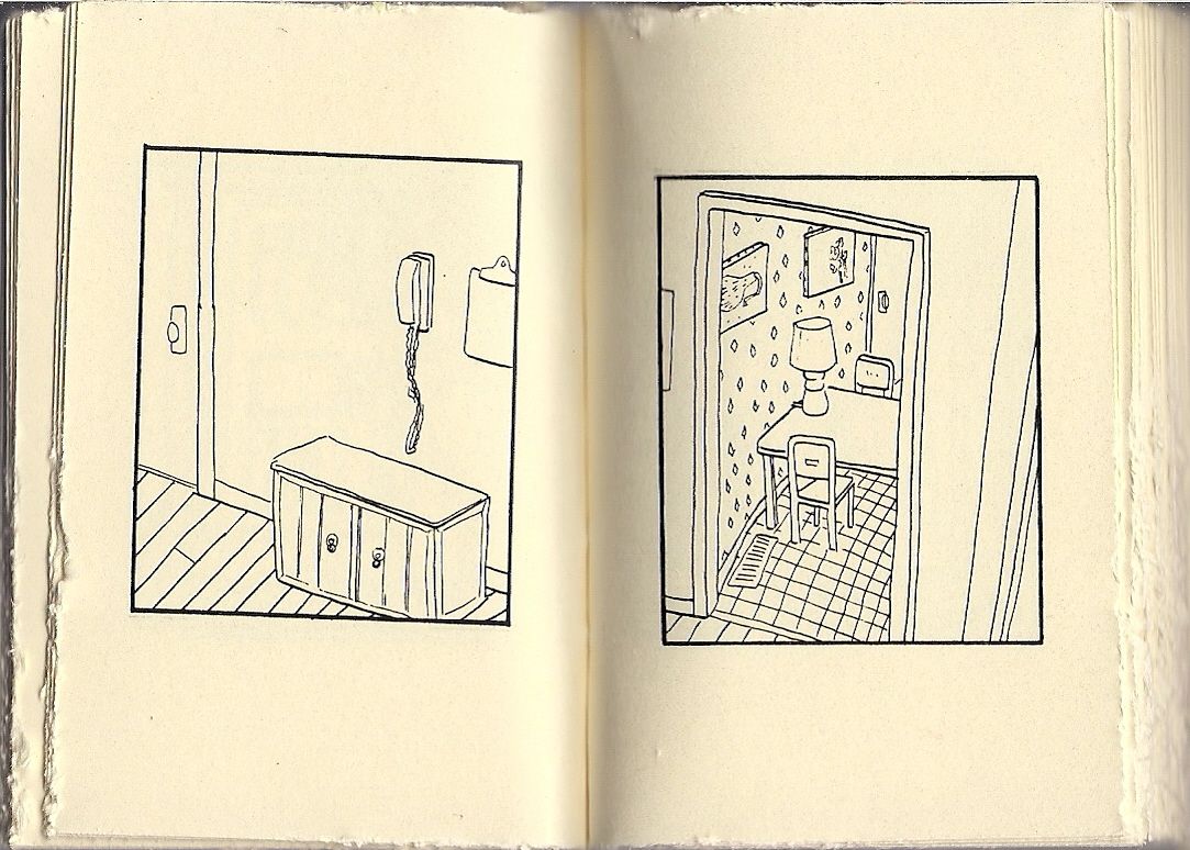
Archaeology (James McShane)
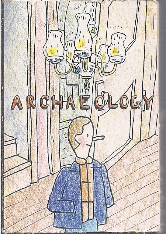
And sometimes format just wins you over. Be aware that the above cover image is a good deal larger than this 80-page package, actually about the size of a pack of cigarettes. McShane -- a Kramers Ergot contributor -- limits himself to very few words and only one panel per thick, rough-cut page, mixing and matching natural scenes, homey still life and fleeting romance with a man's effort to pack up the things in a home. A few striking juxtapositions result, to poetic and obscure effect. More obscure than poetic for me, but it's hard to blame a really mini-minicomic for trying on a spine and opining at (and from) length.
***
(The curtain was drawn as we prepared to leave. Literally, although it was drawn across a segment of the hallway outside the show room. I thought it might be another beauty pageant event, but I found out that wasn't until Sunday. They'd be selling tanning oil and everything, and I needed to bronze up for the apple harvest festival the next weekend. It was just the ministry thing again, all fancy and gala, enough so that merely beholding it would strike a comics reader mad. They were think of us, really. It was time to eat. I looked into my bag of books, and there were so many things I could probably have gotten elsewhere, but that's almost everything on the internet, and soon the internet will be the main forum anyway. And I wanted Jerry Moriarty to sign my The Complete Jack Survives. I bought almost everything before circling the room too. It was raining outside, and when I looked up I saw the face of Tom Spurgeon in the clouds, and a single tear ran down his cheek.)
***
Ganges #3 (Kevin Huizenga)
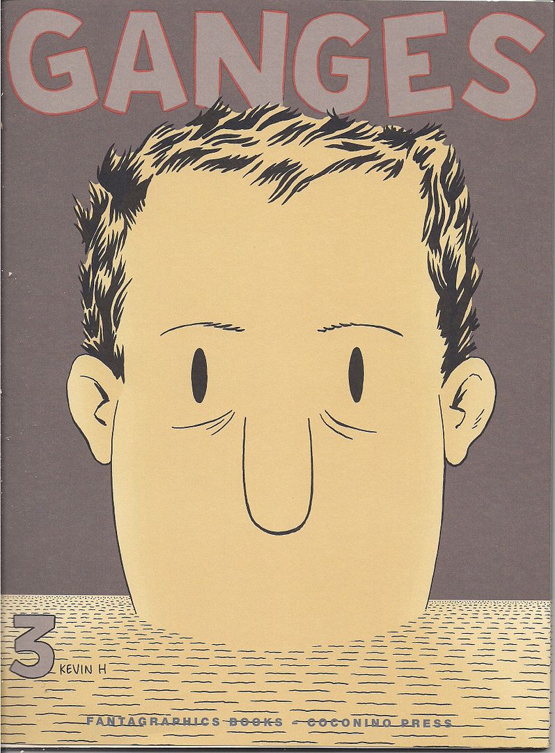
Continuing Huizenga's definitive internal landscape study of his signature character, Glenn Ganges; those giant heads aren't gracing every cover for nothing. And I think the series' many, many digressions into variations on Glenn's mental processes -- thought balloons, curt location shifts, charts & graphs, a surreal video-game-as-it's-played fantasy, a long office job flashback with omniscient narration -- have gone a ways toward masking how simple the project really is. Not 24 hours have passed since issue #1 began. Indeed, Glenn is still trying to get some sleep for most of this chapter.
But that's the rub; moreso than any continuing comic I can think of, Ganges places maximum emphasis on how events don't matter so much in a life as how they're processed, by means ranging from simple moment-to-moment experience to fleeting reflections on whole segments of a guy's youth gone by.
The series has also been functioning as a sort of grand concordance of Huizenga's formal ideas, so that the style of, say, Fight Or Run exists as part of Glenn's everyday living experience (i.e. how he processes an odd foreign computer game he likes to play), thus presenting the artist's total body of work as a massive construct primed to represent the invisible stuff of basic human function, a whopping map to the smallest, most crucial spaces of a person.
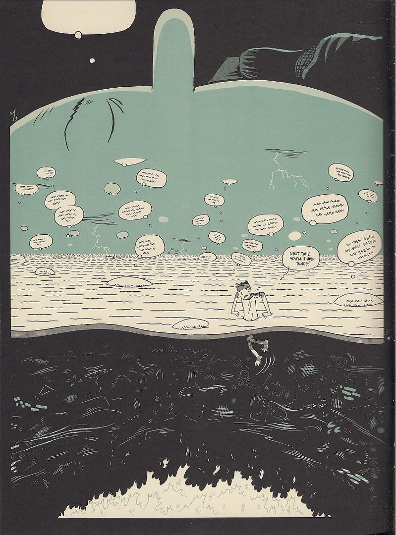
This issue introduces the helium word balloons from Kramers Ergot 7 into the action, as Glenn spends a solid 3/4 of the issue laying in bed, letting his mind wander, literally, in the form of a ghost version of himself that warps from place to place, sometimes crawling into the black holes that are Glenn's Floyd Gottfredson ink pool eyes to plunge down through a rightly mythical labyrinth of the self, stray notions bobbing like jellyfish.
Literalization of funnybook iconography powers the book's wit -- I mean, word balloons that literally float, ok? -- but it's how Huizenga builds on these ideas that matters, stacking images of thought streams and leaping licks of heartburn and disembodied heads with eyes closed to convey the enormity of a night passing, of conscious thought retreating, like a terrible shift in life itself.
That's the great poignancy to this emphasis of parts over the whole: its center is the title character's anxiety over the chaos of nature, of the unexpected. "Something awful always happens!" he declares in issue #1, playfully, but he means it more than he thinks. Huizenga's depiction of every metaphysical inch of him embodies this fear, that of merely standing in the presence of something very large. Near the end, panic overtakes Glenn as he approaches sleep and its accordant loss of control; it's real, relatable.
And then, naturally, Huizenga contrasts it with a comedic second story in which Glenn gets out of bed and tries to do work without waking up his wife. It's plain grids (mostly), slapstick and traditional dream sequences - an external comic book perspective to place the character's funny humanity in sharper relief, now that we've seen so much inside him. Totally assured work, supremely technical so as to address the personal. Kevin Huizenga is this reading generation's Chris Ware, and his work cannot be ignored.
***
(My life is choked with comics, but they hardly touch my living. It's rare that I mention a comic to anyone on a given day. My mother was in New York City the other weekend and she saw a guy on the street selling Marvel Annuals out of a crate and she thought of me and bought one, and I think she thinks that's all comics are. NYC is a long train ride from where I'm living, like the black grass and nothing between me and SPX. We stopped at a gas station going home. It didn't meet with universal acclaim. "There's no coffee in there!" Tucker shouted, "there's a coffee sign but no coffee! Can they do that?" I told him I saw Starbucks iced coffee, and he shook his head. "There's steam coming out of that thing. Steam!" I looked up. I thought I'd have a fantasy scene for my con report, like something with Sesame Street and firearms, but I couldn't think of anything. This wasn't MoCCA. There was no long wander, not hardly any time alone in my head, I was talking, seeing people. I was talking. I was talking to people. Like enough for one year. I smiled.)
***
(A fanfare sounded as Chris Mautner exited the men's room. Song filled the air while we walked, booming as we passed the long line for admission to the Small Press eXpo. A woman's high voice raised and maintained the connotation of praise, divine, though I did not need words to know. It was a ministry event in the adjoining room to the con floor, which itself was in a different room than the year before, not that the rows of tables don't impress the mad market character of an American indie show onto any damn space in the Marriott region. I nonetheless accepted the music as a convocation, a prayer to some god of funnies and monies. I'm here in my suit, wearing my bag, and I'm ready to buy.)
***
Cold Heat #7/8 (of 10) (Ben Jones & Frank Santoro), Cold Heat Special #7 (Michael DeForge), MOME Vol. 16 (various)
Why yes, this is the cover of the new Cold Heat. Or, half of a wraparound. Title's on the back.
For a project that started out infamous for getting rejected for Direct Market distribution, Jones' & Santoro's creation has proven remarkably expansive; there were no less than four Cold Heat items debuting at the show, and the sky looks to remain the limit. Indeed, at Saturday's new action panel, Santoro expressed interest in working with a more 'mainstream' artist and pitching a reoriented incarnation of the story to Image, and it says something that I can't come up with any other comic at the entire show that could possibly support such a plan. But Cold Heat abides.
For now, the big release is issue #7/8 of the 'main' series, another slick, 48-page press-run-of-100 pamphlet priced at $20.00, 'cause that's what it takes. Oblivious to her incredible powers and unable to remember what the hell happened last issue(s), girl hero Castle fools around with a BBC correspondent/music critic and stows away to Brazil, where the demonic Derck-Johnson pharmaceutical corporation launches the next phase of its scheme. Meanwhile, hapless rocker Joel Cannon is at the mercy of a bloated supervillain in Space Channel 5 boots who injects drugs into his penis and rolls through probably the best one-page party scene of 2009.
The whole issue's a bit like that - short sequences and funny lines gradually building toward an upcoming climax, which is plain enough for a fantasy-action series like this, except that Santoro has already stated that generic-structural conventions are not to be trusted (from the above link: "My comic is a big Maguffin, though. It's a big joke. There's really no fighting in my comic, so much. It's all this eerie set-up and I'm trying to trick you that there's going to be some big lightsaber fight at some point, but there really never is."). The true focus, as always, is on the Cold and the Heat, the reds (or so) and blues (thereabouts) that touch everything.
Granted, there actually was some fighting last issue -- or, specifically, in the '6' half of #5/6 -- with an added layer of combat provided by Santoro's juxtaposition of slashing lines and diamond patterns against his forever-in-flux character art, the powerfully inhuman (plus-human, divine) invading the chaotic world of humanity.
This issue sees chaos take control, with an often barely-dressed (if at all) Castle sneaking and fleeing and crying and running through shifting lines and (especially) textures, with Santoro's coloring becoming flat when characters are scared and richly bodied with intimacy, all the better to showcase some eventual invader depicted facially in slashes of crayon over a blank circle outline. In this way, it makes sense that Santoro heads up the project's many corollary comics; the unironic "joke" that is the Cold Heat plot ultimately draws power from being so on the nose about youth comics anxieties, but that power is only conducted through Santoro's art of sensation.
'Sensation' is a good term to guide you with the Cold Heat minicomics too. They'd gotten a bit ahead of themselves lately, with some assigned artists moving quicker than others, so SPX saw some catching up via Cold Heat Special #6 and #7, the former of which didn't even make it to the show until Sunday, so I couldn't get one.
The latter is a small, 12-page solo booklet by illustrator and cartoonist DeForge, recently of the glossy comic Lose, though he's worked in magazines, newspaper broadsheets and plain white minis. He also sometimes fills whole pages with rows of fancy logos (a la Kevin Huizenga's Untitled), which is what we've got here: logos for all sorts of stuff from the world of Cold Heat, forming perhaps the very conclusion of the series' emphasis on detail.
Meanwhile, over at one of the alt comics big dogs:
I'm really, really, really behind on MOME, the Fantagraphics house anthology, but this SPX debut edition verily brims with Renée French, Archer Prewitt, T. Edward Bak, Dash Shaw and new Fuzz & Pluck from Ted Stearn. And it includes two exclusive Cold Heat stories; maybe the assault on the mainstream proper has already begun?
Jones & Santoro handle an initial two-pager, seeing a high school goth lead a local jock to his satanic doom, but it's the second, John Vermilyea-drawn piece, catching a few quiet moments between series aliens Kandril & Mufas, that sticks with you from transposing several crucial Santoro ideas -- diamonds! labels! -- to a far rounder, illustrative approach. Maybe it's the future I'm sensing.
***
(As usual, Frank Santoro had his longboxes set up at the PictureBox table. I owned a lot of those comics. Paradax, from Brendan McCarthy. Pacific Presents, featuring the Rocketeer. Tim Vigil's Grips #1. SPX was birthed from the occasion of popular self-publishers, back in that DIY pamphlet boomlet hot past the Image Revolution. Grips was also a boom child, but of the b&w explosion, circa 1986. Call it a godfather; it belongs. A beneficiary of especial heat, but rough and gross and shoestring as all the darling minis. It's crap, but so's a lot of every generation. Frank then took issue with my review of Inglourious Basterds, which I defended in the inadvertent 'free comedy' style that's come to define my live rhetoric and select sexual encounters. Then a guy standing next to me joined in; he'd later be one of two people to ask a question at the critic's roundtable. I never got his name.)
***
Mazzucchelli Mini-Set (curated by Frank Santoro)
[purchased separately]
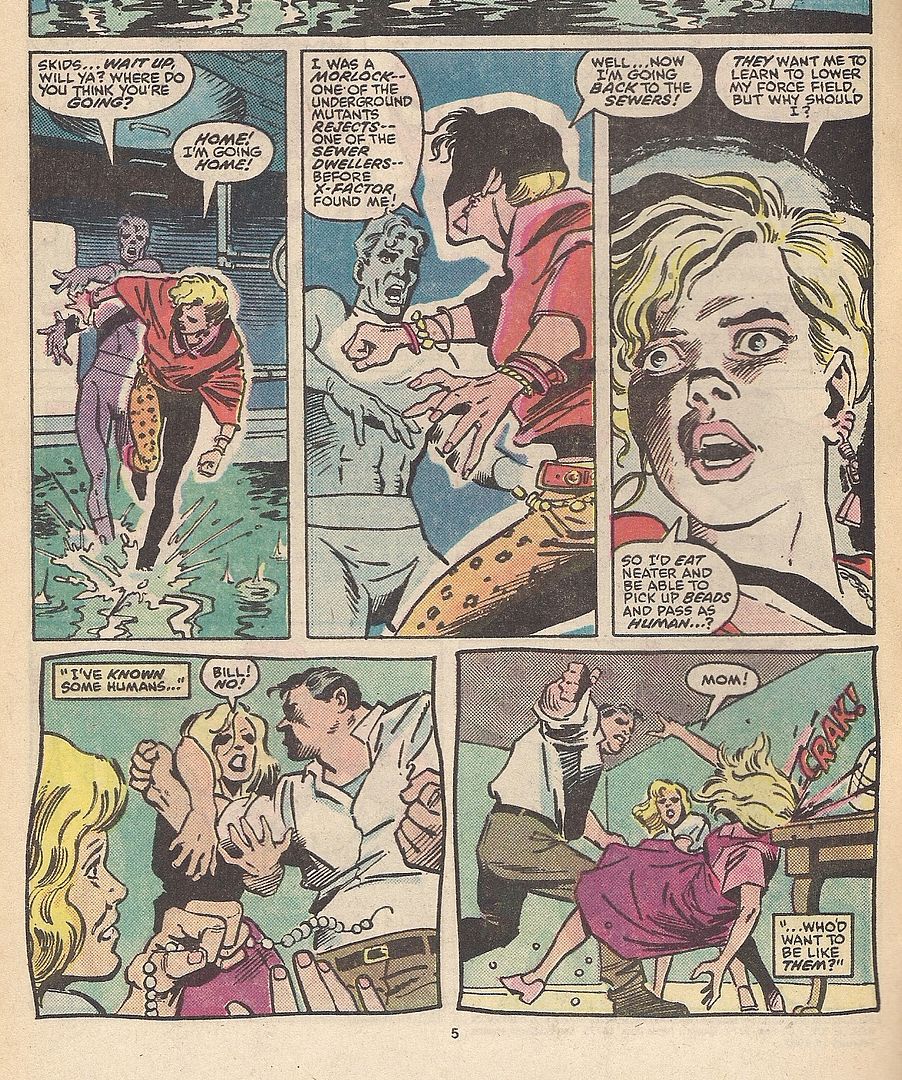
Oh no, Marvel superheroes at SPX?! With David Mazzucchelli, anything is possible. As Frank Miller remarked of him in his Afterword to the collected edition of Daredevil: Born Again, "He's talked of writing his own comics. Keep your eye out for them. I will." That was in 1987, the same year X-Factor #16 was released, possibly to piggyback on DC's then-running Batman: Year One, almost half a decade off of that promised solo showcase, Rubber Blanket.
It's a pretty typical fill-in issue, all things considered, with Mazzucchelli inked by Josef Rubinstein and colored by Petra Scotese (note the cover art by Walt Simonson, regular penciller at the time). Series writer Louise Simonson provides a ripe slice of X-Men metaphor as force field mutant and leopard print enthusiast Skids can't get over her abuse-laden home life because her powers won't let her pick up her dead mother's beloved pearls. Luckily she overcomes this trauma in time to strangle Morlocks co-founder Masque in the midst of a burden-of-guilt scheme to melt the face of firestarter Rusty, who once burned a lady's face off when he kissed her in the Mighty Marvel Manner re: Merry Mutants.
A curiosity, some nice compositions. On the other hand:
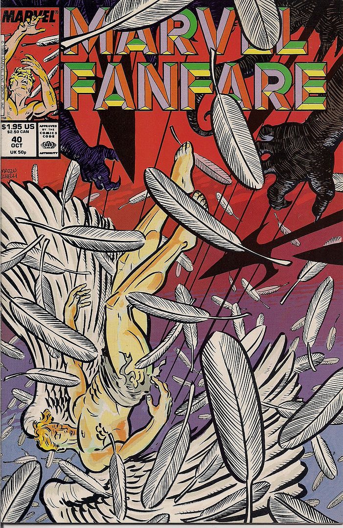
Weirdly, this 1988 issue of Marvel Fanfare (#40) had been a topic of conversation on the car ride down to the show; Tucker Stone described Mazzucchelli's 14-page cover story as proto-Rubber Blanket work, though it was written by Ann Nocenti, who's recently picked up some good notices for her story in Daredevil #500 with artist David Aja, working in homage to Mazzucchelli himself.
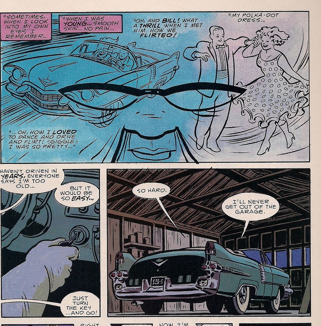
Truthfully, the writing isn't that much more graceful than Simonson's, though it takes pains to aim prudently above genre mechanics; it's a superhero-as-metaphor piece with the X-Men's Angel landing in the yard of a lonely old woman who takes him to be a from-the-Bible angel and learns to Live Life to the Fullest in the process. But man, set down on that glossy Fanfare paper with capable colors by David Hornung - it looks nice.
A car... that just won't leave the garage! But the heavy gloom of these panels are quickly replaced:
This sort of Renaissance pose is just that, mind you - the story's title is Chiaroscuro, but while Mazzucchelli & Hornung seem to set the bright Angel against the dark of the woman's dreary life, Nocenti's writing knowingly undercuts the Christian theme.
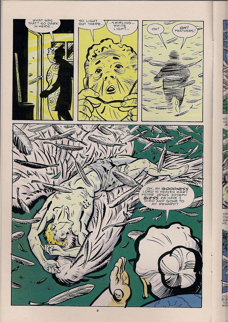
Angel is just a superhero, after all, and his plunge to Earth wasn't from a swarming battle with the forces of Hell itself but via Al Milgrom's & John Buscema's 1987 one-shot-of-a-series Mephisto vs. the X-Men. No sooner is Warren Worthington III on the woman's bed -- and yeah, there is an unstated sexual aspect to all this spiritual fervor -- than Our Heroine encounters a white dove, the ol' spirit standby, which she then shoos out the window, transubstantiating it into... well, a bird escaping its cage. To say nothing of an apple knocked loose by Angel's fall, another biblical icon left untouched; she returns the fruit of knowlege to the mistaken cherubim, and thus remains none the wiser.
Yeah - anytime! The big joke here is that the woman's grasp of religion is just flat-out wrong, though the artists happily play to her cluelessness. It's really her that changes her own situation, not some fake people in the sky. I mean, it's Marvel: there's real people in the sky. In this way, Nocenti's script is both door-in-the-face obvious and sophisticated in its interaction with Mazzuchelli, whose style was clearly itching for more complex stuff than the mutant comics of the late '80s could typically provide. So he became unto a myth himself, at least in the longboxes.
***
(Someone asked me if I knew what happened to Dick Hyacinth. "You know he was Mark Waid, right?" I asked. Then I admitted I was lying, which doesn't feel so bad when you're not before a grand jury. I don't know what happened. In the end, it's none of the internet's business, but the nature of the place gets you thinking. It's easy to go away, especially when you don't practice my Reed Richards-level care over maintaining a distinct secret identity. Nobody has to know anything about you, and you can just stop responding at any time. Part of your liberty. This is the mote of impermanence in the online discourse. That everything could always go away, so it follows that the internet does not encourage depth, as if marked by Original Sin. Yet the space is so big, so that liberty might likewise stretch.)
***
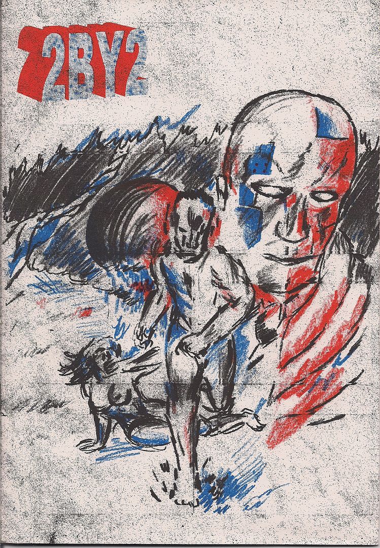
2BY2 (Jonathan Chandler)
This is a packet of three related comics of varying size by the UK-born, Tokyo-based Chandler, published by Famicon Express but carried at the show by PictureBox; he does indeed seem sympatico with the American publisher's interests, citing Yuichi Yokoyama as revered. The work on display, however, strikes me as halfway between C.F. and Anders Nilsen circa Dogs and Water, with a dab of Richard Corben present in his delineation of muscular men and women.
The story is elliptical, divided in time between the three books and not quite straightforward within them either, with every 'panel' floating in a zone of isolating white. A man, a woman and an artificial man roam a desolate planet, although the three never meet - it's the man we stay with, as he's contrasted with his similar fake and his sexual opposite, two pairs of two. Quite minimalist, in terms of construction (some pages contain nothing but short lines of speech) and development; tenuous connections between people hang suspended. I'll look to see how the artist develops.
***
(It was getting late. I sat down for Tucker's panel on humor comics. The critics' roundtable was next. I eyed the water glasses to see if they were big enough to hide in. I liked the panel. Matt Furie got off a good line about comedy based in cruelty toward animals, that humans are animals too and cruelty to them is funny, so really animal cruelty is only the fair thing. Everyone applauded. My second favorite part was when Tucker used the phrase "party at the gangrape factory" and Emily Flake quipped "Is that a casual Friday?")
***
Buenaventura Press Comics Revival 3-Pak (various)
[purchased separately]
These were all sitting around the Buenaventura table on their own, but the Direct Market will see them as part of a daring scheme to circumvent the difficulties faced by small press pamphlets: a specially priced three-in-one comics bag, just like the ones you used to get at the supermarket. The legal indicia of one of them refers to the batch as "scary art comics," but these are frankly among the most accessible humor/fantastical books the publisher has released.
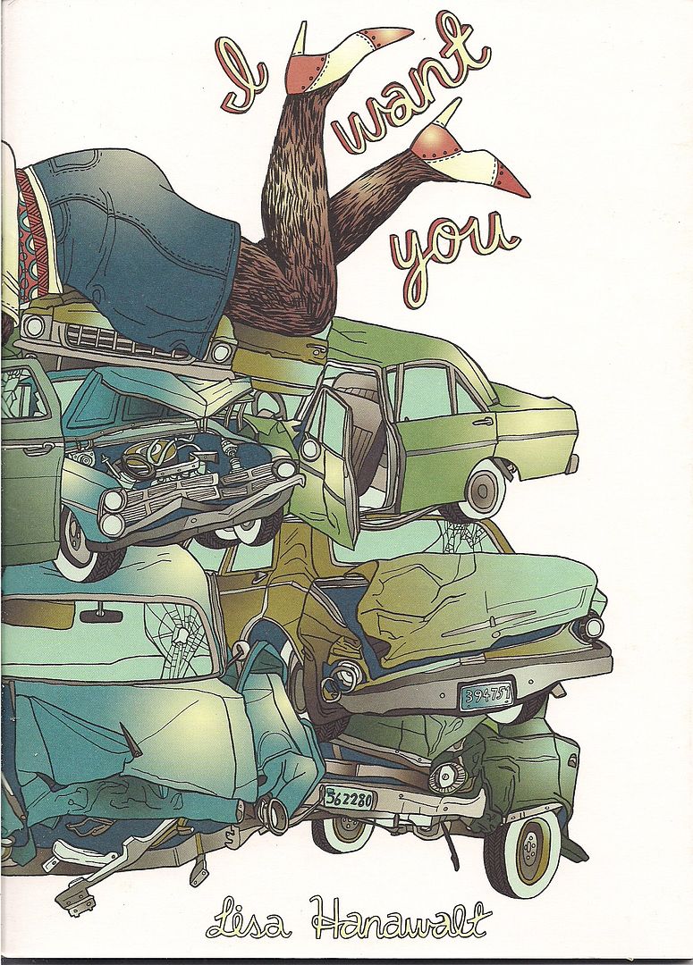
You might not recognize some of the artists, though. All I'd seen of I Want You creator Lisa Hanawalt prior to this was a strip in Arthur:
Most of the comic goes further than that. Hanawalt was also on Tucker's panel, and she told a story about a kindly old farmer type who acted as a grandfather to her when she was little. Then, years later, he started reading her work and became totally shocked with how gross and perverse it could be. And there are stories about ripping the keys from your keyboard and discovering cockroaches jerking off underneath, and tips on picking fun names for personal blemishes (anal fissure: "Jack the Ripper").
But there's also some surreal takes on 'cute' standbys, like a Top Causes of Freeway Accidents feature that somehow involves horses every time, or eerily exact illustrations of animals wearing little hats based around foodstuffs or human anatomical features. At times it reminded me of Lauren Weinstein's Vineyland comics, if a little heavier on the sexuality and deformity. Well worth a look, along with her Stay Away From Other People minicomic, which won an Ignatz Saturday night.
Not all the titles are debuts, though:
This is #3 in Ted May's Injury series, a blend of comedic superhero-flavored stories and sardonic teenage angst from the '80s that wouldn't have seemed at all out of place in the first wave of post-underground alt comics 25 years ago. I liked May's Moe the Bartender story with Sammy Harkham in last week's Treehouse of Horror #15, and the stories in here likewise highlight his knack for collaboration; only a single one-page strip is purely May's, and he particularly thrives in putting together another fine autobiographical strip with co-writer/subject Jeff Wilson, just the thing for those who like spice and fights and unashamed heavy-metal-as-rebellion in their autobio.
Meanwhile, The Aviatrix #1 is the first work I've seen by creator Eric Haven, although his small press work dates back to the '90s, and his three-issue Tales To Demolish series with Sparkplug seems well-regarded.
From what I can gather, this book seems to be a continuation of Tales' style, mixing absurd, dark comedy (often starring similarly dumpy male characters) with passages of wry comic book hero fantasy, rendered in smooth lines. The best of the short stories in here is also the best blend of these styles, seeing Our Man romancing a miniature woman in a spicy sci-fi magazine costume, only to ask to use her toilet and accidentally knock her own with the fumes. This segues with endearing ease into an action-packed car chase in which we're reminded in nearly every panel that the frustrated her is wearing a tie, and therefore can accomplish anything.
I think that, the promise of a Kirby-esque muck monster called Melgor and the following image will provide sufficient guidance on whether to proceed. I would.
***
(The critics' roundtable went pretty well, in that I didn't die like a dog or try to get a laugh by rolling off my chair and then making a break for the exit. The size of the panel, seven people, all but assured we'd be chasing a few topics at most. Listen to it here. I'd like to see a new kind of panel next year, maybe Gary Groth and a more active, self-aware blogger than myself hashing out the past and present. As it stood, Groth functioned essentially as co-mod after the first five minutes by his displacement from the rest of the panel, all of whom I suspect were within eight years of one another's ages. As Johanna Draper Carlson later remarked, we were also all white, all male, all heterosexual. But I wondered about cultural differences all the same. Internet culture, since writing on the internet was so much of the content.)
***
Driven by Lemons (Joshua W. Cotter)
I never got to use one of my prepared jokes on the critics' panel, in case Bill Kartalopoulos asked where Tucker and I got the idea to do an 18-part series on the DC/Humanoids publishing alliance and every last book to come out of it. I'd reply: "undiagnosed mental illness," and then everyone would laugh and I'd finally be married. Later on someone told me they'd met an exhibitor that actually did suffer from mental illness, so maybe the joke wouldn't have gone over so well. Then I showed them this new AdHouse release, and they said "speaking of mental illness..."
Cotter, as you know, is the well-regarded artist behind the lauded Skyscrapers of the Midwest. Those inclined toward pop music analogies may be tempted to call this 'the difficult second album,' although it was also the closest thing I saw to a buzz book of the show. It's kind of astonishing, suggesting comparisons to Anders Nilsen's The End and Gary Panter's Jimbo: Adventures in Paradise, the former an excellent comic and the latter one of my all-time favorites. Others might suggest different Nilsen books, Monologues for the Coming Plague and Monologues for Calculating the Density of Black Holes, his personal philosophical musings in improvised comics form, lettering errors crossed out and left on the page and everything.
You won't get any of that here, though. Cotter did complete this book without going back and changing anything, letting a story suggest itself as he went along, but he mostly emphasizes that aspect of the work through format. The book itself is a reproduction of the Moleskine notebook the art was composed it, 104 pages with decorated inside covers. If you look close at the title band in the cover image, you'll see he's placed scare quotes around 'graphic novel.' The legal incicia cheerfully insists you're reading a 7th printing of the work, from 1979, while the copyright belongs to '73, with God as the author.
All of these things serve to emphasize the personal, hand-made nature of the work, maybe because Cotter's drawing remains startlingly polished and complete, despite the sketchbook origins of the stuff, even when the drawings are loosened up by choice. That's fine, since Cotter does have a firm grasp on a wide variety of styles, and it's the precision with which those styles are presented -- and the artist's careful toying with pace and structure -- that gives the book its weird power. Like Adventures in Paradise, it seems restless, totally willing to rush the enormity of the form, but Cotter also inserts a table of contents breaking the book up into movements. There's even two pages of an all-text "key" up front, to tease you with the possibility of getting it all to make sense.
You're unlikely to pull that off, but Driven by Lemons is not so hard a book to understand. Broadly, it's about a lil' rabbit guy who suffers a metaphoric trauma (depicted as a truck plunging into a city in a bit titled Skyscrapers of the Midwest II), who then explores occasionally windy spiritual-psychological avenues, until he finds a way to live, which does take bits out of himself, literally redacting parts of his dialogue. But mighty Dionysis exists outside his story -- literally, in that he's spotted smashing out of the book prior to the title page -- and quotes The Touch while soaring out of reach.
That's a very, very, very, very simple way of putting it, as you can no doubt tell from the last few images. Much of the book's effect is in watch Cotter control the page, orchestrating a bit in a hospital bed as a dance between all-black bouts of unconsciousness, studying the movements of rabbits chasing and wrestling, or observing symbolic mutations, iconic but animated. And like The End, recurrence is mighty.
Take this page. Look at it. We're told what it means: blue triangles, bad, beautiful thoughts invading the red squares. As with nearly everything in the book, this continues for several pages, like bits of music. Then:
This is later, but the blue triangle returns. The reader might understand this as similarly representative of mental distress, as the dialogue indicates. It's also played out with gradations of color shapes and heads. The red beam, meanwhile, has its own identity, already established, and the yellow leak in the final panel is foreshadowing, eventually becoming a facilitator of growth, when the patient is ready for it.
It's not a puzzle book or anything; you can't cobble together an answer key and solve it. But Cotter's composure as an artist encourages this layering of visual metaphor, which does seem to rule the book's world and at least carries it across the thicker dialogue-based worrying and conversation, a little of which goes frankly a long way. If Cold Heat turbo-charges the stuff of genre as ever-shifting, emphatic, this book sees existence as series of diverse orders, with some order ruling above them all.
It's made simple in this dichotomy: the pulsing techno-organic mass of higher responses pulled away from the car driving on solid ground. One cannot really obtain the other. There's your lemons. I look forward to more writing on this stunning/rambling, fecund work.
***
(In the beginning, the forums encouraged more discussion, more community, everyone on the level. Many of the early blogs were diaristic, fusing analysis with day-to-day personality. Today we are harder. Comics sites look professional, bloggers group their efforts. Review sites review, chit-chat is for Twitter, or a 'personal' site on the side. Is this the resistance to impermanence, our inoculation against the dispersal of idle conversation into a void of supple, unwanted recall? If the comics internet used to be a village, where everyone sort of knew each other even if they didn't want to, and now it's a city with buildings and neighborhoods to stay in, are we prone to the same enclave mentality you read about politically, where everybody knows who their friends are, and they know what facts are, and soon enough we know which Apostle hid Barack Obama's birth certificate from Rann after he rode down on the Zeta Beam. Aesthetically. Or is that just specialization? Just magazines all over again? Wide? Forever and ever ever?)
***
Men Called Him... Hairyola (Tom Batten & Patrick Godfrey)
David Welsh personally directed me to this old-school stapled white paper minicomic, dubbing it "evil." The creators -- of the retailer Velocity Comics in Richmond, VA -- call it "an affectionate parody." It's the tragicomic saga of Hairyola, childhood BFF to Blankets author Craig Thompson, but while Craig gets all the girls Hairyola is stuck with a luchadore mask and nipple hairs that are sentient like the Venom symbiote. Desperate for validation, Our Hero crafts a heartbreaking graphic novel opus, How Smooth My Pony, How Broken My Heart, but it's recieved cooly by the Comic-Con audience; everything climaxes in a deadly showdown between old friends on the con floor.
It's the kind of thing I hope to find at every small press con: a short, cheap funnybook put together on what seems like a total lark (or as much of a lark as drawing a 16-page comic can realistically be). They are of the primordial gunk, and part of the soul of the show... thanks, David!
***
(Time was short. The damn thing closed in two hours and I hadn't even made a full circle around the show floor. I liked meeting people. Sean Witzke, Sandy Bilus, Marc Singer. I finally met Peter, my editor at comiXology, in person. To anyone who came up to me during the show to tell me they liked this site, that means so fucking much to me, thank you. Slowly, I made my way around, though the crowd, bigger than last year. Obviously so.)
***
Archaeology (James McShane)
And sometimes format just wins you over. Be aware that the above cover image is a good deal larger than this 80-page package, actually about the size of a pack of cigarettes. McShane -- a Kramers Ergot contributor -- limits himself to very few words and only one panel per thick, rough-cut page, mixing and matching natural scenes, homey still life and fleeting romance with a man's effort to pack up the things in a home. A few striking juxtapositions result, to poetic and obscure effect. More obscure than poetic for me, but it's hard to blame a really mini-minicomic for trying on a spine and opining at (and from) length.
***
(The curtain was drawn as we prepared to leave. Literally, although it was drawn across a segment of the hallway outside the show room. I thought it might be another beauty pageant event, but I found out that wasn't until Sunday. They'd be selling tanning oil and everything, and I needed to bronze up for the apple harvest festival the next weekend. It was just the ministry thing again, all fancy and gala, enough so that merely beholding it would strike a comics reader mad. They were think of us, really. It was time to eat. I looked into my bag of books, and there were so many things I could probably have gotten elsewhere, but that's almost everything on the internet, and soon the internet will be the main forum anyway. And I wanted Jerry Moriarty to sign my The Complete Jack Survives. I bought almost everything before circling the room too. It was raining outside, and when I looked up I saw the face of Tom Spurgeon in the clouds, and a single tear ran down his cheek.)
***
Ganges #3 (Kevin Huizenga)
Continuing Huizenga's definitive internal landscape study of his signature character, Glenn Ganges; those giant heads aren't gracing every cover for nothing. And I think the series' many, many digressions into variations on Glenn's mental processes -- thought balloons, curt location shifts, charts & graphs, a surreal video-game-as-it's-played fantasy, a long office job flashback with omniscient narration -- have gone a ways toward masking how simple the project really is. Not 24 hours have passed since issue #1 began. Indeed, Glenn is still trying to get some sleep for most of this chapter.
But that's the rub; moreso than any continuing comic I can think of, Ganges places maximum emphasis on how events don't matter so much in a life as how they're processed, by means ranging from simple moment-to-moment experience to fleeting reflections on whole segments of a guy's youth gone by.
The series has also been functioning as a sort of grand concordance of Huizenga's formal ideas, so that the style of, say, Fight Or Run exists as part of Glenn's everyday living experience (i.e. how he processes an odd foreign computer game he likes to play), thus presenting the artist's total body of work as a massive construct primed to represent the invisible stuff of basic human function, a whopping map to the smallest, most crucial spaces of a person.
This issue introduces the helium word balloons from Kramers Ergot 7 into the action, as Glenn spends a solid 3/4 of the issue laying in bed, letting his mind wander, literally, in the form of a ghost version of himself that warps from place to place, sometimes crawling into the black holes that are Glenn's Floyd Gottfredson ink pool eyes to plunge down through a rightly mythical labyrinth of the self, stray notions bobbing like jellyfish.
Literalization of funnybook iconography powers the book's wit -- I mean, word balloons that literally float, ok? -- but it's how Huizenga builds on these ideas that matters, stacking images of thought streams and leaping licks of heartburn and disembodied heads with eyes closed to convey the enormity of a night passing, of conscious thought retreating, like a terrible shift in life itself.
That's the great poignancy to this emphasis of parts over the whole: its center is the title character's anxiety over the chaos of nature, of the unexpected. "Something awful always happens!" he declares in issue #1, playfully, but he means it more than he thinks. Huizenga's depiction of every metaphysical inch of him embodies this fear, that of merely standing in the presence of something very large. Near the end, panic overtakes Glenn as he approaches sleep and its accordant loss of control; it's real, relatable.
And then, naturally, Huizenga contrasts it with a comedic second story in which Glenn gets out of bed and tries to do work without waking up his wife. It's plain grids (mostly), slapstick and traditional dream sequences - an external comic book perspective to place the character's funny humanity in sharper relief, now that we've seen so much inside him. Totally assured work, supremely technical so as to address the personal. Kevin Huizenga is this reading generation's Chris Ware, and his work cannot be ignored.
***
(My life is choked with comics, but they hardly touch my living. It's rare that I mention a comic to anyone on a given day. My mother was in New York City the other weekend and she saw a guy on the street selling Marvel Annuals out of a crate and she thought of me and bought one, and I think she thinks that's all comics are. NYC is a long train ride from where I'm living, like the black grass and nothing between me and SPX. We stopped at a gas station going home. It didn't meet with universal acclaim. "There's no coffee in there!" Tucker shouted, "there's a coffee sign but no coffee! Can they do that?" I told him I saw Starbucks iced coffee, and he shook his head. "There's steam coming out of that thing. Steam!" I looked up. I thought I'd have a fantasy scene for my con report, like something with Sesame Street and firearms, but I couldn't think of anything. This wasn't MoCCA. There was no long wander, not hardly any time alone in my head, I was talking, seeing people. I was talking. I was talking to people. Like enough for one year. I smiled.)
***
posted by Jog at 5:20 AM
|
![]()

<< Home