(back to part 1)***
"
Money from an animation festival..." I thought, stacking up my purchases. Only $2.00 for one of those old Continuity Comics
Deathwatch 2000 crossover issues with the "indestructible" Tyvek covers - I figured it'd come in handy if it started to hail. Just to my right, two junior high-looking kids were ransacking Frank's quarter bin.
"
Hey!" one of them shouted, "
what's more important? Story or animation?"
At first I didn't know what the hell he was getting at. He was holding up an old 1988 Viz/Eclipse issue of Masaomi Kanzaki's
Xenon, so I wondered if it was some anime thing and the wires had gotten crossed. But as Frank helpfully fished out an old(er) Paul Gulacy issue of
Master of Kung Fu to illustrate the competing values of in-panel art vs. panel-to-panel art, I realized the kid meant 'animation' as in 'how panels read' - the illusion of movement from picture to picture, and, implicitly, the value of
how that illusion is maintained. It wasn't a
preference, that was his impression of what comics art
is; no wonder he went for the action manga.
Absently, I fished through my bag for a freebie I'd picked up on the way in: the local retailer (and show co-organizer) Desert Island's free comics newspaper,
Smoke Signal, issue #3. The store's table also had stacks of the famous Fort Thunder issue of
The Comics Journal (#256), which I can forthrightly credit with changing the very way I look at comics, way back in 2003 when I was maybe a year into reading the things regularly again. I concealed money in envelopes and sent them to the torn-down Fort's P.O. box, and I got some strange things, issues of
Paper Rodeo - spilled and spattered ink in maybe-sequential form, with lots of hand-drawn local ads. It could have been from Venus.
I began to scan the tables with more intent. More 'work,' I guess. If there's anything you can damn well count on with a first-time event like this, regardless of the guest list, it's that there won't be a ton of coverage later to clue you in on what you missed so you can fill the gaps in your education online, SPX-style. Shit, there wasn't even a lot of online hype
before the show. No, this one wouldn't be too unlike the classic coal country/midwestern/name-your-region hotel shows, bargain bin heroes not 100% unlike Frank Santoro loading up the longboxes when all the door prizes are gone, although I guess none of them were giving an art talk later. Just packed up and gone. Man, I still like those shows.
And
like those shows, there were no 'hot debuts' in Brooklyn; a small stack of advance copies of Dash Shaw's
The Unclothed Man in the 35th Century materialized by the end of the day, but it wasn't a big deal. There were no 'buzz books' to warrant long lines or excited prose; at one point I turned around to see Charles Burns and Adrian Tomine sitting at the Drawn and Quarterly table with an appreciative but very permeable crowd in front of them. Surely this virgin exploit did not bear the burdens of MoCCA, the lynchpin status or the institutional support - it was a local show down in a literal fucking cellar, and, for all the spread-out crowd and the animation playing on a flat screen television on the stage where the youth group probably does Live Stations every Lent, it
felt it.
I paged through Smoke Signal. When I first read Paper Rodeo I didn't even
understand most of what I saw, but I'm glad I had the experience while I was still developing a comparatively organized critical consciousness. The Desert Island paper isn't nearly as haphazard, it's pretty well organized as far as broadsheet-style folded paper comics giveaways go, balanced neatly between rough-hewn but basically direct humor stuff, semi-sequential visual vignettes and traditional autobio and lit-comics narrative forms. My impression is that it decently captures a lot of today's non-webcomic alt-comics styles.
What was slowly fascinating, though, was how the
show didn't behave that way, what with all the east coast 'art' comics people and European brut 'n design forces and the screenprinters and mark-makers floating around. No, this wasn't a show about
new or
big comics, or particularly
balanced comics or, y'know, not even (eek!)
relevant comics, not in the sense that they're bound to lead the medium toward anything popular or prominent. It was about
arranged comics, packed together to recast the familiarity of these works -- and believe me, if even all you do is MoCCA and SPX every year, it
is familiar -- as something more prone to aesthetic impression than miscellaneous buy-my-book capitalism, as seems to be the norm for the alternative shows I've hit.
So: curation, to its due extent. And make no mistake, the show floor
was set up in your typical farmer's market format, with items to buy at every stop; I'm sure some tables did better than others, maybe some of the bigger publishers' tables in particular. Hey, I also doubt a curatorial mission statement was drafted somewhere and disseminated among the showrunners, or that a vice's grip was necessarily felt on table registration. Yet left in the room was some character, some gutter-filling meaning, animation between tables that told me that comics could be like stiller forms of visual art and that wide-defined clarity of storytelling could rightly and coherently not enjoy a god-given primacy and no, everyone will not starve and the medium will not lapse further into irrelevancy.
I didn't need to look that hard, it was right in the title:
Comics and Graphics, two things that are not the same, but close enough. And if this is not perhaps an inroad to greater cultural recognition of the comics form in the money/column inches (bullet points) (asides) (dreams) (memories)/prominent blog posts/basic popular appeal sense, well - that's how it is in a church basement, at a local show, among the longboxes, off the highway among the
Heavy Metal back issues and local sketch-signers, the old food of comics fandom - so why not
show some real under-the-stairs niche vision?
I thought hard about all of these things as I ate a hot dog with apples and curry at a possibly-curated food stand in the back of the room.
***
JM: Comics?
TS: Okay. Slam Dunk! I haven't picked up 7 yet, but I have read up until 6. I think that's a fantastic series.
JM: Oh, it's wonderful. I'm looking forward to the big game, which is going to take up the last seven or so volumes of the series.
TS: I loved how 5 ended with ten seconds on the clock.
JM: Oh yes, it gets wacky that way. It's finally outpaced the old Gutsoon! releases. They tried to do a weekly manga anthology here, Raijin Comics, and it just fucking failed. The collections of Slam Dunk just died.

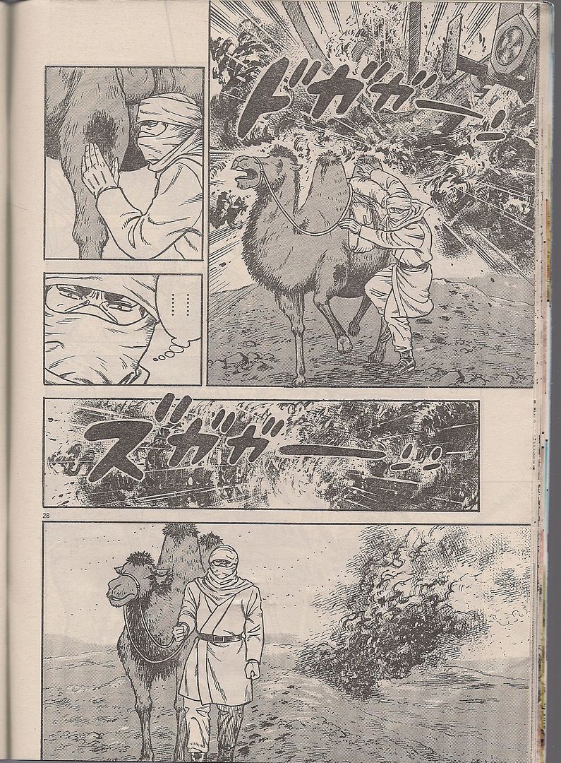
(Golgo 13's camel isn't as manly as him, but it'll learn.)
TS: I'd be curious to know how well this thing is selling. Not in the Direct Market, obviously. Just at all.
JM: I'd be curious to know what kind of licensing thing they've got, because I know that occasionally they're bound to release the entirety of a series. I don't know if they're required to release all of Slam Dunk because they've got Vagabond. I think Vagabond sells really well. I don't know that it does, though.
TS: No, I think Vagabond does well. A lot of people seem to know about Vagabond, care about Vagabond.
JM: Yes.
TS: I think too, in America--for some reason - [Miyamoto] Musashi stuff, just anything Musashi, like The Book of Five Rings, etc. All of it seems to be available, out there. I'm not sure how that happened, but the stuff has presence.
JM: Swords man! Showing up to the big battle, all disheveled, making a wooden sword out of the oar from the boat he rowed to the island on.
TS: Have you seen those Toshiro Mifunes?
JM: The Samurai Trilogy? Yes.
TS: I like those movies. They're a little Gone With The Wind-y, but I like them. ***
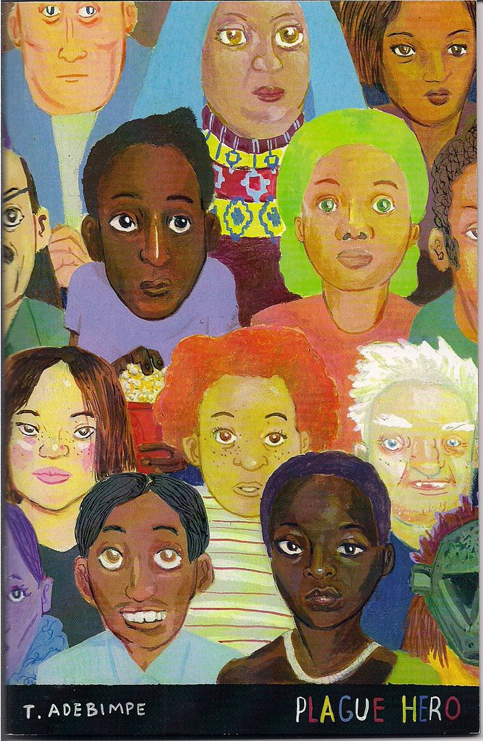
Plague Hero (Tunde Adebimpe) & What Had Happened Was... (Domitille Collardey)
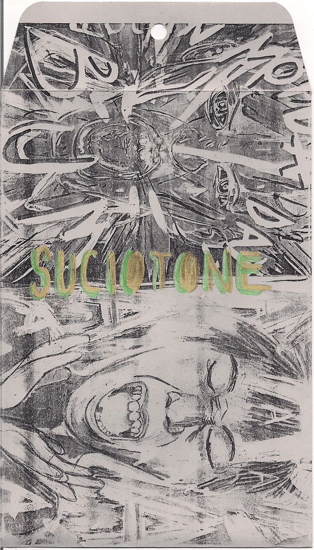
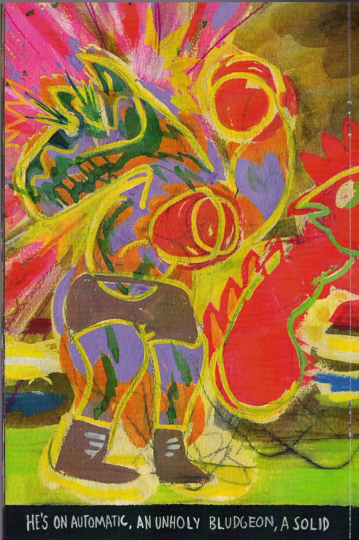
But if there was any new and now and very very exciting trend to be divined from the show floor, it'd have to be... ENVELOPE COMICS. Which are self-published comics that come hand-packed in an
ENVELOPE. It's not Tyvek, but I dig the protective and decorative qualities!

As you can see,
Plague Hero contrasts the gold, green and gray facial close-ups of its outer packaging with the many colors and faces of its cover (actually a wraparound). That's kind of a feint, since every one of the comic's 28 pages is a double-page splash, facial close-up or similar tight view of something, albeit in often blazing color.

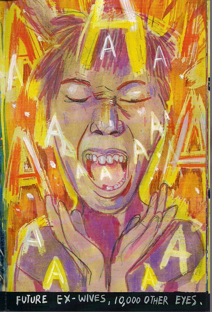
See? Same as the envelope. Artist Tunde Adebimpe is best known as a songwriter and lead singer for the music outfit TV on the Radio, and his full page images (no panels) are bordered at the bottom by a narrative poem that crawls across each set of facing pages as a stanza. Or a verse, since this might as well be a song with musical illustrations, though I suspect most comics readers (myself included) view 'musical' traits in comics as secondary to panel arrangements and page beats.
In contrast, Adebimpe's music is synesthetic, derived from bright colors swirling around his pages, two at a time. Facing pages are usually occupied by animal boxers (a mule and a bird-thing) squaring off in a big fight, narratively positioning the work's colors as in conflict, even as his words delight in the thrill of merely being up in front of so many people, helpfully depicted on the cover. You soon notice that
both fighters are Adebimpe's narrator, indicated through a mix of neutral language and willfully conflicting words and pictures - truly it doesn't matter if you win or lose, 'cause just being alive in the plague makes you a hero.

Not to turn every one of these comics into a device in the larger metaphor of the Brooklyn Comics and Graphics Festival 2009, but yeah - the victory is getting up and
doing, which is a decent enough theme for a fast-paced debut comic I haven't seen up for sale anywhere outside the show itself.

Meanwhile, the envelope for
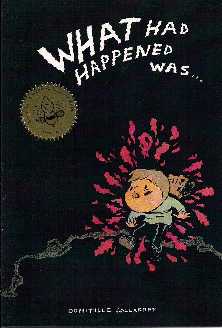
What Had Happened Was... seems more apt to pretend that a special gift of comics has been mailed straight to you, which I guess it could be if you order it from artist Domitille Collardey's
webshop ($6.00 U.S., $8.00 elsewhere). Note the seal of approval below!

Collardey's highest profile work so far has been with the
Chicou-Chicou group, a French collective that saw an eponymous, 400+ page
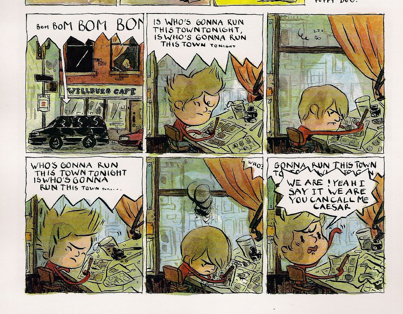
anthology published last year by Lewis Trondheim's Shampooing label at Delcourt. But Collardey is New York-based now, so her one-woman debut is this 20-page b&w and color oversized pamphlet, in English and French (with English subtitles at the bottom of those pages) - if she represents the European and American forces at work in the show, the book's makeup reflects an adopted hometown advantage.

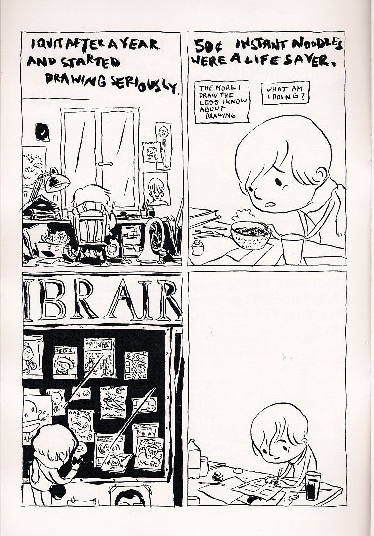
The subject matter won't upset anyone's traditional American indie comics perceptions either - indeed, this is probably the most 'classical' comic I found at the show, in that it hews closely to the autobiographical/here's-stuff-I-saw/here's-stuff-I-like style that's probably still what the resolutely unacclimated deem all self-published comics of an alternative festival to be. Mind you, I don't know nearly enough about French autobiographical comics of the last twenty years to address the work on that level, which is surely pertinent.
Anyway, Collardey has an attractive, wavy line, sometimes enhanced with delicate paints - the visual impression is vulnerability thickened with resolve, as there is an assured craft to her pages that disallows you from
feeling her drawings might come apart, even if they look it. Tellingly, the various and sundry collected strips share the theme of uncertain beginnings, from the cover art of Our Woman struggling through blackness and inside covers festooned with traces from artistic influences to stories about moving to New York, fixating on Americana (the Michael Jackson collection), interviewing someone admired (Françoise Mouly) and even proving an origin story for a life's path to comics, its first and last pages maked by dropouts in an otherwise constant narration, artistic serenity likened to the self-sustained bliss of childhood.
The fragility of that place is not stated, of course. It is everywhere.

***

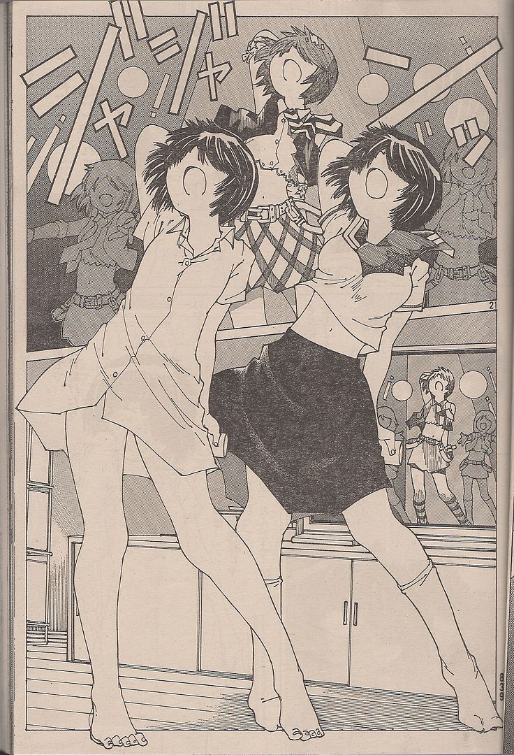
(The title of this translates to Mysterious Girlfriend X, but I'm guessing the title page displays all you'll ever really need to know. The series concerns a yandere-type classroom weird girl and the young man who becomes addicted to her spit, enough so that his body needs it all the time, and then they fall in love and get psychic powers. Great old-school trashy manga art from Riichi Ueshiba.)
TS: Empowered. Do you read that?
JM: I stopped reading after the first couple of volumes. I did get the one-shot that Dark Horse just put out.
TS: What do you think about it?
JM: It's always a little weird. I think it was the first one, some of the responses surrounding it may have imbued it with more satiric bite and cleverness than is actually in it, I think? Because when you look at more than one of these books, I think some people have come around to this, it's as much a wallow in tie-me-up and "oh woe is me" female super-hero stuff as it is a castigation of the industry that degrades female super-heroes. It's as much a soap opera, which isn't something you might get from the one-shot, which just fills you in on who Empowered the character is.
The construction is kind of funny, because it just bounces from scene-to-scene, willy-nilly. It's interesting, because it's almost - it's like a deviantART comic that's gotten a bunch of attention, something that's done well enough to get a thousand pages of it released from a front-of-Previews publisher. You've gotta respect that man! Have you read a lot of Adam Warren's work?

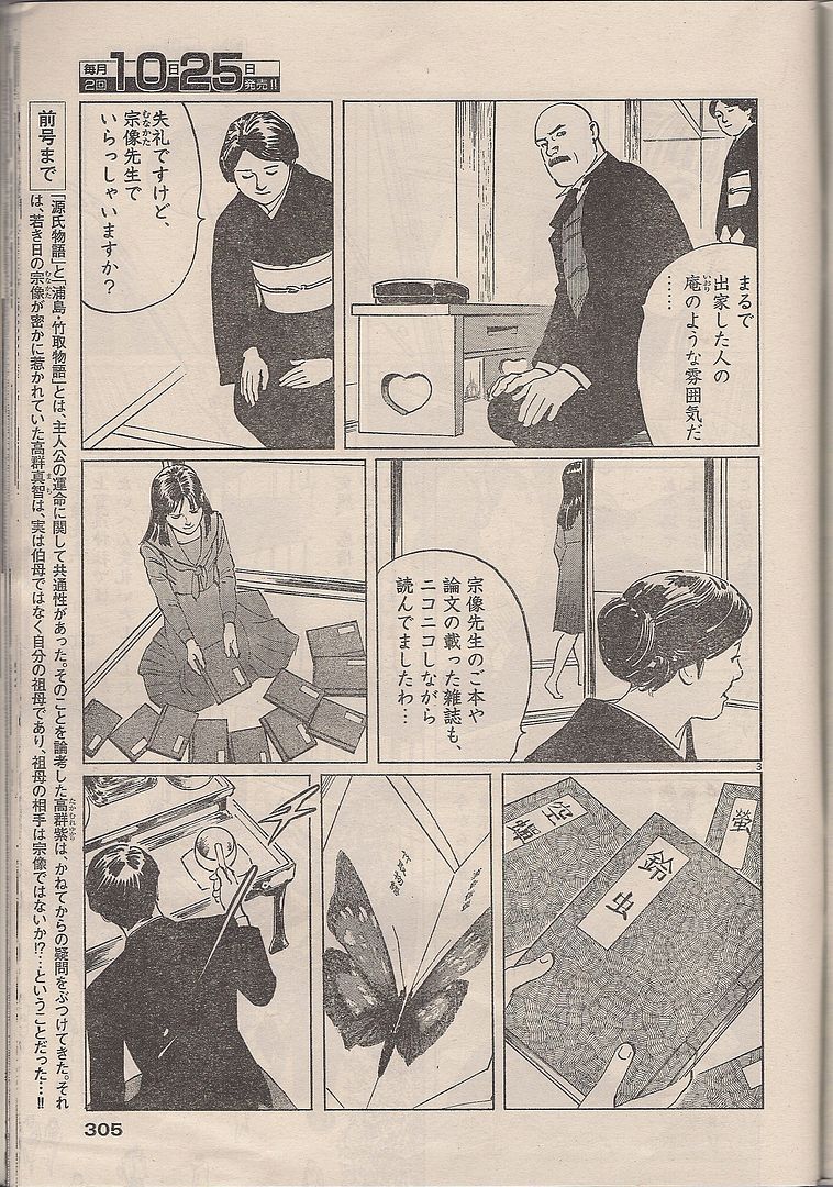
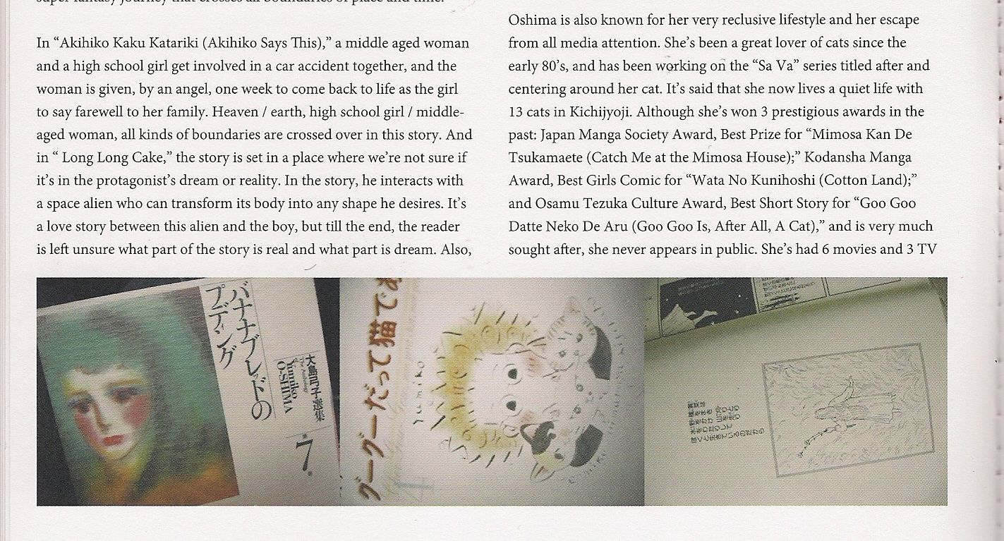
(It's smut, from what I can tell. Dumb smut too, at least by synopsis. 'Mature' manga by way of being a boys' comics love comedy with added breasts, perhaps not atypically so for Afternoon, a monthly phonebook with something of a reputation for skewing younger and pandering to otaku needs. Not that they're the only men with sexual desires, but the story's premise is unique to that demographic, run on the virgin-borne mystery of a woman's fluids, her unknowable innards given magical force. Ick.)
TS: I've read Livewires. One or two volumes of Empowered.
JM: What did you think?
TS: I think it's a have-your-cake and eat it too kind of thing. I'd read it after it had been out for awhile, after it had been agreed that "this is a comic that was doing something." I don't know if you'd call it "positive" for females, but it seemed to have been decided that it was satiric, that it was critical of that fetish mentality. I have a bit of a hard time with that, part of my understanding is that it was born out of sketch requests.
JM: Well, born out of him getting sketch requests that he felt weird about. That's what gives it texture, that he was feeling kind of weird about doing this. I agree with Johnny Bacardi, who I think said that it would have made an awesome serial in Penthouse Comix.
TS: Ha. Sure. I don't actively have an idea or defense prepared for not sharing the "pornography is bad" mentality, I just don't think it is, unless it's criminal.

(I mean, it's not like drawings of girls in cute and/or minial outfits are terrible on their face, but you've got to examine the context. Which means, granted, that you'd also have to deal with yaoi's idealization, aestheticization, fictionalization of gay men, a very small, not-incredibly-powerful-in-Japan group, primarily for the apolitical consumption of heterosexual women, a far larger consumer group.)
JM: I suppose one argument is that pornography promotes augmented, unrealistic views of women. But when you look at it, the sheer amount of pornography on the internet -- if you take it as one big thing, the economics show that pornography, stealing it, enough to bite into the industry's money -- it really does represent a massive spread of different kinds of women, and from far enough back, looking at all of it, it really doesn't represent the same unrealistic depictions of women that say, a magazine spread might.
TS: Television or film too.
JM: Which might be because it's so incredibly cheap to make it successfully - a digital camera, nothing else. Inevitability has its virtues in that way.

(Wait a minute - "massive spread"...? Oh Jesus Christ, just... like, just skip to the next segment or something, ok? Nothing good is coming of this.)
TS: I don't know, it just seems that there has to be a worse consequence than merely promoting an unrealistic view of women and relationships before something gets shut down. There's a sort of brilliance to that thing the Onion News did on "why pornography should be more realistic," that it should depict complete shame, failure to reach orgasm, that it should depict people not calling you the day after...
JM: You look at the big adult production companies, say in the Golden Age of porn, the late 70's, and there's always a few projects that go for that kind of realism. Obviously it's never going to be dominant in the industry, but there always seems to be something that is at least trying to achieve a more base realism.
TS: There's just a lot of weird art porn as well. I don't know the names of those things. I don't know how far down this road I want to go. Empowered? I think it's drawn well. I don't want to read it. Not for me.
JM: For me, it's fallen into the "it's nice," but not nice enough for me to want to read it? There's stuff that I don't jump on.

(Hey, are you even reading these transcripts? Y'know, Afternoon looks almost exactly like a Cerebus collection in dimension - that huge transcript in The Latter Days was the only part of the whole series I didn't read. I just looked at the illustrations. All love to Tucker, but you can always just look at the pictures here, panels in panels, panel-to-panel, 'animation.')
TS: I do think that it's interesting, from a publishing model standpoint, that Empowered seems to have proved that you can successfully serialize a story in graphic novel format.
JM: And a lot of that is because Warren gets the art out.
TS: It's on its schedule, and it comes out regularly. Hell, we're talking about a book that comes out and is invariably shrink wrapped and yet it's been successful enough to have five full volumes.
JM: Exactly. It's a thousand fucking pages on the market, coming from Dark Horse. That's not something that should be taken so lightly.

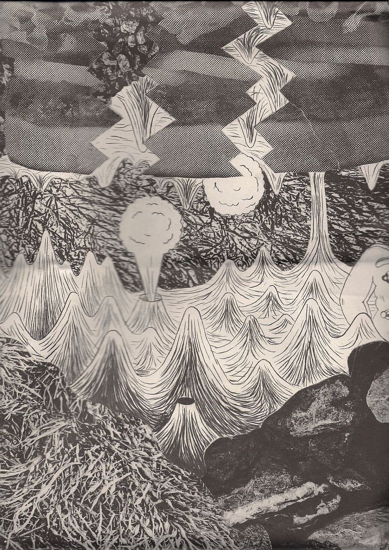
(It's alright. This looks okay. See how the big finish erupts the page, dancing that obscures the heaving bosoms the attentive obsessive might spot first. Scroll up, roll down - god, that happy, momentary primacy of drawing as drawing, god, be it ignorance I still can't deny it, god, I can't even read this and it seems to succeed, in spite of itself.)***
The second area of the show I visited was the programming room in the
Secret Project Robot gallery space, just one climb of the loading dock stairs away from the actual end of the road (Metropolitan Ave.), by the razor wire fences. It was almost 4:00 and the panels were running late; I stood in the antechamber and listened to the last 10 minutes of Ben Katchor's absolutely packed presentation, which at that point was a story reading with comics-on-the-overhead accompaniment. Stripped of visuals, it sounded almost exactly like A Prairie Home Companion, down to the slow-paced narration and steady gulps of crowd laughter, although presumably more urbane.
My experience with the panels turned out a lot like a video game, in that each round took me closer to my goal of getting a seat. (Which doesn't say much for my taste in video games.) I made it to the floor for the
Flatlands: Comics On the Picture Plane discussion, a fairly cerebral march of presentations by Lisa Hanawalt, Mark Newgarden, Ron Regé, Jr. and David Sandlin on the idea of comics as both arrangements of symbols and depictions of imaginary three-dimensional space. The crowd rioted, Salvador Dali kicked over the projector, the cops turned on the hose, I didn't take notes - hopefully a transcript or recording exists somewhere, because picking through text might be the most fruitful means of engaging the material. Also, the Secret Project toilets are lit so your piss seems to glow.
Tucker Stone arrived in time to grab seats up front for Frank Santoro's live drawing event, which was wonderful, and probably wouldn't be served well at all by a transcript; it should have been held upstairs at the church, with Santoro at the pulpit exhorting the congregation. Programming organizer Bill Kartalopoulos stood off to one side, occasionally lobbing queries in Santoro's direction. On opposite ends of a table and dueling overhead projectors, two artists created one page of comics each, adapting Odysseus' encounter with the Sirens, consulting Santoro's
golden ratio diagram for organizational guidance toward a stronger, more appealing image. It was like a polemical chalk-talk gone self-aware enough to allow for alternate expressions of its lecture routine:
(1.)
R. Sikoryak initially seemed on track to complete his page in 15 minutes, until I saw him breaking out the scissors and slicing transparency paper into panels. He then switched and swapped out different layers, refining his drawings with different marker colors per sheet, comparing images and working in stacks as he cast Thimble Theatre characters in the story, a la his
Masterpiece Comics. He noted that Santoro's grid suggested more of comic book-type layout than the E.C. Segar strip style he'd normally adopt, and declared the page would be finished in about a month. Piecing things together, it was clear how meticulous the act of
construction could get in his work, which I think led to his engagement with Santoro's designs on a holistic level. Back and forth he went, tinkering, squares and rectangles in and out.
(2.)
Gabrielle Bell began by drawing her panels. Then she started filling in the uppermost left panel, and finished in the bottommost right. Her page was composed of panels of even height and varying width; her usage of the grid created something of a layout symmety, although she seemed to use its contours mainly to guide her in-panel drawing, which did not stop for more than a few moments at any given time. Every line she made stayed on the page; she made no mistakes. When she finished ten minutes early, she pulled out some markers and began to color.
***
TS: Ahh! Dark Tower!
JM: Ahh! Dark Tower! Jae Lee!
TS: DARK TOWER!
JM: AHHH!

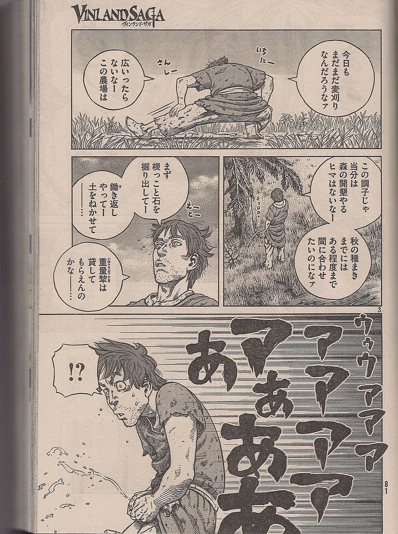
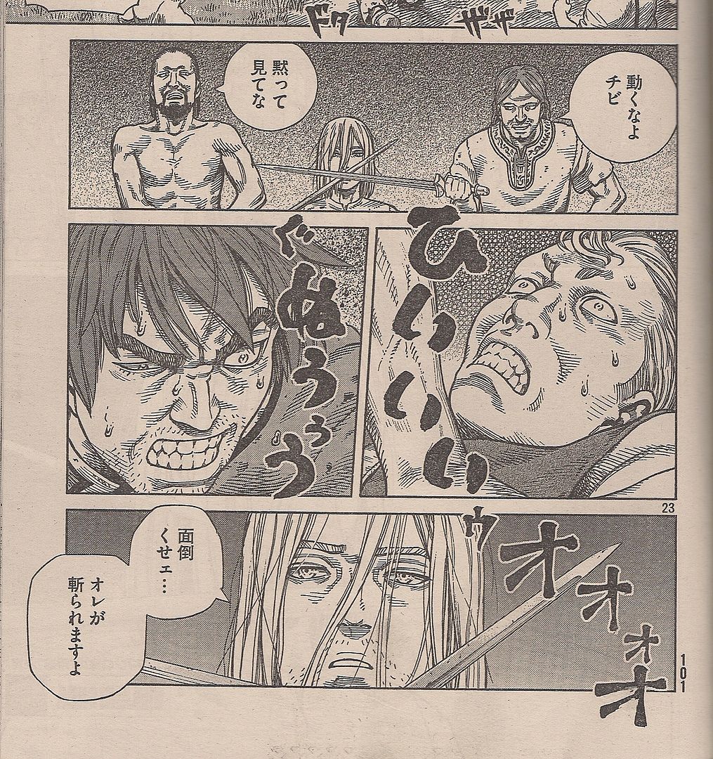
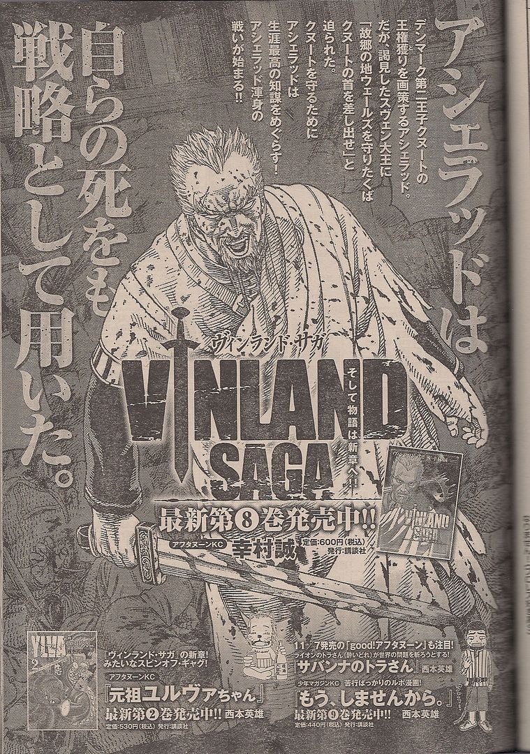
(Ladies and gentlemen, your 2009 Japan Media Arts Festival Grand Prize for Manga winner - Makoto Yukimura's Vinland Saga! Yeah, take that, author of Town of Evening Calm, Country of Cherry Blossoms!)
TS: Did you hear he's supposedly going to do another book?
JM: Oh, really?
TS: Like, a book-book.
JM: Where did you hear that?
TS: Hell, I don't know. Some conference thingy.
JM: He's illustrating a prose book?
TS: No, no. Stephen King is doing another Dark Tower book.
JM: Oh, Stephen King?
TS: Like a book-book.
JM: I hadn't heard that. What kind of bad attitude is this, "book-book"? Comics are fucking books.
TS: Fine. A prose book.
JM: Yeah! (Seriously, I've been demanding this thing get itself licensed since 2005, and if you'd told me then that Takashi Nemoto would have a new book in English before Yukimura... sometimes I wonder if Planetes wound up exactly visible enough that folks with authority looked up and looked at the sales and took note of Yukimura as someone not to bother with.)TS: Have you read any of these Dark Tower comics?
JM: Yes, I've read a few.
TS: You're a big Jae Lee fan.
JM: Yes I am. It's kind of heartbreaking, because this Richard Isanove - see, Jae Lee is doing the pencils, and Isanove is really filling it in with the coloring effects. It's not so pleasant, I don't think. All the people look like Muppets molded from latex, the people look like they're wearing rubber people costumes on top of their bodies, and it's really too bad. Jae Lee's - one thing he's really good at it, is that there's always at least one page in his comics where people pose as if they're uncomfortable in their own skin. Especially in the early stuff, the early Dark Tower The Gunslinger Born series. The teenagers in that comic actually look like teenagers, they don't look fully mature which is really hard for a lot of artists to do. I'm sure he's using some photo-ref, but he fucking sells it.
I mean, it's Jae Lee, he's always a little strange because he's really gotten into a heavy, almost theatrical style presentation, like an opera or something else on a stage. It's pre-Tezuka manga, with the little dog Norakuro running along the stage kind of presentation. With Lee, I get the feeling from his comics that he's just not big on cinematographic elements in his art. A lot of Image artists, and he's associated with that Image generation, he started on Namor [the Sub-Mariner], then he did a bunch of WildC.A.T.s and Youngblood stuff. He took this posey style, people posing, and he's built an entire aesthetic around it. It's operatic, posing with faces half-formed. For my money, the best thing he ever did was that one Ultimate Fantastic Four [#20], where 3/4 of the issue, everything is in shadow, with these little color flashes for the eyes. That was awesome. What's your opinion on Jae Lee? (What this house ad is saying is: "America, you want me and I want you! Here is my want face, now show me yours!")TS: I don't really have a knowledge base to have one. I've read Fantastic Four 1234 and I tried to read the Dark Tower book because I got it for free, that's it. I read those books, the novels. I liked those when I was a kid. Wizard and Glass, that's a good one. It's just a western with supernatural elements. It's not like the other books in the series. But those books went to hell, they all went to complete hell. Stephen King becomes a character in the books, they incorporate when he got hit by a van and nearly died, those are plot points in the book.
JM: In the new Dark Tower book maybe Stephen King will team up with Superboy Prime.
TS: Well, the bad guy in the last Dark Tower book is the same guy from Final Crisis. Wait, no. The Crimson King. Maybe that's Doom Patrol.
JM: Red Jack? That character was kind of based off the film The Ruling Class, the Peter O' Toole movie where he thought he was Jack the Ripper. That's a fucking good movie. Probably my favorite Peter O'Toole movie.
TS: Oh yeah! That's an old Criterion isn't it? I've meant to see that. He's wearing a bowler cap on the front, right?
JM: Yes, that's it, with a halo around it. Alan Moore cites that movie in The League of Extraordinary Gentlemen: Century too.***
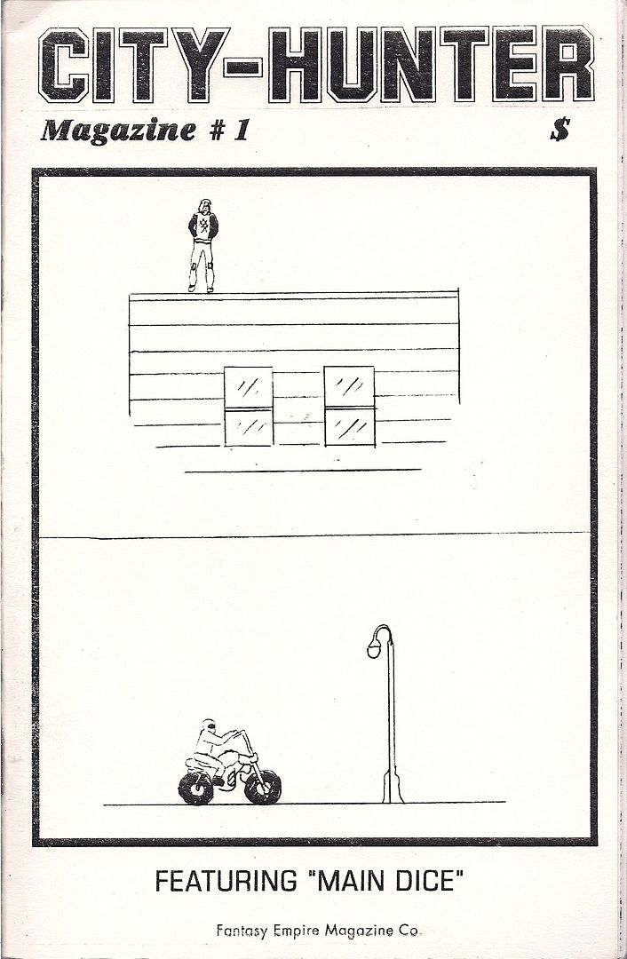
[untitled] (Dash Shaw) & City-Hunter Magazine #1 (C.F.)
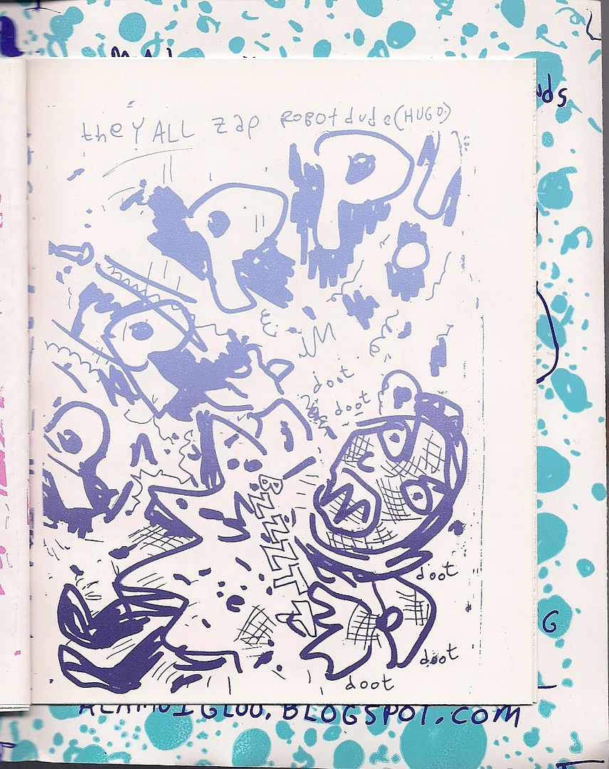
If the artists on stage were set to the task of demonstrating attitudes of page composition, hanging meat on the bones of one page of several -- image construction as a comic's endoskeleton, let's say -- other 'established' artists put out some new small-run picture zines: exoskeletal images. Dash Shaw -- he of comics and
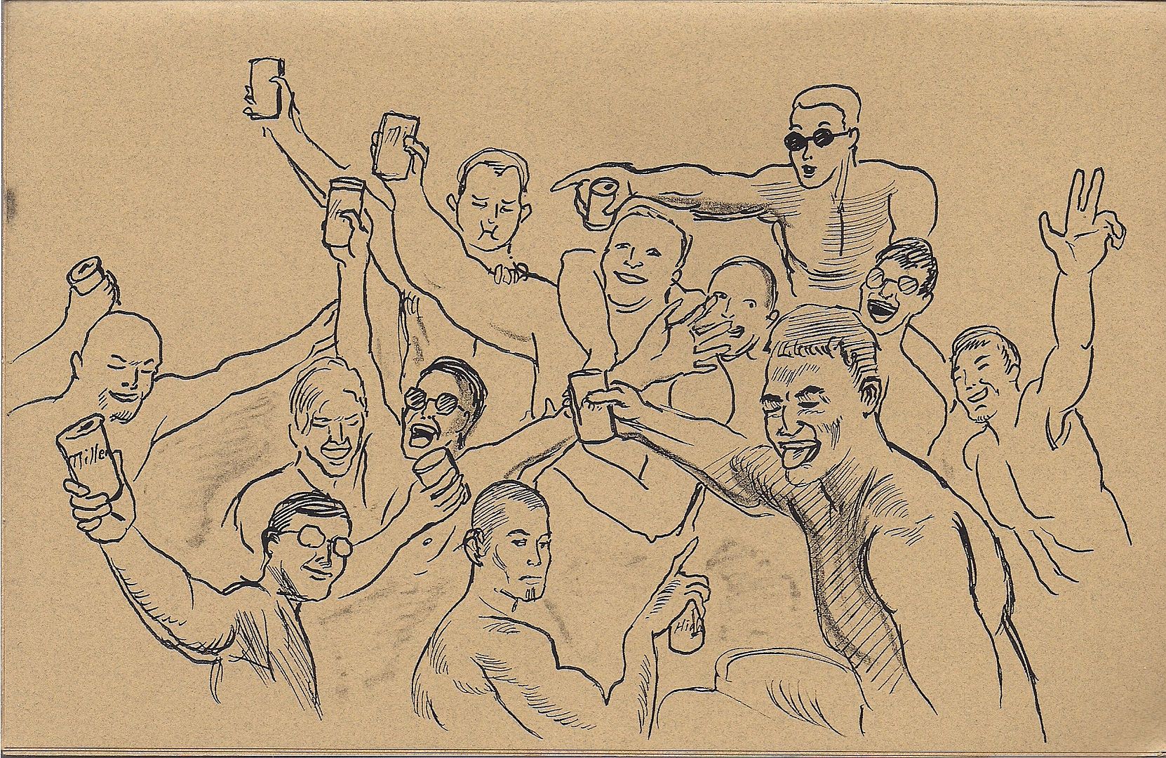
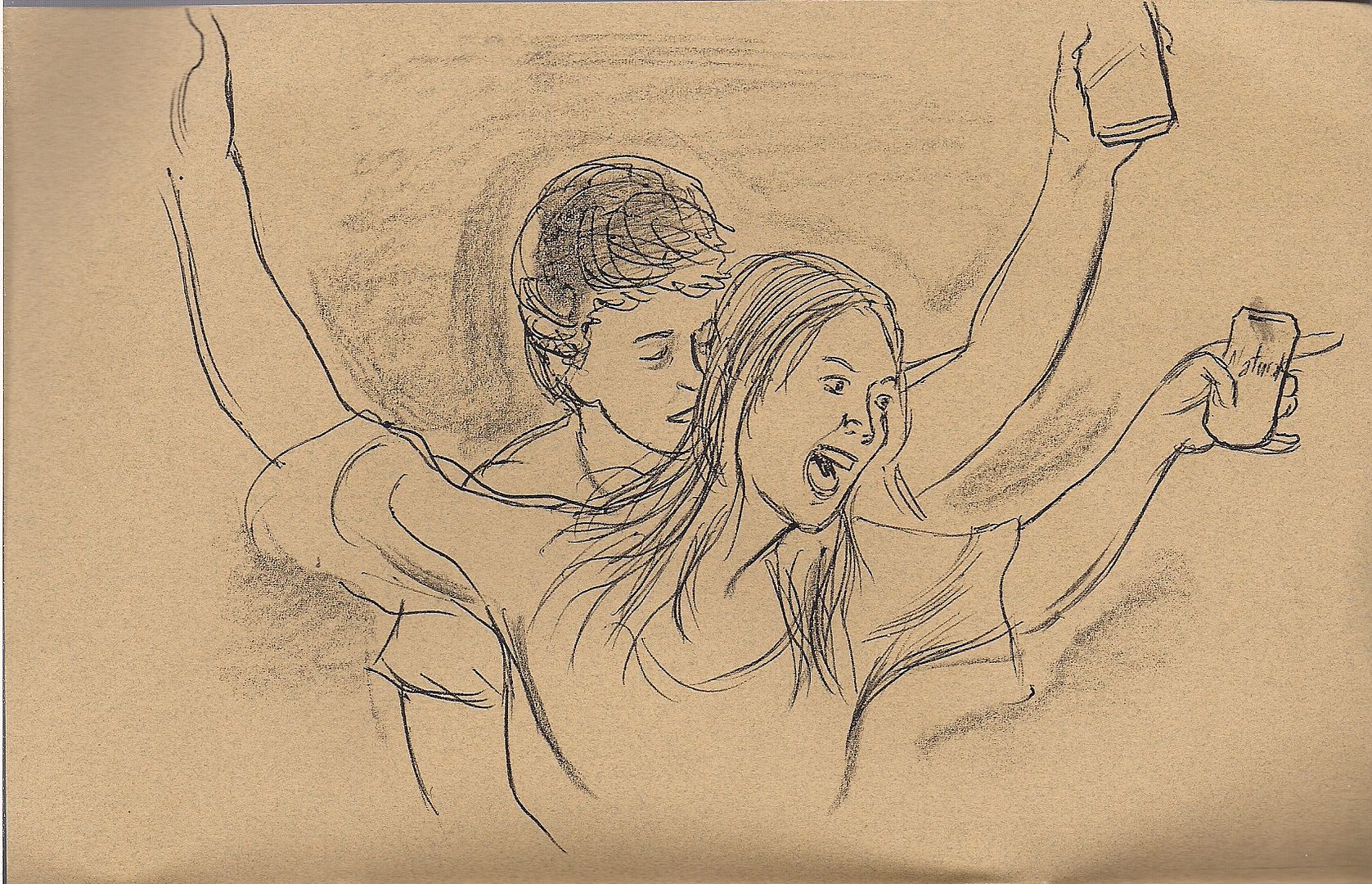
animation -- keeps it direct with a brown, landscape-format eight-pager depicting scenes from a big drinking party.
That's all. It's nice. There's shirtless toasts, cases of Keystone Light, girls kissing - a simple progress. Although I wonder if there's some special, obvious-but-not-to-me purpose, some underlying...

Oh my god,
it's live drawing from the Ben Katchor panel!!
But 'simple' doesn't always remain cozy, as often proven by C.F., creator of
Powr Mastrs. I'm pretty sure you'll know if you're gonna click with his new Fantasy Empire Magazine Co.
release (see also:
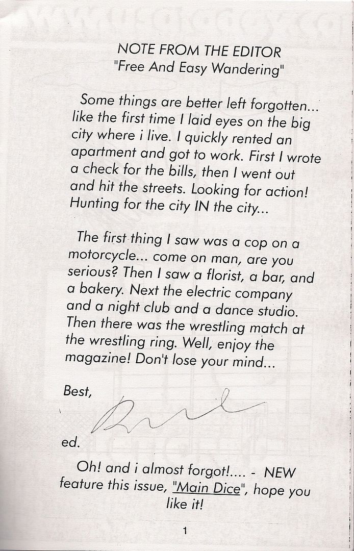
Core of Caligua) from the opening editorial.

This
is issue #1 of
City-Hunter Magazine, so a new feature probably isn't that surprising; the other 19 pages, three of which are labeled page 14 (with a and b subdivisions) share the same easygoing goofball spirit of discovery in less a mortal city than one divined from the word' s personal implication. It's not a tribute to the manga of
Tsukasa Hojo either, but a similar and especially personal urban imagination runs the place.  Main Dice
, for example, is four pages of a uniformed action man posing small and shadowed in diverse locations that do just enough to establish a 'city' that the eventual sci-fi car park and Arabian Nights palace interior just have to fit in with your internal street view. Other sections have drawings of a castle and a compound, a nine-panel science fiction segment, an extreme-fuzz close-up of USA Today's Life section at its web page, and a full-page color bondage pin-up that becomes oddly disquieting when you realize how improbably the girl's leg is tied to the desk. A Paid Advertisement tempts you to go
here, for additional allusive sequences.
***
TS: The Comics Journal #300.
JM: I've read the Comics Journal.
TS: The whole thing?
JM: Not the whole thing. What was your favorite interview in it so far?

(Here's a little Yukinobu Hoshino, from his ongoing Case Records of Professor Munakata, as mentioned in the other week's Manga post. I've gotta fess up - Jason Thompson was onto something, this really does look a lot like Ryoichi Ikegami, particularly in the stark backgrounds of the first two tiers, and the undramatic outlines of the characters, the mark of a 'realist' mangaka honing it down, saving it up to stay on schedule.)
TS: I liked the Fraction interview with Denny O'Neil, I haven't finished the Huizenga/Speigelman one, but I liked what I've read so far. That's the one I mentioned to you, the one that kind of broke my heart a little bit, finding out that somebody who I would've assumed - maybe not that they have incredible financial success, but that I assumed was perfectly comfortable and well off from how much they make.
JM: Well, I haven't read the interview, but maybe that's not Huizenga's idea of success.
TS: Oh, I would doubt that it is. I think most of the sort of people who are going to do creative, non-mainstream, "alternative" work, work that's clearly tied into following what one wants to do with one's art - it's normal to see them not caring about whether they have financial success. I don't think Frank Santoro, Dan Nadel, those kinds of people are concerned with what their work is doing to their bank accounts to figure out if they're "successful." At the same time? There's a desire on my part -- possibly socialist and liberal -- that the artists I like be financially successful.
That's the thing with comics, you can only read so many stories about these people getting hit by medical bills, suffering without treatment when they face something like cancer, a disease that hits about a third of the public - and yet all that work those people have put in, they're incapable of paying for help. It's their choice, sure. They have to face those consequences. But it doesn't mean I have to like it, or not find it upsetting. I'm not going to be hardcore and cold steel when people who make the work I like end up in a place where someone might say "your choice!" I just would've liked to read that Huizenga made a little more money, because I like what he does. He may not care about that. But what he cares or doesn't care about doesn't change my feelings. It certainly doesn't mean I have to adopt his worldview, which strikes me as a bit less cynical then my own.

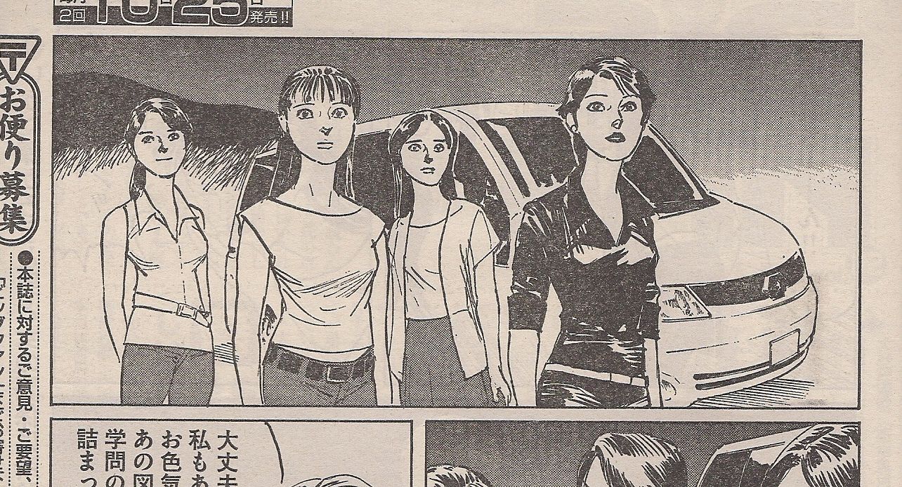
(Look at the white outlines on these women, how they seem cut and pasted against the background, by hand - no light source, a rightmost shirt and head of hair molded from the same distressed approach to a pool of ink. Fuck the historical context of Western influence on a hardening aesthetic in the 1970s - this is some by-hand manga at the edges, in the attire.)
JM: Sure. I still remember a comment from the Howard Chaykin/Ho Che Anderson interview...
TS: I haven't read that one yet. I'm saving that one, because Howard Chaykin is by far the best interview subject the Journal has ever had.
JM: I like the history aspect of Howard Chaykin in the final Journal, he's in some of the early ones.
TS: Yeah, I've read one recently, it was one of those fantasy comics that he's done.
JM: The Byron Preiss one? Empire, or the one with Michael Moorcock [Swords of Heaven, Flowers of Hell]?
TS: It's the Michael Moorcock one.
JM: That's also the Frank Brunner issue [#51], the one where Howard the Duck's cigar is put out on Stan Lee's desk, an open letter "fuck you Marvel."
TS: "I won't be signing that contract!"
JM: Yes! Well, there's a line from the new Chaykin interview, I'm paraphrasing it, but a line where he says "I'm a very sentimental man. I'm just not a very sentimental writer." And that sticks me with me.

(Old times, old times.)
TS: Chaykin just has a complete lack of bullshit when he's talking. There's this interview in the original collection of his The Shadow mini-series where he acknowledges that he doesn't really care for the Shadow, and that his job with the Shadow was to make something profitable for his employer. And yet you don't read something there that comes across like hackwork, some rush job.
JM: The first issue of that Shadow comic, I think it came out the month before Batman: The Dark Knight Returns - that is some straight blood and thunder mid-80's super-hero comics. The supporting cast of the Shadow, getting shot in the head, page after page after page.
TS: I can't remember if it's a girl or a guy, but there's somebody shoved inside the water cooler, broken and mangled with just a...
JM: He's having a blast, you can see him just having fun with the Shadow saying awful things, playing with his fascist leanings. I think Dennis O'Neil said in the old Mike Kaluta Shadow book that "you gotta be careful with the Shadow," because there is kind of a fascist element. You have to treat the Shadow as basically a demigod. You know how they always say that there's one thing you have to buy to get into a story? The thing you have to buy about the Shadow is that He's Right. He's right about what's wrong, and you have to buy that or else you're going to end up in sticky territory.***
In
issue #300 of The Comics Journal, J.C. Menu, one of the founders of L'Association, asks:
"
Do you live with the feeling that this civilization with all its industries, including the book industry, is going to collapse?"
(This is much better if you imagine the silly bird Lewis Trondheim always draws him as.)
"
What kind of crazy question is that?!" replies Sammy Harkham, creator of the art comics anthology staple,
Kramers Ergot, which has always been a bit more accessible than its reputation suggests. Then he answers very forthrightly, but I was nodding my head from line one.
Elsewhere, Gary Groth jokes that Fantagraphics will soon be switching its publishing model to selling exactly one copy of one comic for one million dollars. This will place it more in line with 'fine' art in galleries. I looked around the show floor, having returned through the dark rain with Tucker Stone, and I realized that the comics market atmosphere could have its own non-unique but perfectly real leavening effect on the notion of 'gallery' art, as collided with the comics form, promoting the desire to
read visual art as well as merely
behold it, even in the absence of perfectly sequential story panels, to emphasize
knowing and
feeling in art, not as a good citizen's trait but as encouraged out from the body of the work, as a way of seeing.
Comics can be stately, or aloof. They do not need to tell clean stories, or depict accurate scenes, or represent activities so that anyone can understand. They
can, but they don't
need to. And it does no good to assert that crisp criterion underground and declare what you see within only the purview of curiosity. Because you can claim until your cheeks are beets that comics is a mass medium, and must therefore literally cast its net wide, but this defines the form, implicitly, as struggling with acceptance. An accurate definition, sure: very few comics appeal to a
lot of people, compared to other 'mass' media, 'popular' media, and often success is stated equivocally, as reference or adaptation, as visibility in public or fodder for bolder mass arts.
Mass appeal shouldn't have to exist as a lost kingdom, a city to re-take or a gate to beg into. To think of mass appeal in the slight arms of the Brooklyn curation is to be dared to understand that the battle ended with the form, that comics' mass appeal always exists, inside the beholder. To understand that images connect, that drawings are bones, that animation, if invisible, still dangles the world between you and the artist - this explication it is the heart of comics. It is clear, clear as day, unpretentious in that it doesn't demand any literal sequence, just the crackle of activity behind your eyes, the voice whispering that visual art embodies a world, and from there you can deny that world, deny representation, switch and swap, allude - it's mass appeal as
perspective, and you can educate that, and benefit greatly. But it's a thing of the masses.
Maybe I'm condescending. Maybe everyone has considered this, and is over it. Maybe I'm slow and backward with visual art. But it is still comics, that snatch of essence freed to hover above the closing tables and counted money.
And so I became surrounded by images.
***
TS: Starr The Slayer! Did you finish it? I didn't finish it.
JM: I did finish it. It's fun. What I liked about it was that it had the kind of "loose" fantasy feeling that brings me back to [Richard] Corben's underground days. Daniel Way is writing it, but he's writing it in a way that it mixes with Corben's art and really makes you feel that this is some collar-loosening fantasy thing. There's people saying things like "Motherfucker!" and it's - I liked it. I haven't read a lot of Daniel Way's stuff, I haven't liked a lot of Daniel Way's stuff I read, but I found this satisfying. I don't think it would have worked with a different artist honestly, but I liked the final product.
TS: Well, it's a comic that I didn't keep up with mostly because it was selling out pretty consistently. It's numbers are pretty small. I have a soft spot for Corben's art, I think the only thing I haven't really enjoyed by him was the Lovecraft adaptations. I like Lovecraft quite a bit, it's just - I didn't enjoy them. I don't want to be the "book was better" stickler, but that's how I felt. Lovecraft's stuff is so pure, and I don't want something else in the way.

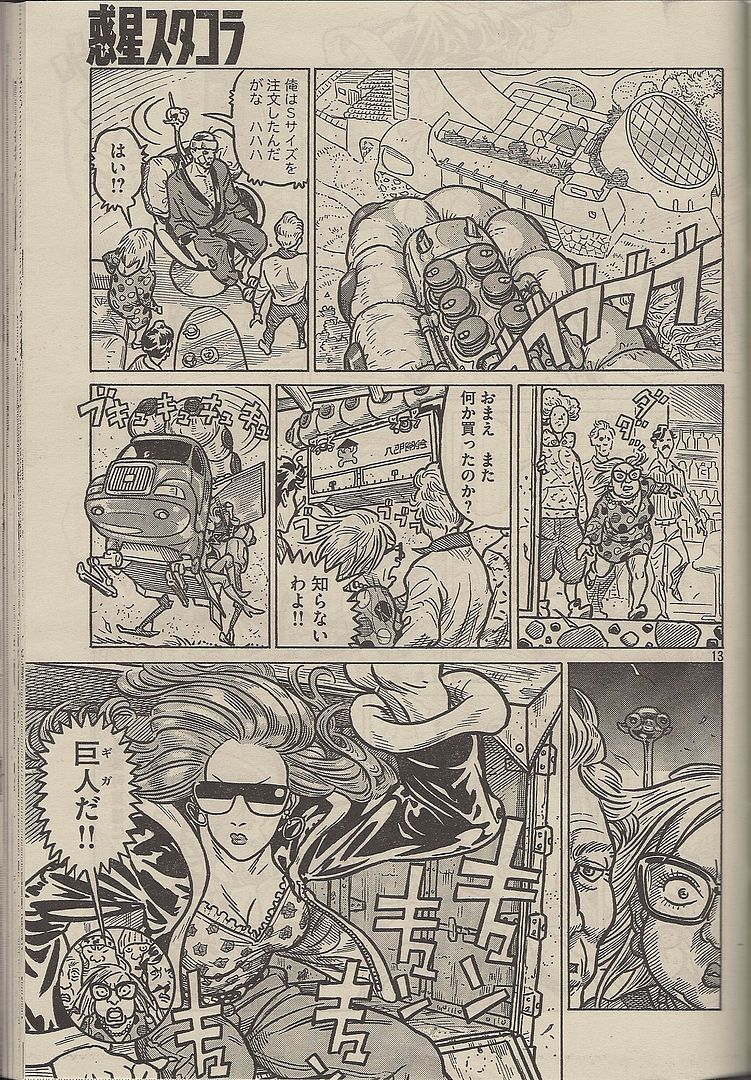
(Kodansha was happy as can be over the debut of the first collected volume of Shinkichi Kato's The Planet of Sutakola, devoting no less than THREE Morning 2 ad slots to the occasion; scanlation hounds of a few years back will recognize Kato's name from the early '90s gonzo satire National Quiz, but the art never does quite look like anything else.)
JM: Have you read that Lovecraft comic that Alan Moore and Jacen Burrows did? The Courtyard?
TS: No. No, Jacen Burrows is - he's never been my thing.
JM: From your reviewing Jacen Burrows, I get the feeling that you always start off kind of suspicious of him, but he inevitably wins you over at the end.
TS: There may be some truth to that. I should give that some thought. Courtyard - it's short, right? Prestige format style thing?
JM: A two issue series, collected into a prestige format. Then they did a color prestige format version, and the new horror comic they're doing is prestige format. The Courtyard is based on a short story Alan Moore did. The new one, Necronomicon [EDIT: this is incorrect; the title is "Neonomicon"], is an original comic that Jacen Burrows is doing whenever Crossed is finished. It's going to follow up the Courtyard. Apparently it's going to be intense, with some of the Lovecraft racial stuff.
TS: I'll give it a chance. I try to read all his stuff, just haven't gotten around to it yet.***

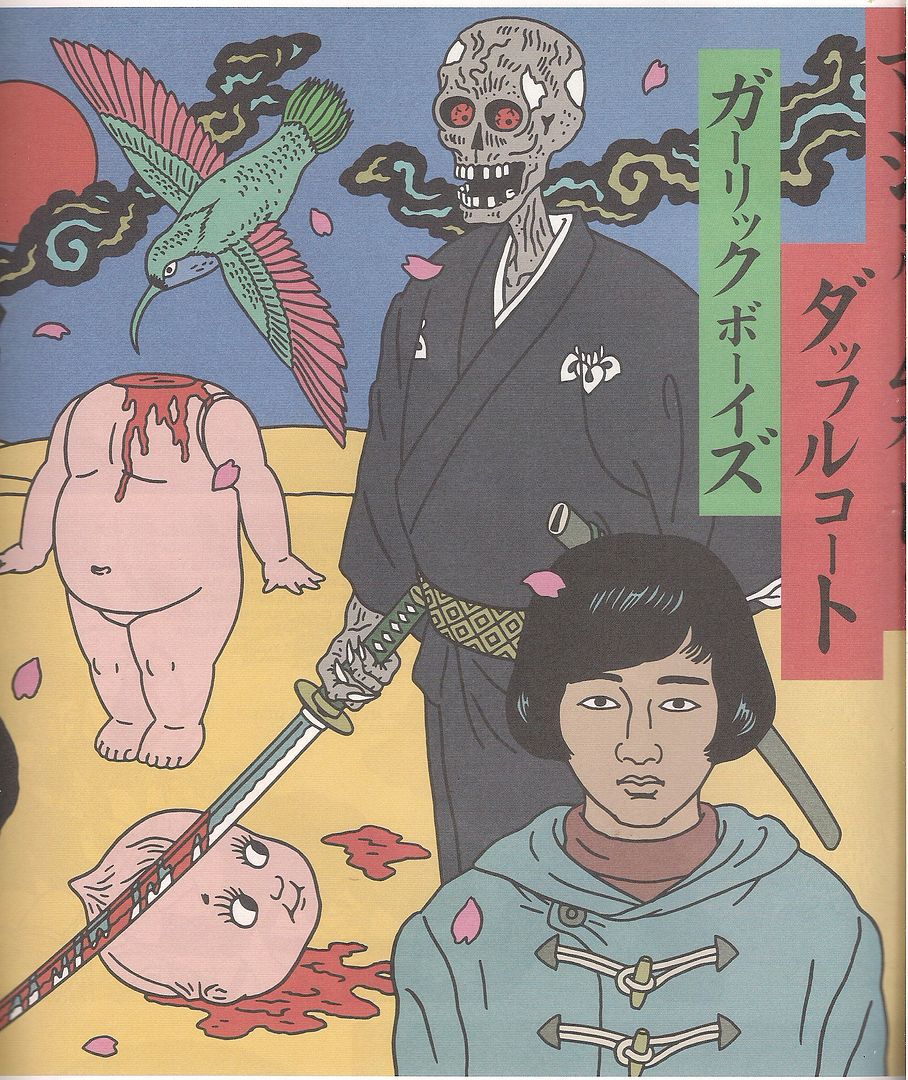
This is from an imported Presspop Gallery portfolio of album covers by
Toshio Saeki, illustrator and comics artist, colorful guy of fantastic sex zones.

These are glossy pages with colored ink sitting inside a larger screen printed cover, all by
Keith G. Herkiz -
Bordetella.

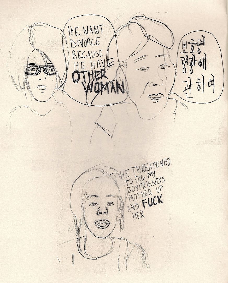
This is from a comic titled
All Kinds of Bees I found sitting in a pile labeled Take One at Secret Project Robot. It illustrates victims of domestic violence telling stories, sketched covertly.
 This is Bluetooth I
 by
Panayiotis Terzis, a large newspaper of drawings over photographs.

This is
School, a Japanese-published, English-language zine edited by Maki Hakui. It's really wonderful - 22 pages of writing on art & culture by women, often talking to women, or about women. Great stuff on classic shojo manga too.
Oh... oh right, manga! Fuck, I knew I forgot something!
***
TS: Ahhh.
JM: Ahhh?
TS: Peter Milligan.
JM: Ahh! Peter Milligan. I haven't even read the new Greek Street issue, although I have it. I guess when I say things like "Peter Milligan Book of the Week," it's because I'm just tickled that I CAN say things like that, because for a while, he was just absent. And now he's just really prolific. I loved his Vertigo stuff back in the 90's, like Face.
TS: The Eaters!
JM: The Eaters. Enigma. Hell, you want a good post-Watchmen super-hero movie, Enigma would be a good idea. It works really well as a comic, you'd have to change it to be a movie, but it's very good.
TS: Have you read Bad Company?
JM: Oh yeah, I've read some of Bad Company.
TS: I really like Bad Company.
JM: That was the early 2000 AD stuff.
TS: And then there's the Brendan McCarthy stuff, all of that stuff is great.
JM: And let's just state it for the record. Rogan Gosh - and you'll notice, the order is Brendan McCarthy and then Peter Milligan because McCarthy had a particularly strong hand in that, but that is literally one of my favorite comics of all time. Rogan Gosh.

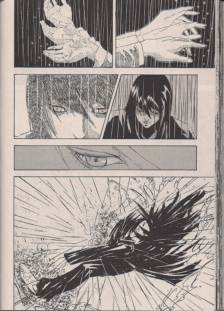
(This manga is titled SOLA. I don't know the artist's name, because sometimes online translation programs fail me. Afternoon devoted 200 of its 1200+ pages this month to a special digest volume, printing the winners of the Four Seasons Awards for debut stories. This one took home the Moto Hagio Special Award, which I presume is a commendation for visual ingenuity. So here's the simple idea of two characters connecting.)
TS: Bold statement.
JM: I don't know if it's my favorite-favorite, that would probably be Jimbo: Adventures in Paradise, but Rogan Gosh is way up there man. It is.
TS: Did you read The Programme - wait, you kept up with that, you wrote about it, right?
JM: Yes, I reviewed all of Programme at the Savage Critics. It's the kind of thing where you're kind of like "they tried, sigh." On the Programme's tombstone, they have the inscription "It Tried." I know you like that C.P. Smith guy, he did the art for Wolverine Noir.
TS: His work in Wolverine Noir is fantastic.
JM: Parts of the Programme is - I think Jonny Rench was coloring it, and then Smith started coloring it himself, and it's almost, like, confrontationally ugly. It really didn't look like anything else, Wildstorm, Vertigo. It was trying to get down to it. The story - it's okay, it's Millgan. It's about how superpowers fighting will inevitably push people further into extreme zones. It was okay. Overlong at twelve issues. I reviewed it.
TS: Infinity Inc.?
JM: Oh, Infinity Inc.! That just went right off the rails at the very end. That final issue just screamed, "we gotta shut it down! Hit the button, we gotta turn it off!" I guess they were just told "wrap it up," and that's what they had to do. It had some good parts, especially in the beginning. it was kind of a reappraisal of the stuff he was doing in X-Statix. It had its moments, let's say.

(And here's a flashback, the extravagence of layout replaced by needly clouds of hatching and cross-hatching.)
TS: I will say that he's done some stuff that I didn't even realize he'd done, like Venom vs. Carnage with Clayton Crain on the art.
JM: He did two of those! Toxin!
TS: He did some stuff with [Spider Man's] Tangled Web, but that was pretty much everybody on Tangled Web.
JM: He and [Duncan] Fegredo reunited for a Flowers for Algernon take with the Rhino. That was a funny story.
TS: I think that's sitting in the to-be-read pile, along with the Programme. The only real black mark I have for him right now would probably be The Resurrection of Ra's Al Ghul. I always thought of that as a "helper" comic.
JM: That was pretty disorganized, that thing. Even if you read it in the context of [Grant] Morrison's Batman megastory, it barely relates to anything. You can just take it out. It's a big action crossover, but you could literally remove that book from the Morrison Batman library, and nothing will happen. You'll lose nothing of importance.
TS: They chucked away a bit of the best of what they did with the Dini Batman stories, it was right after, I think? Batman drugged Ra's into a coma, keeping him locked away. That was brilliant, they dumped it. There's been a couple of those, where they put a button on the end of these Batman villains in a fashion that was truly satisfying, an end that was smart and made it like "you don't need to see them anymore." Status quo changes that were smart and worthwhile. Like turning the Penguin into what he is now.
I still remember that old Kelley Jones - it might have been written by Doug Moench? Kelley Jones Swamp Thing/Killer Croc story [Batman #521-522]. You ever read that?
JM: No, I don't think so.

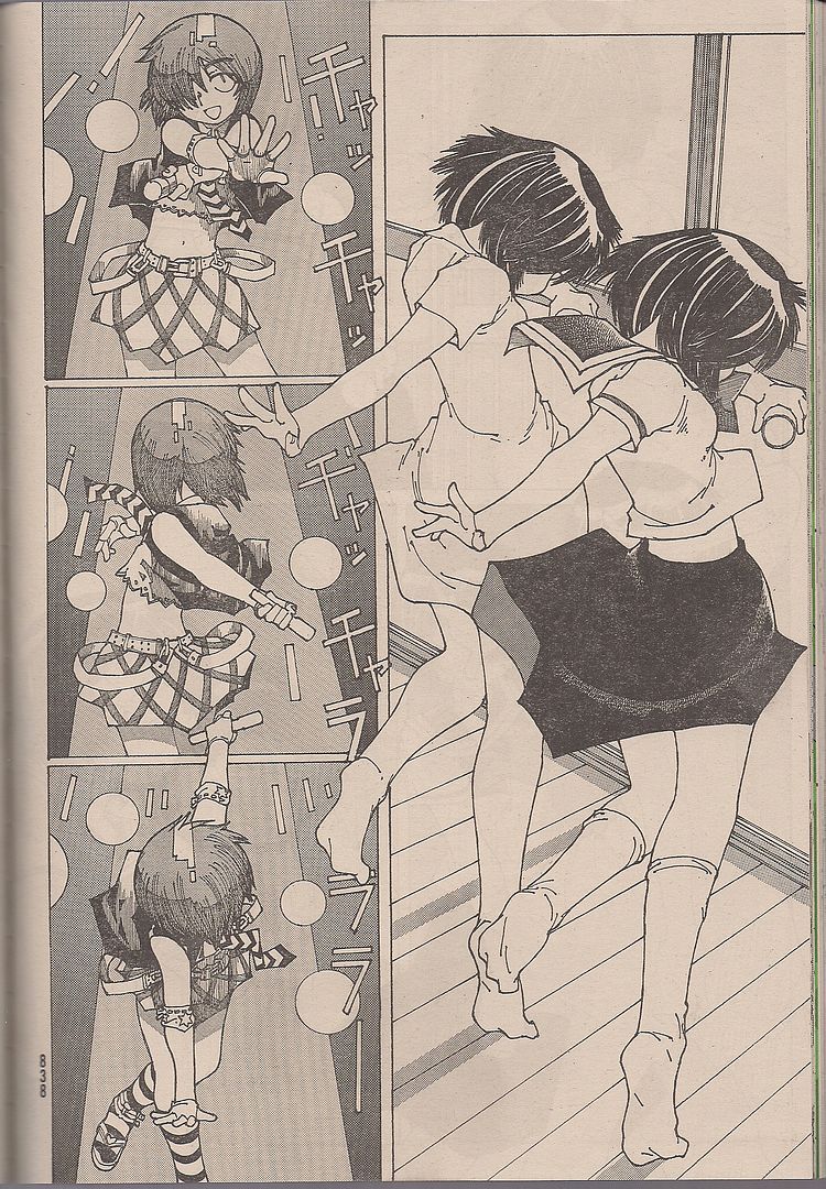
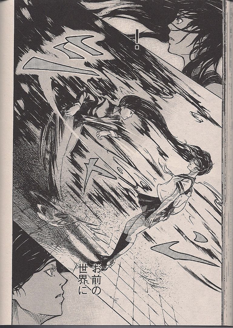
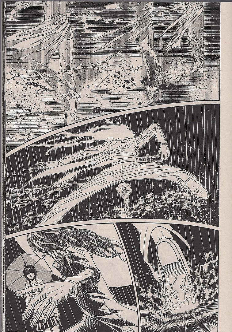
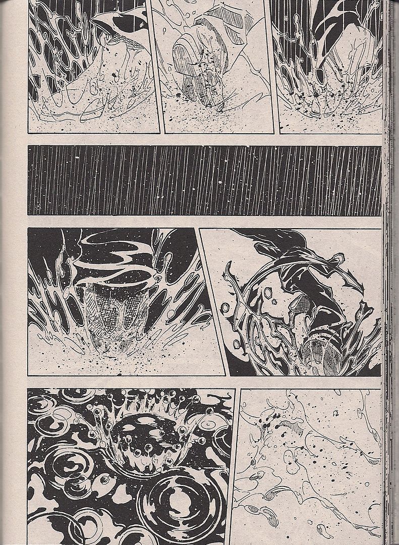
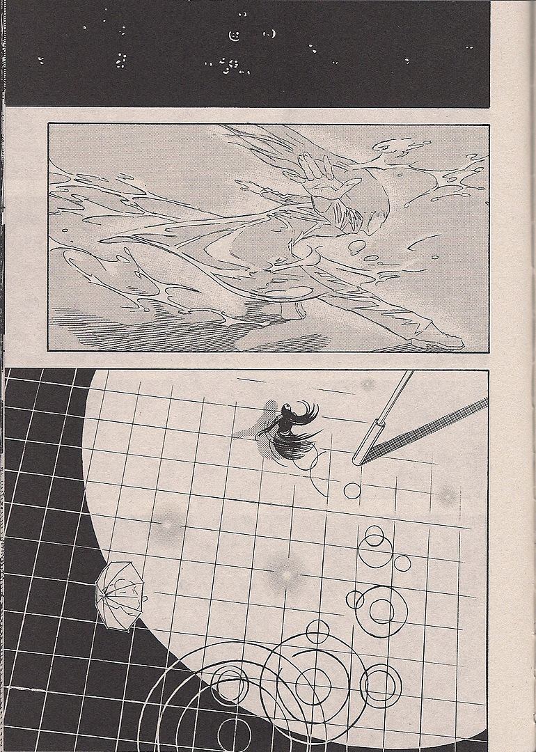
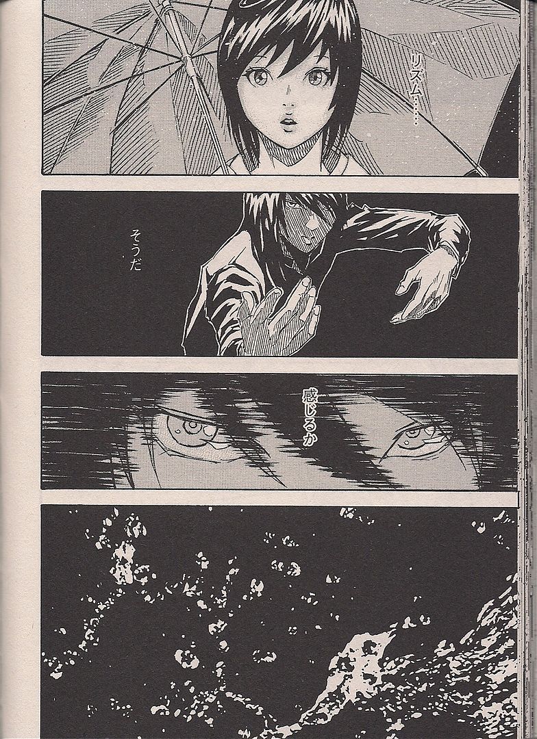
(And here's the start of a climactic dance number. I liked this one a hell of a lot -- I really like the idea of climactic dance numbers -- although heaven knows if I'd like it more or less if I could read beyond image.)
TS: It's when Killer Croc became such an animal that they just had application for him anymore, so Batman entrusts him to the care of Swamp Thing. He's no longer cognizant of what's going on, and so that's what Batman does with him, just hands him off to Swamp Thing. He becomes a sort of pet. It wasn't touching or anything, but it was a smart conclusion for characters that never have any conclusions. Ra's Al Ghul conclusion would've been more worthwhile if it had just lasted longer. It gave a nice Heavy Metal Cruel idea to Batman. You can't do anything to Ra's Al Ghul, he's always coming back, so why not drug him into mindlessness and lock him up in a room? That's what they did.
JM: The mechanisms of damnation.

(When I was younger, I loaned my brother a copy of Kurt Vonnegut's Slaughterhouse-Five. When I asked him what he thought of the narrative, broken up and jumping through time, he replied that he didn't read it in order. He picked it up every night, and read segments in an order contrary to Vonnegut's out-of-order. "Like the Bibe," he said. I thought this was absolutely ridiculous, because even broken order suggests an authorial intent, rising action cresting left-to-right, like the timeline we might imagine for our lives, if we read left-to-right.)
[NOISE OUTSIDE]

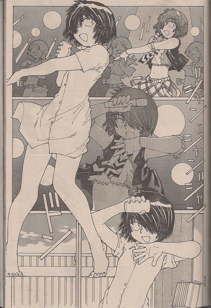
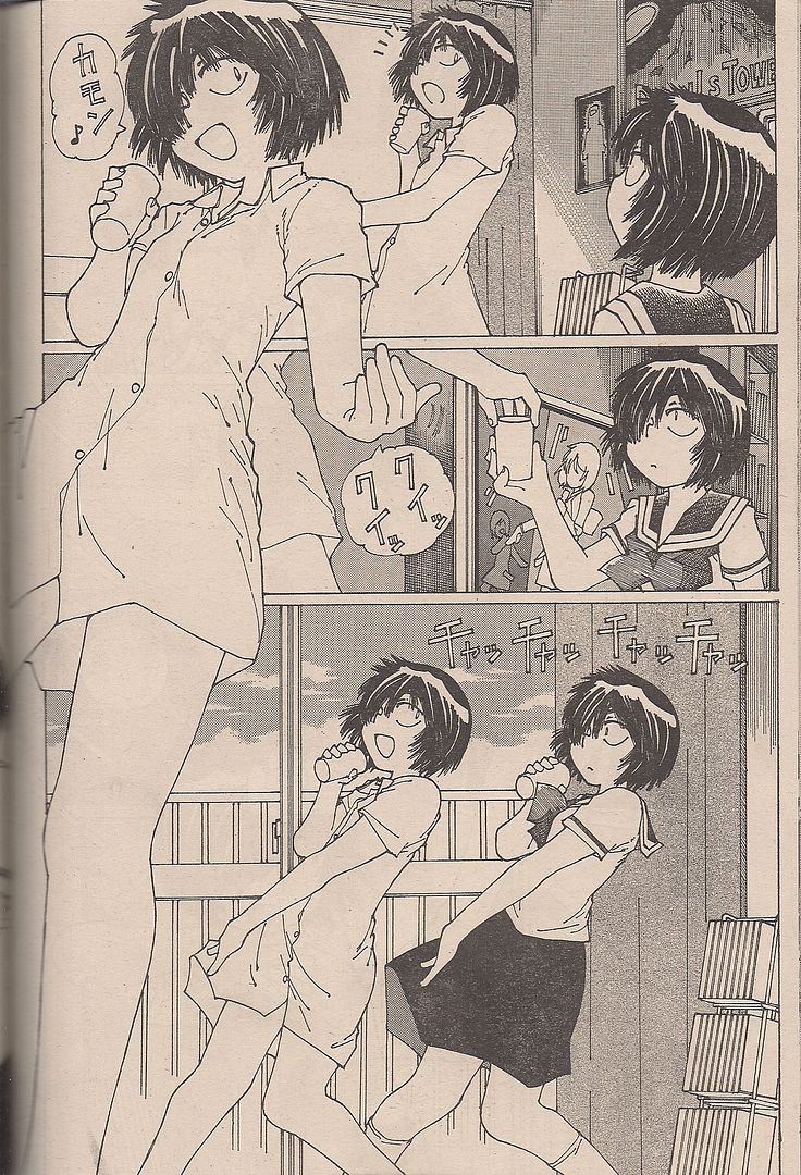
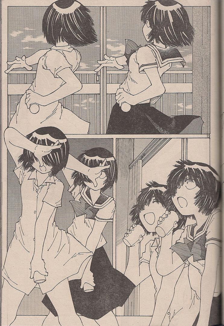
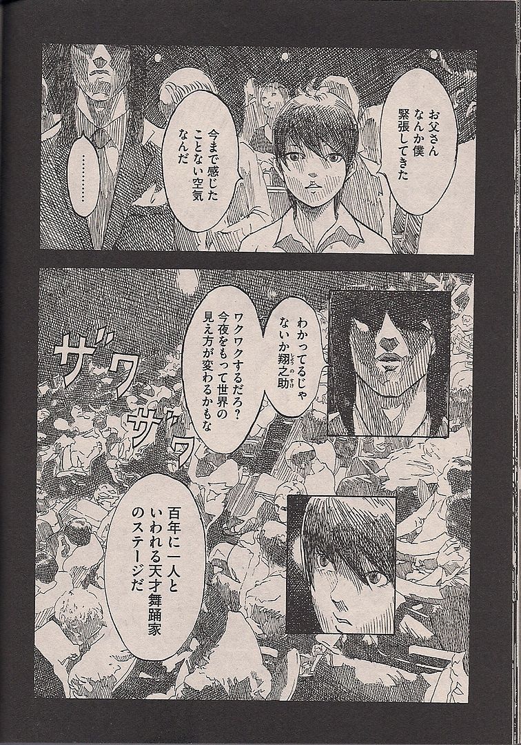
(Today when I look at the form of simple, storytelling manga in a foreign language, I realize my attachment to the visuals is as 'wrong,' but to boil these representations down to sheer expressions is to touch something in comics, your own stupid, inaccurate inventions of animation, a misunderstanding just for you, that still communicates. You are the girl here, and the boy is the comic, and he is dancing, still for you.)
TS: The mechanisms of damnation.

(What consolation.)
[A SCREAM ESCAPES THE EARTH AS HORNS SOUND, BIRDS CAW, AND YAE, EACH AND EVERY INTANGIBLE HUMAN CONCEPT SUDDENLY MOLDS PHYSICAL BEING OUT FROM THE BLUE MID-DAY NEW YORK CITY SKY, DEAD AND ABSENT SOULS AGAIN LIVING, VISIBLE VIVID AND TRANSPARENT LIKE A TRILLION-LAYERED HEAVING FILTER OVER THE FUTILE SOLIDS OF SECURE HUMAN INDUSTRY, STREETS AND BILLBOARDS ALL HOT PRISMED AND MISTY ECTOPLASMIC - IT IS THE LAST DAY]

JM: Let's go back to books I haven't read.
TS: Did you
[END]Labels: BCGF
