Désastre Hurlant (T4): Is Man Good?
And so begins the Alejandro Jodorowsky portion of our program. Which naturally means we must first discuss Moebius.
It wouldn't be fair to dub Moebius 'the man who got Jodorowsky into comics' -- Jodorowsky had worked on several cartoons and stories in the mid-'60s while working in Mexican theater, including a newspaper strip he illustrated himself -- but it's clear that the partnership between the two men launched Jodorowsky to prominence in the French comics sphere, forming a magnetic core that attracted all sorts of diverse works.
Surely their best-known work remains The Incal, the 1980-88 saga of crystal mysticism and bombastic sci-fi that launched a horde of prequels, sequels and spin-offs, many of which found English-language release through Humanoids. L'affaire du DC even boasted a fresh reprinting of the original saga, in two softcover volumes: The Incal: The Epic Conspiracy and The Incal: The Epic Journey.
Mind you, that's not to be confused with Humanoids' earlier, non-DC Incal trades, The Incal: Orphan of the City Shaft and The Incal: John Dfool, Class "R" Detective, which were actually collections of the 1988-95 prequel series Avant l'Incal (Before the Incal), culled from Humanoids' 2001-02 pamphlet-format series titled simply "The Incal."
It seems confusing now, but there's some logic behind it all, if you look to intent. Put simply, Humanoids didn't forsee a particularly easy time ahead of them re-entering U.S. comics at the turn of the 21st century, so they took what probably seemed like worthwhile branding steps. The pamphlet series titled "The Incal" followed the similarly pamphlet-styled release of Jodorowsky's 1992-2004 series The Metabarons (one of the aforementioned Incal spin-offs, at the time incomplete); Humanoids likely wanted to establish the older series as a similar chronological saga, and thus opted to release the prequel series first, with Moebius' name splashed all over the cover in his capacity as original co-creator, though the actual drawings were handled by Moebius superfan Zoran Janjetov.
This at least loans said omnibus "The Incal" title some sense, although the pamphlet series wound up stalling after issue #12 finished off the prequel material. It was a troubled thing, heavy with the compromises Humanoids apparently felt were necessary for adequate competition in the U.S. comic book market. All nudity was edited out - in a Jodorowsky comic! A man who once declared (in conversation with Stephen R. Bissette in Taboo Vol. 4) that "[f]or me, an art without violence, sex, and blood, it is not a real art"...!
Moreover, the work's colors were entirely revised, in a dimmer, 'modern' computer-enhanced style. Humanoids was clearly aware of what they were getting into there, since issue #1 provided a rationale from the editors:
"The original scheme of 'bubblegum' colors added level [sic] of irony to the otherwise dark subject matter. This was possible because its readers were already familiar with the world of The Incal and the subversive 'comic' tone of the colors would serve to undercut the depravity of the world.
"For the American launch of this book; where the audience was not already familiar with the direction of the book, the 'comic' tone of the original coloring would not read as ironic. At the same time the sophistication of the audience's taste for coloring, in light of the computer aided coloring revolution, a new look was sorely needed. So while the comic tone is still present in Janjetov's art, the severity of Jodorowsky's vision is perhaps better suited by the new colors."
In a way, this sort of warms the heart; when was the last time you witnessed a genre comics publisher mention the utility of color in bolstering or deliberately undercutting a work's tone? Hell, issue #5 of the series even presents an editorial on the usage of coloring as part of its backmatter - surely none of this was entered into thoughtlessly!
And yet, Humanoids' rationale seems disingenuous -- frankly condescending -- in that it presumes an American audience can't detect the presence of visual irony without some prompting by an earlier work while failing to note that the French audience pulled off exactly the same feat with the original Incal, which, of course, was colored in much the same manner.
But Humanoids wasn't about to stop with the prequel.
You see, all commentary about American tastes and exposure aside, Humanoids' updated coloring also appeared in new French printings of the material, which quickly followed the U.S. pamphlet releases. And when the pamphlet series tapped out, the coloring updates apparently continued as if it hadn't, spreading into reprints of the Moebius original, starting in 2003. When the DC/Humanoids editions of the Moebius material appeared in 2005, the new coloring was present and accounted for, which perhaps calls into question the 'for American tastes' excuse, although clearly the re-coloring started in American-published work. Did they already commission it? Or was something else going on?
I'll continue my Encyclopedia Brown routine later, but for right now it's probably best to actually look at the revised coloring. The issue's something of an old favorite on the internet, with Epic's 1988 three-volume edition of the material serving as the Gallant to Humanoids' Goofus. All of my goofing comes from the latter-day French printings, as sampled by the publisher.
We'll start with a classic:
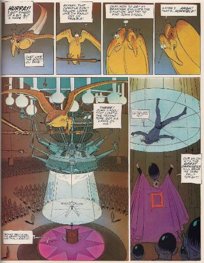
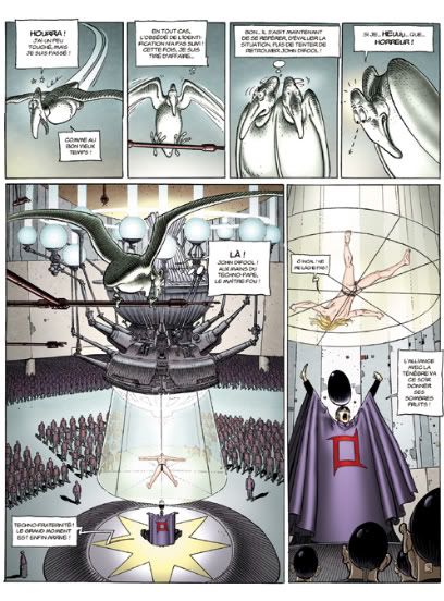
This is obvious, right? The updated version provides a winter fresh alternative to the classic 'spooky' nature of the original (handled by Isabelle Beaumenay-Joannet; contrary to what you might have heard, the great Yves Chaland only colored the very first Incal album, and this example's from tome 2), while ripping out any instances of flat, limited 'mood' coloring in favor of 'realism.' That's why the trapped man in panel 6 is no longer blue, and the animal sidekick is properly pale; his orange look in the original is only an approximation of his dimmed appearance in the room's low light -- not to mention a means of directing the eye toward the word balloon in panel 5 -- although the 'low light' itself is absent from the updated version.
Also, the shouty fellow appears to be wearing a shower curtain instead of a cloak, since it's reflecting light so fabulously.
How about the natural world?
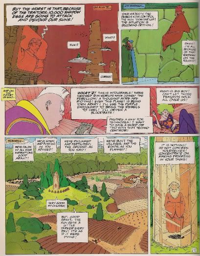
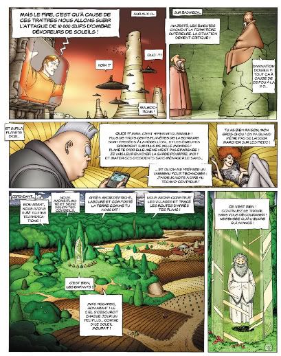
As you can see, everything in the updated Incal appears to be lit by floodlights blasting from off-panel. Skin tones shine like rubber while skies pulse. When in doubt, hues are drained of richness, or simply made white, washing the 'bubblegum' off the universe but, as the Funnybook Babylon link above observes, rendering the whole of Moebius' live-in worlds oddly antiseptic. I mean, does that grass look like anything could grow from it?
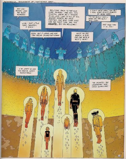
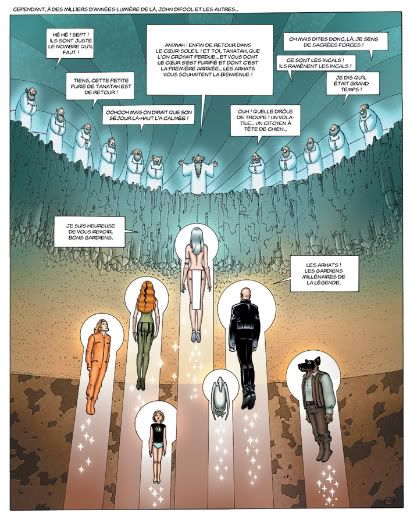
'Realistic' detail is also a big concern. I like the bisected nature of the old version a lot, even though it probably doesn't behave in a terribly logical manner (it's also a different colorist at work: 'Frazick'). The new version ensures that every character is carefully detailed in their 'correct' state, while sucking some aplomb out of the welcoming party up top.
And while heaven knows that version 1.0 was likely abetted by printing limitations of its day, there's a less alien character to the new edition, which manages to be both duller and louder at the same time - ugh those glowing sparkles!
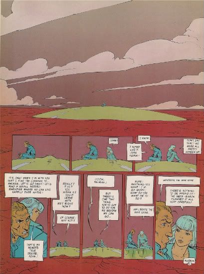
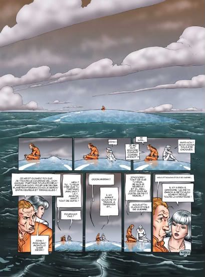
Another friendly old fave, which sort of summarizes the whole thing. I don't need to tell you how the entire mood of the page is changed by the color choices; I seriously doubt that escaped anyone at any time while working on the latter stuff. You can probably make the case that the digital textures do a better job of setting the smaller panels apart from the larger image, although I think the frothy waves are a distraction on their own, and the subtler purple-on-red is more responsive to the conversation going on.
But moreover, the flatter colors are simply more compatible with Moebius' lines, which in this phase of his development (under the 'Moebius' name) were keyed toward dialing down unnecessary detail; even the layout of the page seems a bit complex, relatively, prompting the artist to muse (in the supplements to the Epic edition) that he may have been taking on the influence of American comics at that point. Surely there's plenty more than is necessary in the latter example, although I concede it probably does look even more like an American sci-fi comic of 2005 (or 2009) for its labor.
Oh, and the coloring on the original, later Incal volumes? The work of one Zoran Janjetov.
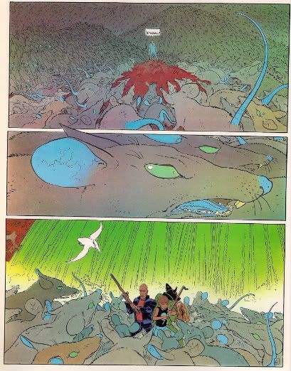
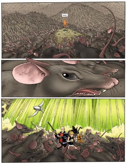
Yeah, in the end, though, I think I respond to the simple things the best. Green eyes on giant rats? Blue ears and tails? Awesome. Who wants a dirty bunch of normal huge rats, rushing at a plain mound of earth? Give me whimsy and comedy in my metaphysical sci-fi; don't worry, I know what it means.
And I think I might know what the new coloring means too. The key is hidden with our man Janjetov, the colorist-turned-line artist. In 1988, he started off very much beholden to Moebius' approach, as is evident from this updated version of the first album from the Incal prequel:
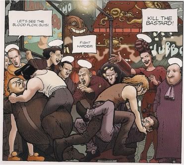
Yet by 1995, as the series ended, it was plain that Janjetov had become a different artist, and probably one whose increasingly realistic style was more conductive of a shiny digital coloring approach.

This was the style Janjetov brought over to his next project, a Jodorowsky-written Incal spin-off titled The Technopriests, which ran from 1998 to 2006. His primary (only?) colorist on that project was one Frédéric "Fred" Beltran.
And who was fellow that masterminded the Incal re-coloring, at least as far as Janjetov's work went, doubtlessly setting the stage for the revised coloring project as a whole?
Fred fucking Beltran!!
That's right. Oh, he wasn't the only colorist; such work in most of Humanoids' pamphlet issues is credited to a Valerie Beltran, to which the colors in at least the first DC volume of the Moebius work are also attributed. But Humanoids makes it clear in issue #1 of the pamphlets that Fred was the one who set forth the mission for the new hues, even citing his Technopriests work, so there'll be no mistake.
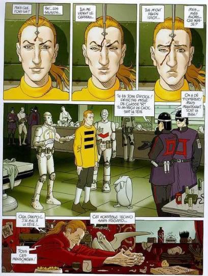
And hey, what about Moebius? Didn't the legends whisper of his real and true return to the Incal at some point? Like, if there was a Before the Incal, wouldn't there be an Après l'Incal (After the Incal), even if it only lasted one volume, released in 2000? What could it possibly look like?
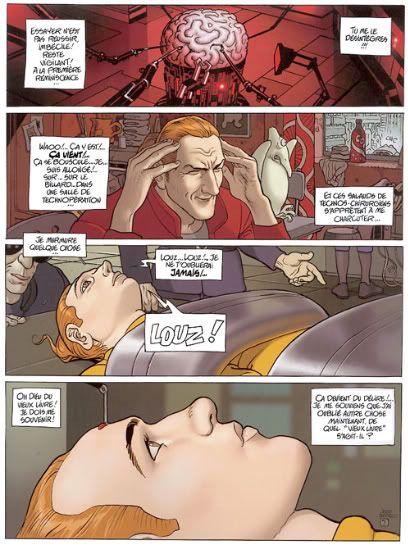
Huh! I have no clue who the colorist was on this stuff -- it could have been Moebius himself, for all I know -- but it certainly does seem that the artist is striving to make his work seem more 'realistic,' with a similar coloring scheme as would appear in the updated versions of the older works, just a few years later, although admittedly a bit more vivid, yet never quite garish.
No worries, though! The failure-to-launch of After the Incal has since been superseded by the 2008 arrival of Final Incal , a remake and eventual continuation of Moebius' After the Incal work, still written by Jodorowsky and featuring art by Hip Flask veteran and Marvel covers regular José Ladrönn. The steely-clean realism may yet return.
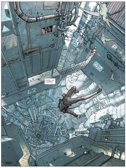
Personally? I think the overriding objective may have been linewide visual consistency. Surely Humanoids realized that both the Technopriests and the Metabarons (as painted by Juan Giménez) were going in a realist direction. For whatever reason, Moebius adopted a style a bit closer to that one for his own latter-day Incal book (never released in English, btw), so it might have seemed logical to go all-out and thrash the earlier Incal works into semi-similar shape. Janjetov would already be used to working with Beltran, so the only seriously tricky bit would be Moebius' '80s output.
They did it anyway. I presume Moebius agreed. Why? As in, 'why' for him and Humanoids?
Hey, there were letters in those old Incal issues praising the new colors a good deal. It sure did look more like a 'new' comic. And besides, if Humanoids' objective in releasing the Incal in the U.S. in the first place was to make it look like a single, long epic, prequels published first, it could only help if it all sort of looked the same, a little. Raise the salability to foreign territories a bit. Give it all a reason to be reprinted. Brand the whole Jodoverse together.
I don't think it made for a better comic, no, but a study of what surrounded those updated Incals does offer some more valuable guesswork than 'god it looks like crap, they screwed him, etc.' Feels to me like just another effort on Humanoids' part to fit in, bereft of the shock of the new that accompanied that first Hurlant. Even the DC deal couldn't overcome this one, although I have no idea if any content editing went down in the DC editions of the Moebius material, seeing as how they were recolored too.
Oh? Why not compare with my Epic editions?
Shit, I don't even own the DC/Humanoids books. You want me to pay $50.00 for used copies of books I already own a better version of? Moebius comics are fucking expensive, man!
So yeah, this week is Jodorowsky week, and the next chapter of this adventure into personal ruin will explore that first Incal, if actually from the old Epic editions, and their translation, and their colors. Told ya I'd be playing with the format.
And as for Moebius, he didn't stick with the whole shiny colors thing. Here's a little Jean Giraud, from his guest turn in 2007's XIII vol. 18:
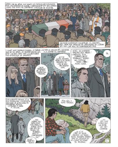
Pale, flat, on stylized lines. If you wanted something brighter, there was always his stuff in the Halo Graphic Novel from 2006:
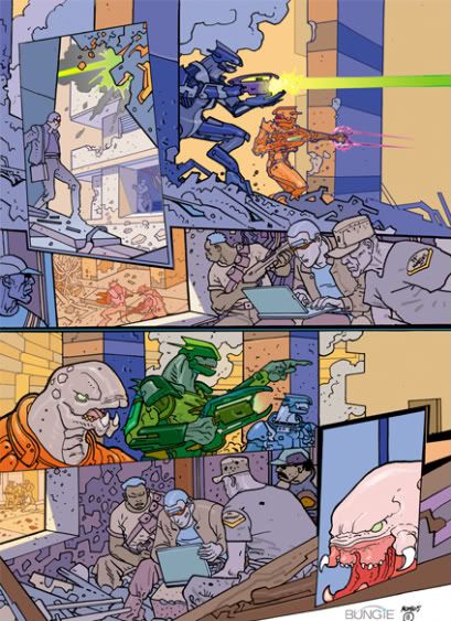
Always shifting, never satisfied. The Halo artist barely even looks like anyone else pictured here. That's the Moebius way; even the most overwhelming new colors can't seem to really ruin him, as he's apt to try something totally odd himself next time around.
That's restless, that's human. That's good. I'll eat that.
It wouldn't be fair to dub Moebius 'the man who got Jodorowsky into comics' -- Jodorowsky had worked on several cartoons and stories in the mid-'60s while working in Mexican theater, including a newspaper strip he illustrated himself -- but it's clear that the partnership between the two men launched Jodorowsky to prominence in the French comics sphere, forming a magnetic core that attracted all sorts of diverse works.
Surely their best-known work remains The Incal, the 1980-88 saga of crystal mysticism and bombastic sci-fi that launched a horde of prequels, sequels and spin-offs, many of which found English-language release through Humanoids. L'affaire du DC even boasted a fresh reprinting of the original saga, in two softcover volumes: The Incal: The Epic Conspiracy and The Incal: The Epic Journey.
Mind you, that's not to be confused with Humanoids' earlier, non-DC Incal trades, The Incal: Orphan of the City Shaft and The Incal: John Dfool, Class "R" Detective, which were actually collections of the 1988-95 prequel series Avant l'Incal (Before the Incal), culled from Humanoids' 2001-02 pamphlet-format series titled simply "The Incal."
It seems confusing now, but there's some logic behind it all, if you look to intent. Put simply, Humanoids didn't forsee a particularly easy time ahead of them re-entering U.S. comics at the turn of the 21st century, so they took what probably seemed like worthwhile branding steps. The pamphlet series titled "The Incal" followed the similarly pamphlet-styled release of Jodorowsky's 1992-2004 series The Metabarons (one of the aforementioned Incal spin-offs, at the time incomplete); Humanoids likely wanted to establish the older series as a similar chronological saga, and thus opted to release the prequel series first, with Moebius' name splashed all over the cover in his capacity as original co-creator, though the actual drawings were handled by Moebius superfan Zoran Janjetov.
This at least loans said omnibus "The Incal" title some sense, although the pamphlet series wound up stalling after issue #12 finished off the prequel material. It was a troubled thing, heavy with the compromises Humanoids apparently felt were necessary for adequate competition in the U.S. comic book market. All nudity was edited out - in a Jodorowsky comic! A man who once declared (in conversation with Stephen R. Bissette in Taboo Vol. 4) that "[f]or me, an art without violence, sex, and blood, it is not a real art"...!
Moreover, the work's colors were entirely revised, in a dimmer, 'modern' computer-enhanced style. Humanoids was clearly aware of what they were getting into there, since issue #1 provided a rationale from the editors:
"The original scheme of 'bubblegum' colors added level [sic] of irony to the otherwise dark subject matter. This was possible because its readers were already familiar with the world of The Incal and the subversive 'comic' tone of the colors would serve to undercut the depravity of the world.
"For the American launch of this book; where the audience was not already familiar with the direction of the book, the 'comic' tone of the original coloring would not read as ironic. At the same time the sophistication of the audience's taste for coloring, in light of the computer aided coloring revolution, a new look was sorely needed. So while the comic tone is still present in Janjetov's art, the severity of Jodorowsky's vision is perhaps better suited by the new colors."
In a way, this sort of warms the heart; when was the last time you witnessed a genre comics publisher mention the utility of color in bolstering or deliberately undercutting a work's tone? Hell, issue #5 of the series even presents an editorial on the usage of coloring as part of its backmatter - surely none of this was entered into thoughtlessly!
And yet, Humanoids' rationale seems disingenuous -- frankly condescending -- in that it presumes an American audience can't detect the presence of visual irony without some prompting by an earlier work while failing to note that the French audience pulled off exactly the same feat with the original Incal, which, of course, was colored in much the same manner.
But Humanoids wasn't about to stop with the prequel.
You see, all commentary about American tastes and exposure aside, Humanoids' updated coloring also appeared in new French printings of the material, which quickly followed the U.S. pamphlet releases. And when the pamphlet series tapped out, the coloring updates apparently continued as if it hadn't, spreading into reprints of the Moebius original, starting in 2003. When the DC/Humanoids editions of the Moebius material appeared in 2005, the new coloring was present and accounted for, which perhaps calls into question the 'for American tastes' excuse, although clearly the re-coloring started in American-published work. Did they already commission it? Or was something else going on?
I'll continue my Encyclopedia Brown routine later, but for right now it's probably best to actually look at the revised coloring. The issue's something of an old favorite on the internet, with Epic's 1988 three-volume edition of the material serving as the Gallant to Humanoids' Goofus. All of my goofing comes from the latter-day French printings, as sampled by the publisher.
We'll start with a classic:


This is obvious, right? The updated version provides a winter fresh alternative to the classic 'spooky' nature of the original (handled by Isabelle Beaumenay-Joannet; contrary to what you might have heard, the great Yves Chaland only colored the very first Incal album, and this example's from tome 2), while ripping out any instances of flat, limited 'mood' coloring in favor of 'realism.' That's why the trapped man in panel 6 is no longer blue, and the animal sidekick is properly pale; his orange look in the original is only an approximation of his dimmed appearance in the room's low light -- not to mention a means of directing the eye toward the word balloon in panel 5 -- although the 'low light' itself is absent from the updated version.
Also, the shouty fellow appears to be wearing a shower curtain instead of a cloak, since it's reflecting light so fabulously.
How about the natural world?


As you can see, everything in the updated Incal appears to be lit by floodlights blasting from off-panel. Skin tones shine like rubber while skies pulse. When in doubt, hues are drained of richness, or simply made white, washing the 'bubblegum' off the universe but, as the Funnybook Babylon link above observes, rendering the whole of Moebius' live-in worlds oddly antiseptic. I mean, does that grass look like anything could grow from it?


'Realistic' detail is also a big concern. I like the bisected nature of the old version a lot, even though it probably doesn't behave in a terribly logical manner (it's also a different colorist at work: 'Frazick'). The new version ensures that every character is carefully detailed in their 'correct' state, while sucking some aplomb out of the welcoming party up top.
And while heaven knows that version 1.0 was likely abetted by printing limitations of its day, there's a less alien character to the new edition, which manages to be both duller and louder at the same time - ugh those glowing sparkles!


Another friendly old fave, which sort of summarizes the whole thing. I don't need to tell you how the entire mood of the page is changed by the color choices; I seriously doubt that escaped anyone at any time while working on the latter stuff. You can probably make the case that the digital textures do a better job of setting the smaller panels apart from the larger image, although I think the frothy waves are a distraction on their own, and the subtler purple-on-red is more responsive to the conversation going on.
But moreover, the flatter colors are simply more compatible with Moebius' lines, which in this phase of his development (under the 'Moebius' name) were keyed toward dialing down unnecessary detail; even the layout of the page seems a bit complex, relatively, prompting the artist to muse (in the supplements to the Epic edition) that he may have been taking on the influence of American comics at that point. Surely there's plenty more than is necessary in the latter example, although I concede it probably does look even more like an American sci-fi comic of 2005 (or 2009) for its labor.
Oh, and the coloring on the original, later Incal volumes? The work of one Zoran Janjetov.


Yeah, in the end, though, I think I respond to the simple things the best. Green eyes on giant rats? Blue ears and tails? Awesome. Who wants a dirty bunch of normal huge rats, rushing at a plain mound of earth? Give me whimsy and comedy in my metaphysical sci-fi; don't worry, I know what it means.
And I think I might know what the new coloring means too. The key is hidden with our man Janjetov, the colorist-turned-line artist. In 1988, he started off very much beholden to Moebius' approach, as is evident from this updated version of the first album from the Incal prequel:

Yet by 1995, as the series ended, it was plain that Janjetov had become a different artist, and probably one whose increasingly realistic style was more conductive of a shiny digital coloring approach.

This was the style Janjetov brought over to his next project, a Jodorowsky-written Incal spin-off titled The Technopriests, which ran from 1998 to 2006. His primary (only?) colorist on that project was one Frédéric "Fred" Beltran.
And who was fellow that masterminded the Incal re-coloring, at least as far as Janjetov's work went, doubtlessly setting the stage for the revised coloring project as a whole?
Fred fucking Beltran!!
That's right. Oh, he wasn't the only colorist; such work in most of Humanoids' pamphlet issues is credited to a Valerie Beltran, to which the colors in at least the first DC volume of the Moebius work are also attributed. But Humanoids makes it clear in issue #1 of the pamphlets that Fred was the one who set forth the mission for the new hues, even citing his Technopriests work, so there'll be no mistake.
And hey, what about Moebius? Didn't the legends whisper of his real and true return to the Incal at some point? Like, if there was a Before the Incal, wouldn't there be an Après l'Incal (After the Incal), even if it only lasted one volume, released in 2000? What could it possibly look like?

Huh! I have no clue who the colorist was on this stuff -- it could have been Moebius himself, for all I know -- but it certainly does seem that the artist is striving to make his work seem more 'realistic,' with a similar coloring scheme as would appear in the updated versions of the older works, just a few years later, although admittedly a bit more vivid, yet never quite garish.

No worries, though! The failure-to-launch of After the Incal has since been superseded by the 2008 arrival of Final Incal , a remake and eventual continuation of Moebius' After the Incal work, still written by Jodorowsky and featuring art by Hip Flask veteran and Marvel covers regular José Ladrönn. The steely-clean realism may yet return.

Personally? I think the overriding objective may have been linewide visual consistency. Surely Humanoids realized that both the Technopriests and the Metabarons (as painted by Juan Giménez) were going in a realist direction. For whatever reason, Moebius adopted a style a bit closer to that one for his own latter-day Incal book (never released in English, btw), so it might have seemed logical to go all-out and thrash the earlier Incal works into semi-similar shape. Janjetov would already be used to working with Beltran, so the only seriously tricky bit would be Moebius' '80s output.
They did it anyway. I presume Moebius agreed. Why? As in, 'why' for him and Humanoids?
Hey, there were letters in those old Incal issues praising the new colors a good deal. It sure did look more like a 'new' comic. And besides, if Humanoids' objective in releasing the Incal in the U.S. in the first place was to make it look like a single, long epic, prequels published first, it could only help if it all sort of looked the same, a little. Raise the salability to foreign territories a bit. Give it all a reason to be reprinted. Brand the whole Jodoverse together.
I don't think it made for a better comic, no, but a study of what surrounded those updated Incals does offer some more valuable guesswork than 'god it looks like crap, they screwed him, etc.' Feels to me like just another effort on Humanoids' part to fit in, bereft of the shock of the new that accompanied that first Hurlant. Even the DC deal couldn't overcome this one, although I have no idea if any content editing went down in the DC editions of the Moebius material, seeing as how they were recolored too.
Oh? Why not compare with my Epic editions?
Shit, I don't even own the DC/Humanoids books. You want me to pay $50.00 for used copies of books I already own a better version of? Moebius comics are fucking expensive, man!
So yeah, this week is Jodorowsky week, and the next chapter of this adventure into personal ruin will explore that first Incal, if actually from the old Epic editions, and their translation, and their colors. Told ya I'd be playing with the format.
And as for Moebius, he didn't stick with the whole shiny colors thing. Here's a little Jean Giraud, from his guest turn in 2007's XIII vol. 18:

Pale, flat, on stylized lines. If you wanted something brighter, there was always his stuff in the Halo Graphic Novel from 2006:

Always shifting, never satisfied. The Halo artist barely even looks like anyone else pictured here. That's the Moebius way; even the most overwhelming new colors can't seem to really ruin him, as he's apt to try something totally odd himself next time around.
That's restless, that's human. That's good. I'll eat that.
Labels: Hurlant

<< Home