Delicacies of Frozen Window Synapse
Blurred Vision Vol. 4
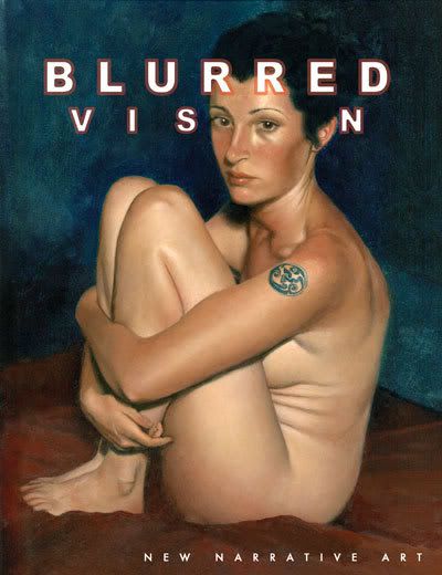
This is a new anthology of b&w comics, the latest in a series from Blurred Books. There's not a lot of adornment, nor even a credited editor (from reading around, I know Kevin Mutch is one of several). Those of its 232 pages not occupied by comics are primarily white, speckled with small type. Contributor biographies -- often with a statement of introduction and/or intent -- directly precede each piece. The overall presentational feel is one of modesty, or perhaps thrift, not quite minimal (it is 8 1/2" x 11") but far from fancy. It costs $15.95, though it doesn't say so on the cover.
Take note of one thing it does say, however: "New Narrative Art." That's not necessarily the nervous dodge of connotation it might seem like - the contributors use terms like 'comic,' 'comic strip,' 'graphic novel' and others more or less interchangeably. No, I think the cover brand should be highlighted as an indicator of the series' aesthetic point of view, elsewhere detailed as a look into the revitalization of 'narrative' in contemporary art, as it meets with the evolving sophistication of the comics form. In other words, it's comics often informed by a 'fine' arts perspective, to various ends, its package inclined toward accessibility.
However, the book's broad mission and particular simplicity of presentation also form an arrangement of solitudes; all that white space and continuing authorial greeting and waving effectively positions each piece as an island, no one bit really informing any other. And that aggravates the project's plain, crucial problem: most of its included works simply aren't very interesting. Many different styles are on display, with varied content - there's overt political howling, stop-and-start improvisatory scribbles, digitally distorted sculpture fumetti, and the occasional belabored visual metaphor in the manner of a guy having an empty one night stand with a woman who's head is literally severed from her body, set aside for the night's sex but left alone in bed come morning's regret. Virtually none of it stands out, individualized as all of it is.
One bit did get me looking closely, though. It was a short slice of 'abstract' comics, Andrei Molotiu's Expedition to the Interior (actually a reprint of a 2005 minicomic, and posted online), which caught my eye for two inital reasons: (1) I couldn't think of a semi-high profile anthology (as far as these things go) since Kramers Ergot 4 that gave prominent space to abstract work; and (2) Molotiu mentioned in the obligatory bio blurb that his Abstract Comics: An Anthology was definitely forthcoming from Fantagraphics.
I'll be interested in seeing what forms the stuff can take - Molotiu opines that, at minimum, abstract comics can foreground the "sequential energy" that underlies the comics form, the drive that connects panel to panel and page to page, distilled from the elaboration of firm representation (if well-harnessed for representational purposes by the likes of Kirby and Ditko). As such, the artist's particular approach involves "playing with shapes that are just under the threshold of legibility: shapes that, ideally, will suggest several representational alternatives but will not allow the reader to settle on any single interpretation."
That all raises some immediate concerns for me, chief among them how extra-panel properties might be exploited to channel said sequential energy. All those velvet nights of drug abuse and Alan Moore comics have soiled my mind into zooming outward, seeing panels as malleable elements of the page, comperable (though not identical) to in-panel elements in fueling primal reader effect. Take away the legibility of shapes, and you may still mold that illegibility so as to impose perspective or suggest time; how those properties react with liquid representation will affect the reading of the sequence, and perhaps impose a certain objectivity onto the experience.
Let's look at a sample from the piece, in which we learn that Alfred is the Black Glove:
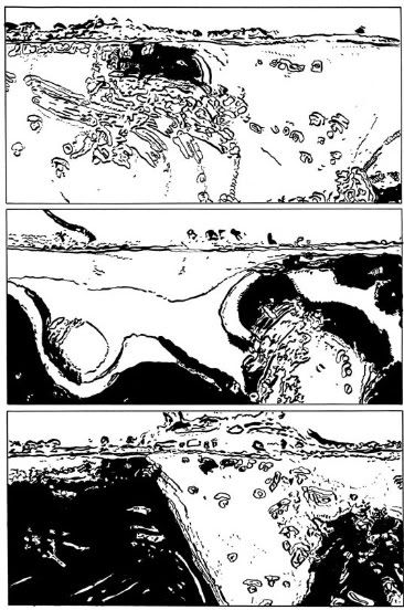
Note the wide, horizontal panels, much like in The Authority. Superhero comics artists often use these panels to afford their stories an obvious sense of grand scope, 'surrounding' the reader with information by dominating the contours of the page - we read comic across the page, so a wide panel sends its image booming through a full line of comprehension. Molotiu's wide panels have a similar effect, although their content is not specifically representational - I can feel the pounding of those waves.
But wait - why do I think they're waves? Further: how did I get the idea that they're pounding, an impression that suggests a fixed perspective (an unmoving view of water) that time is passing over (waves and sloshing)? I initially wondered if uniform panels implicitly suggested an immobile viewpoint, fixed as they are on the page and lacking the specifics of a viewpoint represented - did Louis Riel hit on something that fundamental?
Ah, but look closer at those images - Molotiu fixes the eye with a horizontal line just under the top, foaming in the manner of cresting waves. My vision hung on that detail, eager for a visual hook, maybe as a side effect of reading from panel to panel; it could just be years of conditioning, but I suspect the act of simply moving between panels creates an expectation of a firm or mobile perspective, part and parcel with Molotiu's sequential energy. Upon reflection, I noticed that I filled in areas below the horizontal line with assumptions, all black and white space an area beneath the water, although the lingering, primary white above the line also helped that feeling along.
Compare that with the next page:
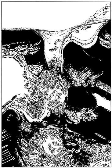
Here, because I had just finished with the prior page, I continued to see the upper region as the sky and the lower region as water. But Molotiu then violates that spatial property by creating a second wave coming in from the left, creating a second, complimentary 'sky.' Even then, however, I continued to retain my initial impression through each page's use of panels; because enough of a semblance of a fixed perspective remained -- the position of the 'sky' in each panel of the first page roughly equating to its position on the second page -- I naturally felt the impact of smaller panels building up to the grander impact of a full-page splash, one that seemed to rend reality itself apart on the left!
Now, admittedly, Molotiu is working with images "just under" that legibility threshold, so it seems likely that he meant to hold my eye on that top horizontal line. But it's his choice of panels that affects my reading just as much, solidifying my notion of a visually referenced world via panel beat.
It doesn't stay that way:
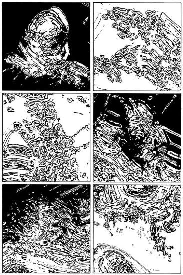
This is two pages later. There's no longer a 'hook' - from my prior reading, I might presume we're submerged, offering a helpful loss of direction as happens whenever I trip in my bathtub or fall out of a boat (every day it's one or the other). But that's kind of a slippery notion, as there's little sense of fixed space - where are we underwater? Are we moving? I couldn't say. We have moved from page to page, through something I'll dub 'wavering representation': the dialing in and out of representation, here through Molotiu's elimination of any representational hold.
Instead, we've got a six-panel grid, no white background next to a black one. To me, each background seemed to freeze its cluster of shapes into warring sides, to the point where black panel #2 seems like a splitting of the round shape in black panel #1, even though the mass in white panel #2 seems rather close to it in form. The use of shades and even panel rows back up the notion of conflict, black vs. white, even as the in-panel images are less legible. Therein perhaps lies the control of sequential energy. Imagine if the center row had been tighter than the others - it might convey a sense of added force (in tandem with the above-detailed elements, of course), or of time slowing. It would not be representation, but it would be control over the vessels of representation, imposing its own effect.
This is the next page, and the next-to-last in Molotiu's piece. I would say the wavering representation is pulling back in here, as a shared central zone of black holds the eye, shaping the rest of the widescreen action around it and making panel #2 seem to 'zoom in,' with panel #3 moving farther out than panel #1, the black being squelched or absorbed.
As an aside, you'll notice my use of filmic terms right there. Comics is not entirely removed from the cinema -- today's genre comics in particular are sometimes very eager to look as much like movies as possible! -- but I think 'abstract' samples of each actually reinforce their most fundamental differences.
Molotiu's swirls of activity here momentarily brought to my mind the painted films of Stan Brakhage, which divorced the cinema from any visual reference to the world by applying materials directly to film stock, often then processing the work through multiple exposures or other so-called post-production techniques. He did collages too, and scratchwork (not that any of these techniques are or were mutually exclusive), but I find his paint-heavy works to be his finest. They're roughly abstract expressionism, although the occasional detail of subtle colors might be more impressionistic. But they're paintings that exploit the cinema's illusion of movement so thoroughly that they seem to burn right into the brain, causing real, physical sensation in me through the time of film, one end of the reel to the other, the brain accepting what it's given.
Brakhage liked to call that music. Many comics have also often compared to music. But it's a more deliberate art form, one that exists apart from time, with all the visual suggestion of narrative that the cinema might offer, coupled with the stillness of a painting. The idea I got from this abstract comic is that extra-panel properties of the form provide a means of 'temporal' (as much as that makes sense in a still art) control, as well as a great potential for solidification of the liquid representation as seen in here. Formal mechanics such as panel control are the means of power, and the knowing artist can have the will.
But different abstractions can only create different effects, and maybe prompt different conclusions - surely enough to fill their own anthology.
The rest of this Blurred Vision sparked far less consideration from me. I do appreciate the effort put into pieces like editor Mutch's Captain Adam 2: The Diamond of Doom, a 23-page narrative recomposition effort from 1994 (well, half of one; the full work is online), taking individual panels from assorted '60s and '70s comics, blowing them up to full-page splashes and digitally altering elements so as to coax out story threads. But Mutch's alterations seem to impose more story than the collaged fragments evoke, leaving little of interest beyond an elementary evocation of shared funnybook iconography and a rather precious juxtaposition of horror and romance tropes, seeing a restless housewife from Venus falling for a (ho ho) recomposed man.
That isn't to say there's no decent work in here, although I'll admit the best stuff came from artists I'm already familiar with. K. Thor Jensen's three-page Bolus depicts a gaping organic orifice taunting the reader until more and more of its form becomes clear - something about its vivid texture and alien character matched with unassuming dialogue suggested Mat Brinkman's fantasy observation work in Teratoid Heights (the few parts with words). It's a segment of a larger, upcoming work called Cloud Stories, and I expect different properties might spark once it's part of a larger sequence. I'm also partial to Tobias Tak's funny fantasy grotesqueries, smashing storybook whimsy into the unreal sensual glamor of early 20th century film - here, he does it again.
Yet many more pieces simply drift along, usually exhibiting some proficiency but never grasping the memorable. Frankly, a lot of it's comparable to the old, thick SPX anthologies, the ones from just after the turn of the 21st century, where they seemed more a mass of activity than a compelling assembly of works. This book is more purposeful, but about as effective. Then again, I do find myself coming back to those festival bricks, sifting through to track down some odd early or random thing by an artist who's caught my eye elsewhere. Maybe the same will happen with this book, its inquisitive segments shifted from time's and experience's perspective.
This is a new anthology of b&w comics, the latest in a series from Blurred Books. There's not a lot of adornment, nor even a credited editor (from reading around, I know Kevin Mutch is one of several). Those of its 232 pages not occupied by comics are primarily white, speckled with small type. Contributor biographies -- often with a statement of introduction and/or intent -- directly precede each piece. The overall presentational feel is one of modesty, or perhaps thrift, not quite minimal (it is 8 1/2" x 11") but far from fancy. It costs $15.95, though it doesn't say so on the cover.
Take note of one thing it does say, however: "New Narrative Art." That's not necessarily the nervous dodge of connotation it might seem like - the contributors use terms like 'comic,' 'comic strip,' 'graphic novel' and others more or less interchangeably. No, I think the cover brand should be highlighted as an indicator of the series' aesthetic point of view, elsewhere detailed as a look into the revitalization of 'narrative' in contemporary art, as it meets with the evolving sophistication of the comics form. In other words, it's comics often informed by a 'fine' arts perspective, to various ends, its package inclined toward accessibility.
However, the book's broad mission and particular simplicity of presentation also form an arrangement of solitudes; all that white space and continuing authorial greeting and waving effectively positions each piece as an island, no one bit really informing any other. And that aggravates the project's plain, crucial problem: most of its included works simply aren't very interesting. Many different styles are on display, with varied content - there's overt political howling, stop-and-start improvisatory scribbles, digitally distorted sculpture fumetti, and the occasional belabored visual metaphor in the manner of a guy having an empty one night stand with a woman who's head is literally severed from her body, set aside for the night's sex but left alone in bed come morning's regret. Virtually none of it stands out, individualized as all of it is.
One bit did get me looking closely, though. It was a short slice of 'abstract' comics, Andrei Molotiu's Expedition to the Interior (actually a reprint of a 2005 minicomic, and posted online), which caught my eye for two inital reasons: (1) I couldn't think of a semi-high profile anthology (as far as these things go) since Kramers Ergot 4 that gave prominent space to abstract work; and (2) Molotiu mentioned in the obligatory bio blurb that his Abstract Comics: An Anthology was definitely forthcoming from Fantagraphics.
I'll be interested in seeing what forms the stuff can take - Molotiu opines that, at minimum, abstract comics can foreground the "sequential energy" that underlies the comics form, the drive that connects panel to panel and page to page, distilled from the elaboration of firm representation (if well-harnessed for representational purposes by the likes of Kirby and Ditko). As such, the artist's particular approach involves "playing with shapes that are just under the threshold of legibility: shapes that, ideally, will suggest several representational alternatives but will not allow the reader to settle on any single interpretation."
That all raises some immediate concerns for me, chief among them how extra-panel properties might be exploited to channel said sequential energy. All those velvet nights of drug abuse and Alan Moore comics have soiled my mind into zooming outward, seeing panels as malleable elements of the page, comperable (though not identical) to in-panel elements in fueling primal reader effect. Take away the legibility of shapes, and you may still mold that illegibility so as to impose perspective or suggest time; how those properties react with liquid representation will affect the reading of the sequence, and perhaps impose a certain objectivity onto the experience.
Let's look at a sample from the piece, in which we learn that Alfred is the Black Glove:
Note the wide, horizontal panels, much like in The Authority. Superhero comics artists often use these panels to afford their stories an obvious sense of grand scope, 'surrounding' the reader with information by dominating the contours of the page - we read comic across the page, so a wide panel sends its image booming through a full line of comprehension. Molotiu's wide panels have a similar effect, although their content is not specifically representational - I can feel the pounding of those waves.
But wait - why do I think they're waves? Further: how did I get the idea that they're pounding, an impression that suggests a fixed perspective (an unmoving view of water) that time is passing over (waves and sloshing)? I initially wondered if uniform panels implicitly suggested an immobile viewpoint, fixed as they are on the page and lacking the specifics of a viewpoint represented - did Louis Riel hit on something that fundamental?
Ah, but look closer at those images - Molotiu fixes the eye with a horizontal line just under the top, foaming in the manner of cresting waves. My vision hung on that detail, eager for a visual hook, maybe as a side effect of reading from panel to panel; it could just be years of conditioning, but I suspect the act of simply moving between panels creates an expectation of a firm or mobile perspective, part and parcel with Molotiu's sequential energy. Upon reflection, I noticed that I filled in areas below the horizontal line with assumptions, all black and white space an area beneath the water, although the lingering, primary white above the line also helped that feeling along.
Compare that with the next page:
Here, because I had just finished with the prior page, I continued to see the upper region as the sky and the lower region as water. But Molotiu then violates that spatial property by creating a second wave coming in from the left, creating a second, complimentary 'sky.' Even then, however, I continued to retain my initial impression through each page's use of panels; because enough of a semblance of a fixed perspective remained -- the position of the 'sky' in each panel of the first page roughly equating to its position on the second page -- I naturally felt the impact of smaller panels building up to the grander impact of a full-page splash, one that seemed to rend reality itself apart on the left!
Now, admittedly, Molotiu is working with images "just under" that legibility threshold, so it seems likely that he meant to hold my eye on that top horizontal line. But it's his choice of panels that affects my reading just as much, solidifying my notion of a visually referenced world via panel beat.
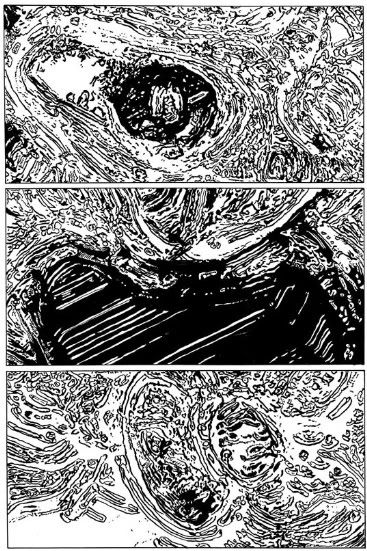
It doesn't stay that way:
This is two pages later. There's no longer a 'hook' - from my prior reading, I might presume we're submerged, offering a helpful loss of direction as happens whenever I trip in my bathtub or fall out of a boat (every day it's one or the other). But that's kind of a slippery notion, as there's little sense of fixed space - where are we underwater? Are we moving? I couldn't say. We have moved from page to page, through something I'll dub 'wavering representation': the dialing in and out of representation, here through Molotiu's elimination of any representational hold.
Instead, we've got a six-panel grid, no white background next to a black one. To me, each background seemed to freeze its cluster of shapes into warring sides, to the point where black panel #2 seems like a splitting of the round shape in black panel #1, even though the mass in white panel #2 seems rather close to it in form. The use of shades and even panel rows back up the notion of conflict, black vs. white, even as the in-panel images are less legible. Therein perhaps lies the control of sequential energy. Imagine if the center row had been tighter than the others - it might convey a sense of added force (in tandem with the above-detailed elements, of course), or of time slowing. It would not be representation, but it would be control over the vessels of representation, imposing its own effect.
This is the next page, and the next-to-last in Molotiu's piece. I would say the wavering representation is pulling back in here, as a shared central zone of black holds the eye, shaping the rest of the widescreen action around it and making panel #2 seem to 'zoom in,' with panel #3 moving farther out than panel #1, the black being squelched or absorbed.
As an aside, you'll notice my use of filmic terms right there. Comics is not entirely removed from the cinema -- today's genre comics in particular are sometimes very eager to look as much like movies as possible! -- but I think 'abstract' samples of each actually reinforce their most fundamental differences.
Molotiu's swirls of activity here momentarily brought to my mind the painted films of Stan Brakhage, which divorced the cinema from any visual reference to the world by applying materials directly to film stock, often then processing the work through multiple exposures or other so-called post-production techniques. He did collages too, and scratchwork (not that any of these techniques are or were mutually exclusive), but I find his paint-heavy works to be his finest. They're roughly abstract expressionism, although the occasional detail of subtle colors might be more impressionistic. But they're paintings that exploit the cinema's illusion of movement so thoroughly that they seem to burn right into the brain, causing real, physical sensation in me through the time of film, one end of the reel to the other, the brain accepting what it's given.
Brakhage liked to call that music. Many comics have also often compared to music. But it's a more deliberate art form, one that exists apart from time, with all the visual suggestion of narrative that the cinema might offer, coupled with the stillness of a painting. The idea I got from this abstract comic is that extra-panel properties of the form provide a means of 'temporal' (as much as that makes sense in a still art) control, as well as a great potential for solidification of the liquid representation as seen in here. Formal mechanics such as panel control are the means of power, and the knowing artist can have the will.
But different abstractions can only create different effects, and maybe prompt different conclusions - surely enough to fill their own anthology.
The rest of this Blurred Vision sparked far less consideration from me. I do appreciate the effort put into pieces like editor Mutch's Captain Adam 2: The Diamond of Doom, a 23-page narrative recomposition effort from 1994 (well, half of one; the full work is online), taking individual panels from assorted '60s and '70s comics, blowing them up to full-page splashes and digitally altering elements so as to coax out story threads. But Mutch's alterations seem to impose more story than the collaged fragments evoke, leaving little of interest beyond an elementary evocation of shared funnybook iconography and a rather precious juxtaposition of horror and romance tropes, seeing a restless housewife from Venus falling for a (ho ho) recomposed man.
That isn't to say there's no decent work in here, although I'll admit the best stuff came from artists I'm already familiar with. K. Thor Jensen's three-page Bolus depicts a gaping organic orifice taunting the reader until more and more of its form becomes clear - something about its vivid texture and alien character matched with unassuming dialogue suggested Mat Brinkman's fantasy observation work in Teratoid Heights (the few parts with words). It's a segment of a larger, upcoming work called Cloud Stories, and I expect different properties might spark once it's part of a larger sequence. I'm also partial to Tobias Tak's funny fantasy grotesqueries, smashing storybook whimsy into the unreal sensual glamor of early 20th century film - here, he does it again.
Yet many more pieces simply drift along, usually exhibiting some proficiency but never grasping the memorable. Frankly, a lot of it's comparable to the old, thick SPX anthologies, the ones from just after the turn of the 21st century, where they seemed more a mass of activity than a compelling assembly of works. This book is more purposeful, but about as effective. Then again, I do find myself coming back to those festival bricks, sifting through to track down some odd early or random thing by an artist who's caught my eye elsewhere. Maybe the same will happen with this book, its inquisitive segments shifted from time's and experience's perspective.
posted by Jog at 11:59 PM
|
![]()

<< Home